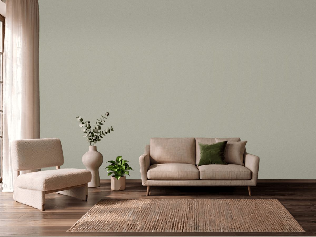
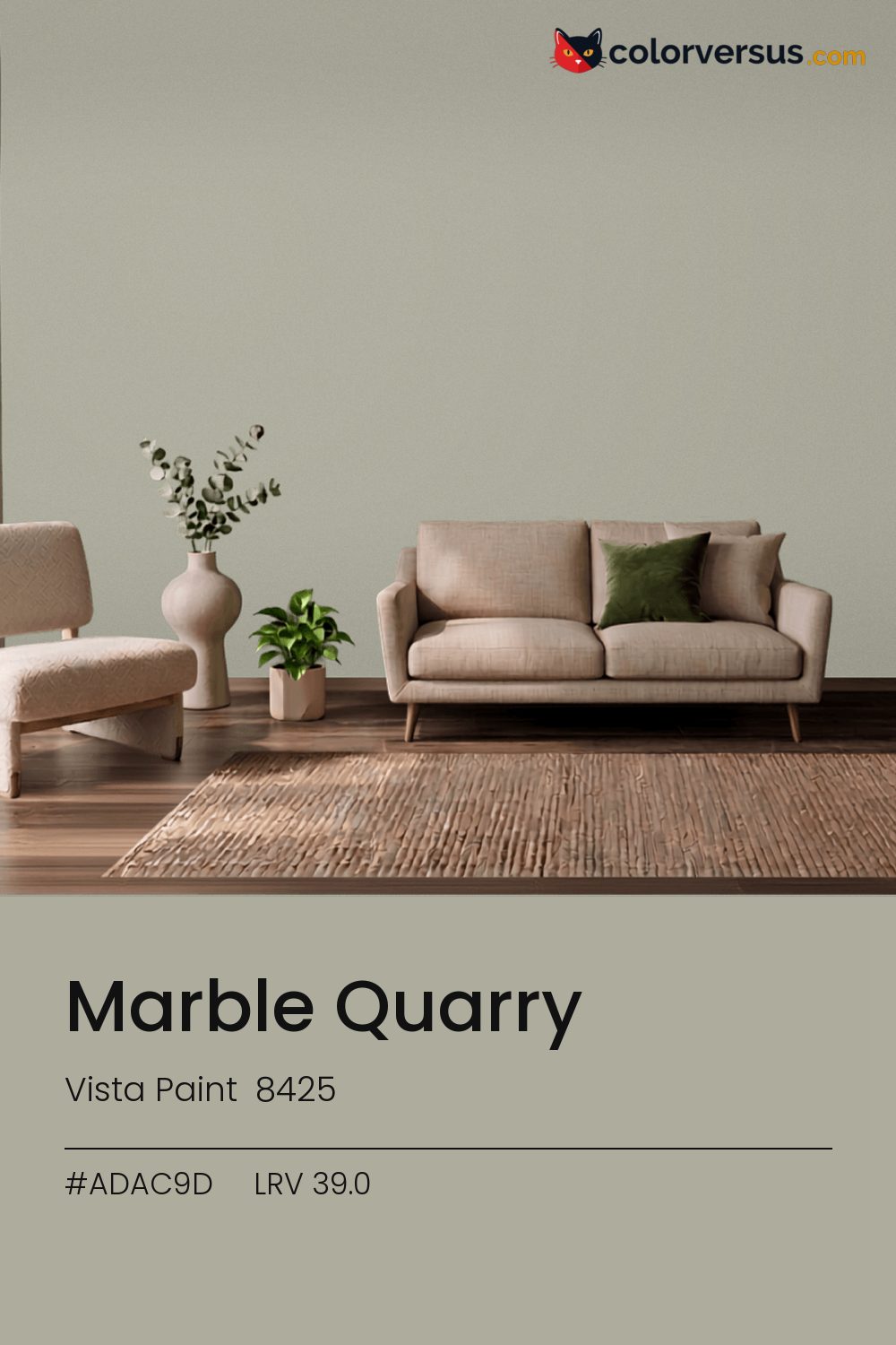
Vista Paint 8425Vista Paint 8425
This is the kind of yellow undertone that works in more rooms than it does not, which is rarer than it sounds. Vista Paint files it as 8425.
Light reflectance measures 39.0, which is enough to keep a room bright without bouncing light around. Chroma 8.2 sits in a comfortable middle: present enough to notice, restrained enough to live with.
Bedrooms and living rooms, where it is seen in lamplight as much as daylight. South light flatters it. In a north-facing room it can turn cold, so sample that wall first. For a secondary wall, Dunn-Edwards Lighthouse gives a natural step up in brightness without feeling like a mismatch (roughly 51.3 LRV points apart).
Depending on the bulb, this can genuinely read as yellow or as orange - it sits right on the border between the two, only 11° apart. Rooms already built around blues and cool greys are the hardest fit for this color - the two are opposites, and opposites next to each other rarely feel calm.
Next to it, white trim reads brighter and cooler than it does anywhere else in the house - the gap in light reflectance is what does that, not the trim paint itself. For layering, pair this with a clearly lighter mid-tone on a secondary wall or cabinetry, and keep the ceiling close to white. The gap between each step should be big enough to see without thinking about it (roughly 39.0 / 62 / 85 on the reflectance scale).
For anyone tied to a different brand, Sherwin-Williams Escape Gray (SW 6185) is the nearest stand-in, at a delta-E of 1.34. This is not a rare shade: 4 colors from other brands sit within delta-E 2 of it. A satin finish is worth it in a room that needs to be wiped down often, at the cost of showing a bit more of the wall's surface than a flat finish would.
It is lighter than 39 percent of the Vista Paint range. This is a crowded part of the scale - 540 colors measure within a point of 39.0 - so most brands will have something close. Vista Paint lists it in the K codes, alongside 1,318 other colors.
Vista Paint Marble Quarry sits between warm and cool: its hue angle is 107° in CIE Lab at a chroma of 8.2, with a yellow undertone.
The light reflectance value (LRV) of Vista Paint Marble Quarry (8425) is 39.0, on a scale where 0 is absolute black and 100 is absolute white, which makes it a mid-tone color.
Measured on the color wheel, Vista Paint Marble Quarry pairs with Behr Wild Thistle (630F-4, complement), Dunn-Edwards Antique Coin (DE6270, analogous, warmer), Behr Fashion Gray (PPU18-15, analogous, cooler), Dunn-Edwards Lighthouse (DEW385, soft accent).
Vista Paint Marble Quarry's hex value is #ADAC9D, RGB 173, 172, 157.
Vista Paint Marble Quarry is classified as a yellow, with a yellow undertone.
The nearest Pantone TCX color to Vista Paint Marble Quarry is 15-6307 TCX Agate Gray, delta-E 1.79; the nearest RAL Classic is RAL 7032 Pebble grey, delta-E 4.78.
The closest cross-brand match to Vista Paint Marble Quarry is Sherwin-Williams Escape Gray (SW 6185), at a delta-E of 1.34.
| HEX | #ADAC9D |
| RGB | 173, 172, 157 |
| CMYK | 0%, 1%, 9%, 32% |
| HSL | 56°, 9%, 65% |
| HSV | 56°, 9%, 68% |
| CIE Lab | 70.05, -2.34, 7.84 |
| LCh | 70.05, 8.18, 106.6° |
| XYZ | 38.07, 40.82, 37.77 |
| Pantone (nearest) | 15-6307 TCX Agate Gray · ΔE 1.79 |
| RAL (nearest) | RAL 7032 Pebble grey · ΔE 4.78 |
| 15-6307 TCX Agate Gray | ΔE 1.79 | |
| 14-6408 TCX Abbey Stone | ΔE 2 | |
| 15-6304 TCX Pussywillow Gray | ΔE 2.21 | |
| RAL 7032 Pebble grey | ΔE 4.78 |
Pantone TCX and RAL Classic are physical standards; these are their published sRGB approximations, so check a fan deck before specifying. Pantone® and RAL are trademarks of their respective owners.
Shades mix the color toward black, tints toward white. Click any step to find the paint colors closest to it.
One image with Marble Quarry and its closest color at every other brand, measured by delta-E.
 Yellow FreezeBenjamin Moore 2020-70
 Banana SplitBehr 360A-3
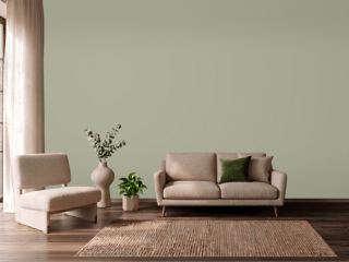 Clary SageSherwin-Williams SW 6178
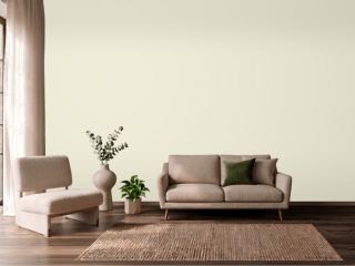 Queen Anne's LaceSherwin-Williams SW 6420
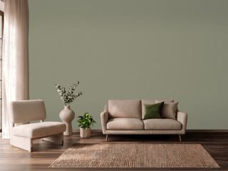 TreronFarrow & Ball 292
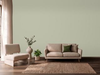 Softened GreenSherwin-Williams SW 6177
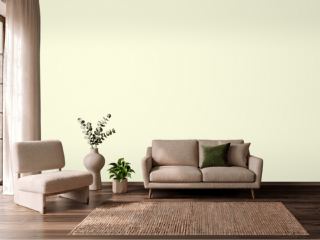 EggshellBenjamin Moore 2026-70
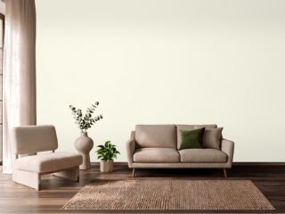 Touch of SunVista Paint 0852
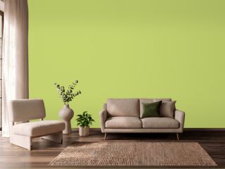 Pear GreenBenjamin Moore 2028-40
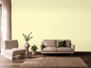 ButterBenjamin Moore 2023-60
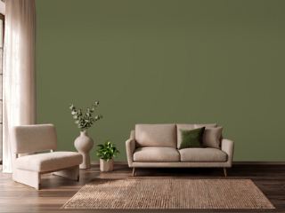 BanchaFarrow & Ball 298
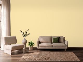 Pecan CreamValspar 3006-4B
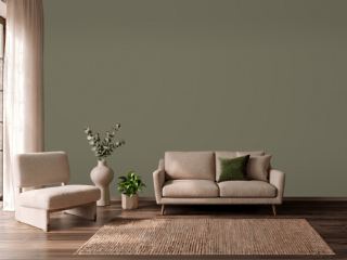 Sage Green LightSherwin-Williams SW 2851
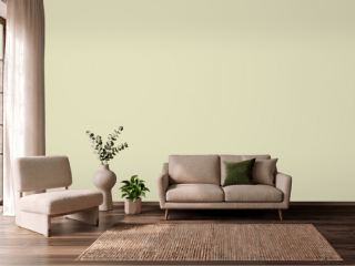 CelerySherwin-Williams SW 6421
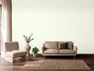 Soft SilverDunn-Edwards DEW359
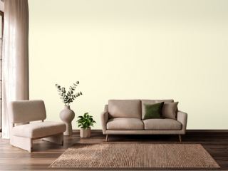 Crème FraicheBenjamin Moore 2023-70