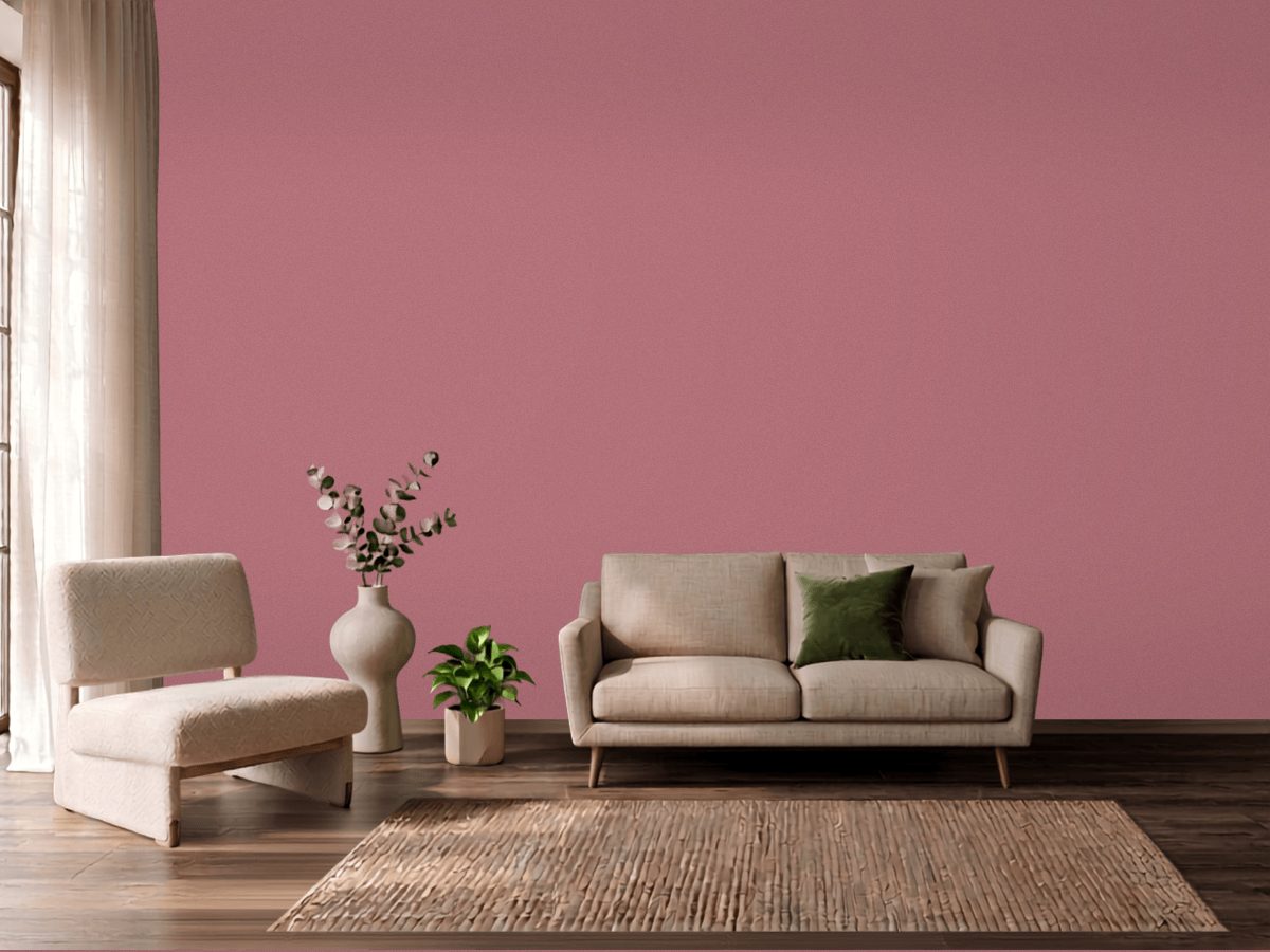
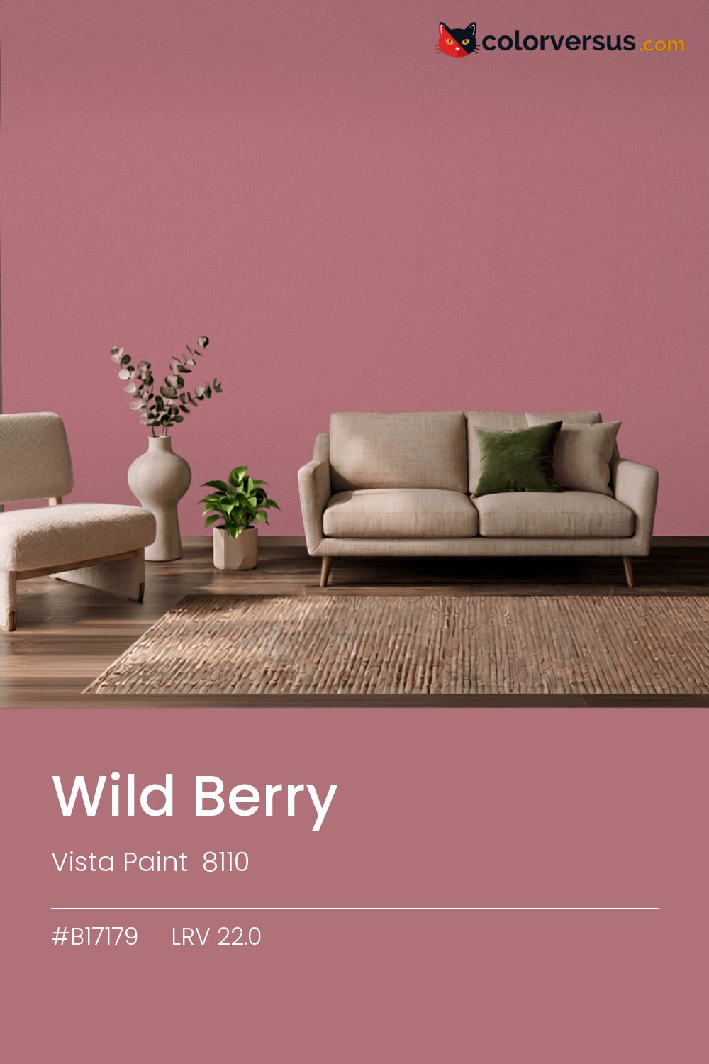
Vista Paint 8110Vista Paint 8110
A color built for commitment, not for blending in. 8110, from Vista Paint.
A chroma of 27.1 is well into the range where the color affects everything nearby - light fixtures, glossy surfaces, even skin tones under it. A powder room or a nook is often the right scale for a color this strong - enough impact without living with it in every sightline.
It holds up in a north-facing room, which is where warmth is usually missing. Light reflectance reads 22.0, though with this much color in it that number is the smaller half of the story.
This color sits right on the line between red and pink - cooler light nudges it toward pink, warmer light keeps it in red (about 7° apart on the color wheel, for anyone measuring). Rooms already built around greens are the hardest fit for this color - the two are opposites, and opposites next to each other rarely feel calm.
Anything pale placed against this wall will look paler than it is; anything warm-metal will look warmer. Neither is an illusion the color plays deliberately - it is simple contrast, but worth planning rather than discovering. For layering, pair this with a clearly lighter mid-tone on a secondary wall or cabinetry, and keep the ceiling close to white. The gap between each step should be big enough to see without thinking about it (roughly 22.0 / 54 / 85 on the reflectance scale).
Benjamin Moore Tundra makes a good second wall color here - different enough to read as a real choice, close enough to still feel related (about 55.1 points apart in light reflectance). This is not a color that benefits from shine - the saturation does the work, and a flat finish lets it do that evenly.
Switching brands, Benjamin Moore Prom Dress (1273) is the closest equivalent at delta-E 1.97, near enough for most rooms. This is a relatively uncrowded spot in the spectrum - just 1 color from other brands come this close.
It is lighter than 20 percent of the Vista Paint range. The name is not unique: Behr P110-6 also sells a color called Wild Berry, and it is not the same shade. Vista Paint lists it in the K codes, alongside 1,318 other colors.
Vista Paint Wild Berry is a warm color: its hue angle is 13° in CIE Lab at a chroma of 27.1, with a pink.
The light reflectance value (LRV) of Vista Paint Wild Berry (8110) is 22.0, on a scale where 0 is absolute black and 100 is absolute white, which makes it a dark color.
Measured on the color wheel, Vista Paint Wild Berry pairs with Sherwin-Williams Cooled Blue (SW 6759, complement), Behr Spiced Brandy (S190-4, analogous, warmer), Behr Exotic Bloom (680B-6, analogous, cooler), Benjamin Moore Tundra (2133-70, soft accent).
Vista Paint Wild Berry's hex value is #B17179, RGB 177, 113, 121.
Vista Paint Wild Berry is classified as a red, with a pink.
The nearest Pantone TCX color to Vista Paint Wild Berry is 17-1718 TCX Dusty Rose, delta-E 3.79; the nearest RAL Classic is RAL 3014 Antique pink, delta-E 14.99. Neither is an exact match.
The closest cross-brand match to Vista Paint Wild Berry is Benjamin Moore Prom Dress (1273), at a delta-E of 1.97.
| HEX | #B17179 |
| RGB | 177, 113, 121 |
| CMYK | 0%, 36%, 32%, 31% |
| HSL | 353°, 29%, 57% |
| HSV | 353°, 36%, 69% |
| CIE Lab | 54.59, 26.37, 6.18 |
| LCh | 54.59, 27.08, 13.2° |
| XYZ | 27.49, 22.54, 20.99 |
| Pantone (nearest) | 17-1718 TCX Dusty Rose · ΔE 3.79 |
| RAL (nearest) | RAL 3014 Antique pink · ΔE 14.99 |
| 17-1718 TCX Dusty Rose | ΔE 3.79 | |
| 17-1609 TCX Mesa Rose | ΔE 4.82 | |
| 17-1608 TCX Heather Rose | ΔE 5.76 | |
| RAL 3014 Antique pink | ΔE 14.99 |
Pantone TCX and RAL Classic are physical standards; these are their published sRGB approximations, so check a fan deck before specifying. Pantone® and RAL are trademarks of their respective owners.
Shades mix the color toward black, tints toward white. Click any step to find the paint colors closest to it.
One image with Wild Berry and its closest color at every other brand, measured by delta-E.
 Red EarthFarrow & Ball 64
 Southwest PotteryBenjamin Moore 048
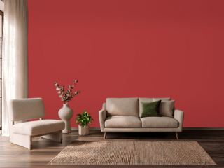 IndiscreetBehr UL110-6
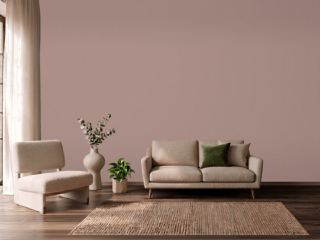 Sulking Room PinkFarrow & Ball 295
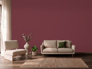 Fine WineSherwin-Williams SW 6307
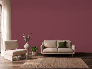 Wine TastingBehr S-H-110
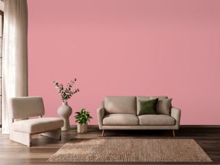 Secret GardenBenjamin Moore 1284
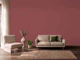 Eating Room RedFarrow & Ball 43
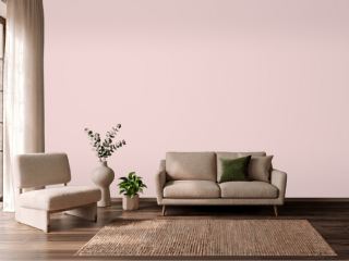 Charming PinkSherwin-Williams SW 6309
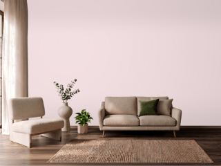 Berry TaffyValspar 1006-6C
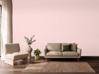 Ballet SlippersBenjamin Moore 1331
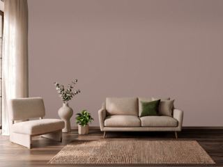 Cocoa BerrySherwin-Williams SW 9078
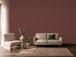 Chipotle PasteBehr PPU2-1
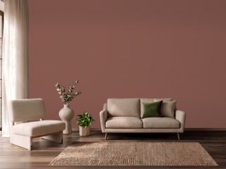 Canyon ClaySherwin-Williams SW 6054
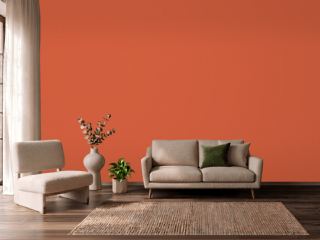 Charlotte's LocksFarrow & Ball 268
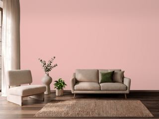 Noble BlushBehr MQ4-4