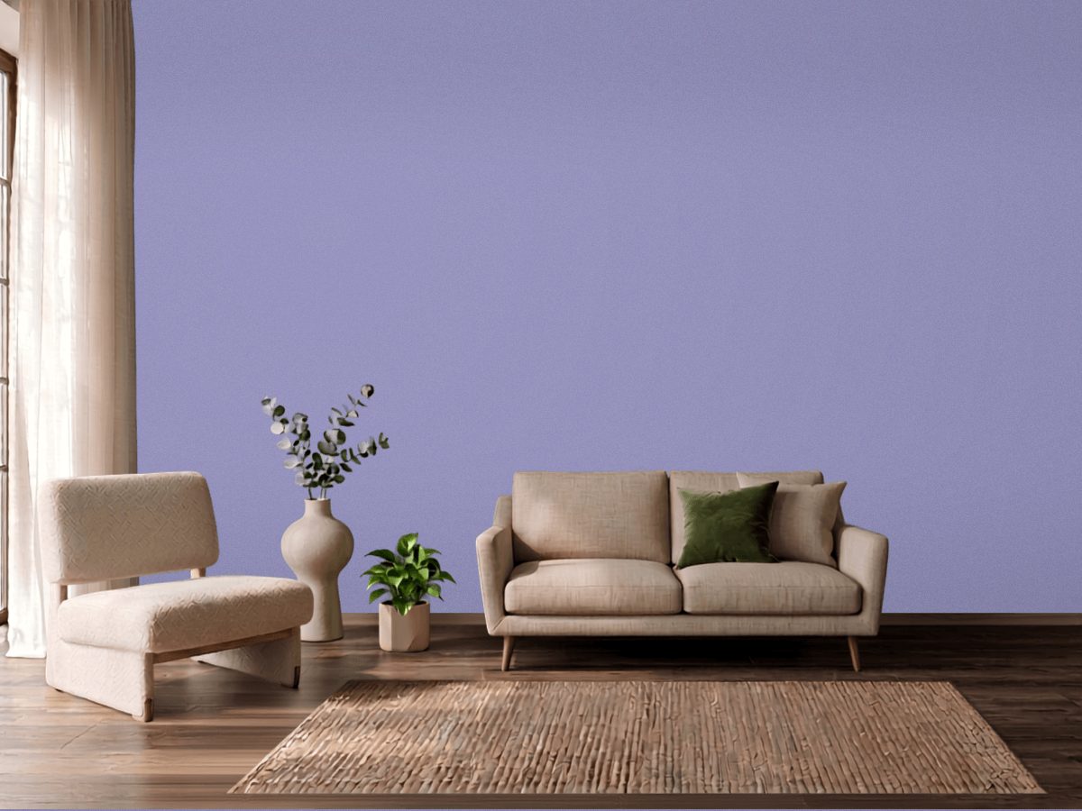
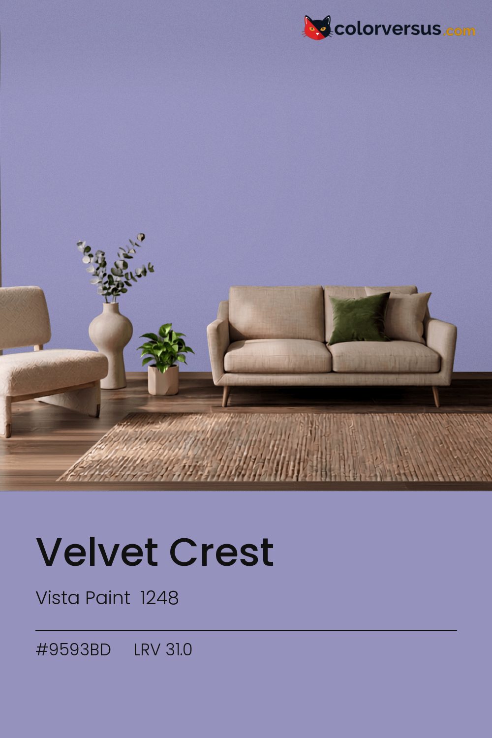
Vista Paint 1248Vista Paint 1248
This is a color that decides the room rather than supporting it. Vista Paint's designation for it is 1248.
Chroma 23.6 is high enough that the color will bounce onto light surfaces, so expect it everywhere, not only on the wall. Ideal for a single accent wall or a small room where you want to commit.
Warm bulbs will soften it; daylight bulbs push it further cool. LRV 31.0 tells you how much light comes back, which matters less here than how much color comes with it.
Not quite blue, not quite purple - this sits right where the two meet, so the room's own lighting ends up deciding which one you actually see. If the room already has yellows and warm gold in the floor, a rug, or the furniture, this color will fight it rather than sit well beside it - the two sit at opposite ends of the color spectrum, which is exactly why they clash instead of blend.
The lighter the trim beside this, the more it will seem to glow - a side effect of the light-reflectance gap rather than anything special about the trim color. A natural scheme here moves in three clear steps: this color on the main wall, a noticeably lighter mid-tone for a second wall or built-in, and a near-white on the ceiling. Each jump should be obvious at a glance, not something you have to squint to tell apart (roughly 31.0, 58 and 85 on the light-reflectance scale, for reference).
Dunn-Edwards Lighthouse pairs well as a second surface - close enough in feel to belong in the same room, far enough in lightness to read as two distinct walls (about 59.3 points apart on the reflectance scale). Matte suits a color this strong - a glossier sheen would turn every light source in the room into a visible hotspot on the wall.
Behr Lily Of The Nile (PPU16-05) runs close enough - delta-E 1.14 - that swapping brands should not change how the room looks. This is a relatively uncrowded spot in the spectrum - just 1 color from other brands come this close.
It is lighter than 28 percent of the Vista Paint range. This is a crowded part of the scale - 543 colors measure within a point of 31.0 - so most brands will have something close. Vista Paint lists it in the C codes, alongside 1,421 other colors.
Vista Paint Velvet Crest is a cool color: its hue angle is 294° in CIE Lab at a chroma of 23.6, with a violet.
The light reflectance value (LRV) of Vista Paint Velvet Crest (1248) is 31.0, on a scale where 0 is absolute black and 100 is absolute white, which makes it a mid-tone color.
Measured on the color wheel, Vista Paint Velvet Crest pairs with Vista Paint Misty Valley (0785, complement), Behr Violet Fields (650B-4, analogous, warmer), Behr Mystery (MQ5-51, analogous, cooler), Dunn-Edwards Lighthouse (DEW385, soft accent).
Vista Paint Velvet Crest's hex value is #9593BD, RGB 149, 147, 189.
Vista Paint Velvet Crest is classified as a blue, with a violet.
The nearest Pantone TCX color to Vista Paint Velvet Crest is 16-3931 TCX Sweet Lavender, delta-E 3.79; the nearest RAL Classic is RAL 4011 Pearl violet, delta-E 13. Neither is an exact match.
The closest cross-brand match to Vista Paint Velvet Crest is Behr Lily Of The Nile (PPU16-05), at a delta-E of 1.14.
| HEX | #9593BD |
| RGB | 149, 147, 189 |
| CMYK | 21%, 22%, 0%, 26% |
| HSL | 243°, 24%, 66% |
| HSV | 243°, 22%, 74% |
| CIE Lab | 62.45, 9.74, -21.5 |
| LCh | 62.45, 23.6, 294.4° |
| XYZ | 32.01, 30.93, 52.42 |
| Pantone (nearest) | 16-3931 TCX Sweet Lavender · ΔE 3.79 |
| RAL (nearest) | RAL 4011 Pearl violet · ΔE 13 |
| 16-3931 TCX Sweet Lavender | ΔE 3.79 | |
| 17-3925 TCX Persian Violet | ΔE 4.33 | |
| 16-3925 TCX Easter Egg | ΔE 4.92 | |
| RAL 4011 Pearl violet | ΔE 13 |
Pantone TCX and RAL Classic are physical standards; these are their published sRGB approximations, so check a fan deck before specifying. Pantone® and RAL are trademarks of their respective owners.
Shades mix the color toward black, tints toward white. Click any step to find the paint colors closest to it.
One image with Velvet Crest and its closest color at every other brand, measured by delta-E.
 BellflowerBehr 610D-4
 Dried LavenderSherwin-Williams SW 9072
 Misty BlueBenjamin Moore 820
 Imperial PurplePPG 1175-7
 Deep RiverBehr P500-6
 ImaginationBehr P550-1
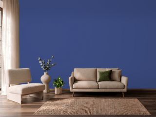 Morning GlorySherwin-Williams SW 6971
 ProvinceVista Paint 7194
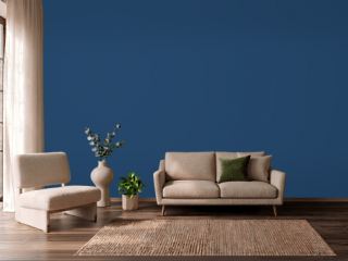 CommodoreSherwin-Williams SW 6524
 Simply SparklingDutch Boy DCP-0594
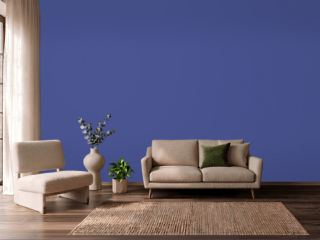 Canyon IrisBehr P540-7
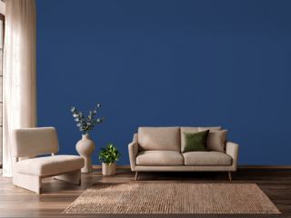 Enchanted NavyValspar 4010-8
 Lavender MistBenjamin Moore 2070-60
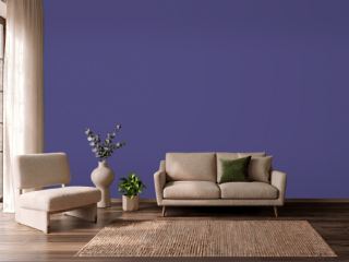 Fully PurpleSherwin-Williams SW 6983
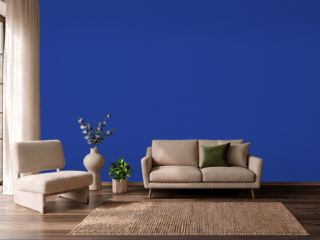 Blue RoyaleDutch Boy VS-9550
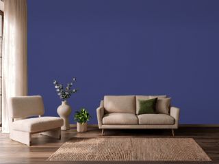 Valiant VioletSherwin-Williams SW 6818