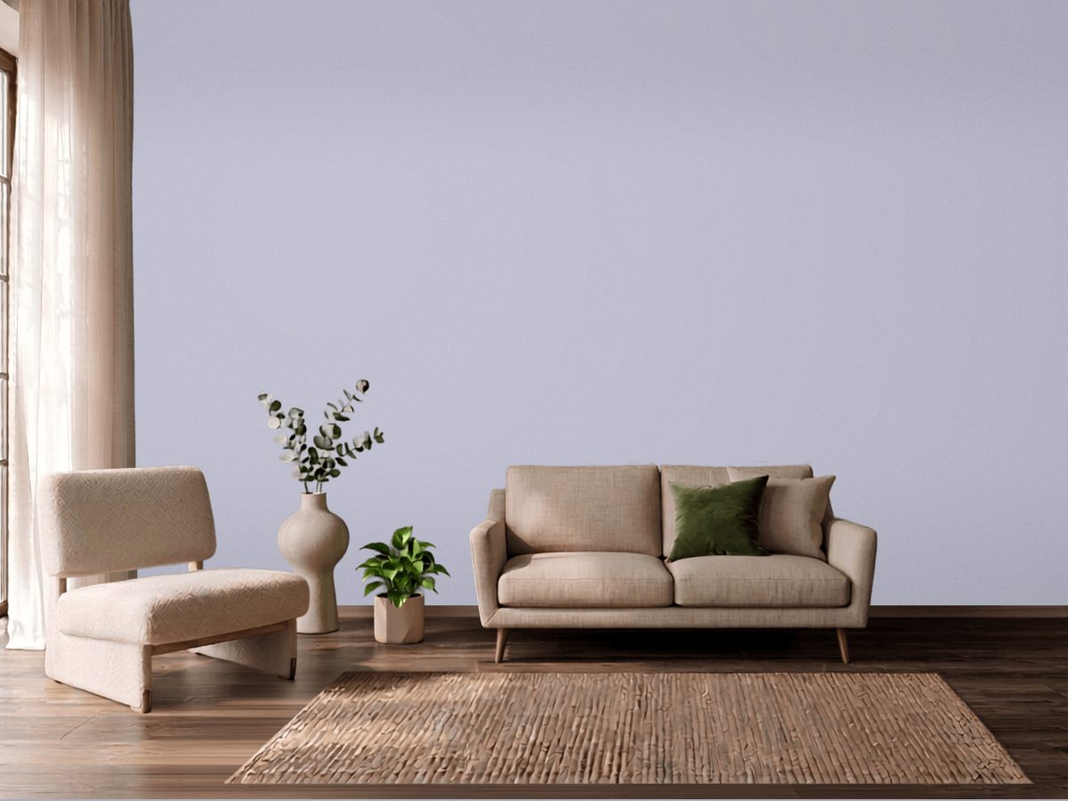
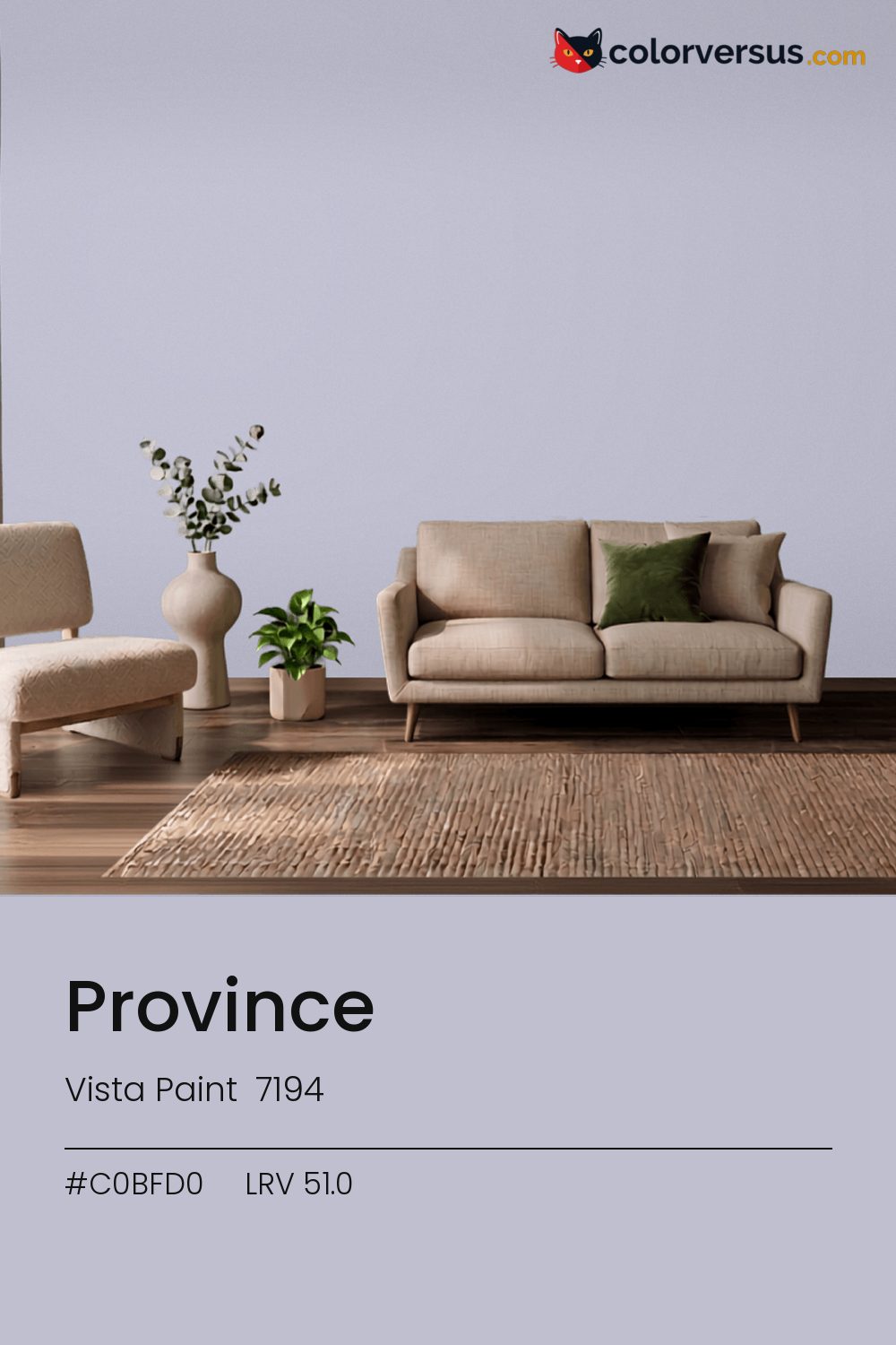
Vista Paint 7194Vista Paint 7194
A dependable middle ground, carried by a violet undertone that reads clearly without needing bright light to prove it. In the Vista Paint lineup this is 7194.
At this LRV (51.0), a room reads as neither bright-white nor dim - a genuinely middle-of-the-road amount of light comes back off the wall. At chroma 9.1 the violet undertone is clear in daylight and softer under lamps.
Bedrooms and living rooms, where it is seen in lamplight as much as daylight. Warm bulbs will soften it; daylight bulbs push it further cool. If a second wall color is wanted in the same room, Dunn-Edwards Lighthouse keeps the jump obvious rather than muddy (roughly 39.3 LRV points from this one).
This is one of the colors that can change identity with the light - somewhere between blue and purple, and near enough to the line between them (5°) that both readings are fair. Worth checking before committing to a full wall: yellows and warm gold nearby - in a floor, a rug, a piece of furniture - will read as a clash here, not a complement, since the two colors sit at opposite ends of the spectrum.
The lighter the trim beside this, the more it will seem to glow - a side effect of the light-reflectance gap rather than anything special about the trim color. The safest multi-color scheme moves from this dark wall to a noticeably lighter secondary tone, then to a near-white ceiling - three genuinely different depths rather than three shades of the same idea (LRV 51.0, 68 and 85, if you're matching by the numbers).
Behr Lavender Honor (S560-2) runs close enough - delta-E 1.47 - that swapping brands should not change how the room looks. Only 2 other-brand colors land within delta-E 2 of this one, which makes it comparatively unusual. Eggshell is a common middle ground here - enough durability for a lived-in room without the sheen that would draw attention to wall imperfections.
It is lighter than 54 percent of the Vista Paint range. Vista Paint lists it in the K codes, alongside 1,318 other colors.
Vista Paint Province is a cool color: its hue angle is 293° in CIE Lab at a chroma of 9.1, with a violet undertone.
The light reflectance value (LRV) of Vista Paint Province (7194) is 51.0, on a scale where 0 is absolute black and 100 is absolute white, which makes it a light-to-mid color.
Measured on the color wheel, Vista Paint Province pairs with Behr Feng Shui (S370-2, complement), Behr Lovely Lavender (650E-2, analogous, warmer), Behr Silver Service (610F-4, analogous, cooler), Dunn-Edwards Lighthouse (DEW385, soft accent).
Vista Paint Province's hex value is #C0BFD0, RGB 192, 191, 208.
Vista Paint Province is classified as a blue, with a violet undertone.
The nearest Pantone TCX color to Vista Paint Province is 14-3905 TCX Lavender Blue, delta-E 1.65; the nearest RAL Classic is RAL 7047 Telegrey 4, delta-E 11.13.
The closest cross-brand match to Vista Paint Province is Behr Lavender Honor (S560-2), at a delta-E of 1.47.
| HEX | #C0BFD0 |
| RGB | 192, 191, 208 |
| CMYK | 8%, 8%, 0%, 18% |
| HSL | 244°, 15%, 78% |
| HSV | 244°, 8%, 82% |
| CIE Lab | 77.89, 3.6, -8.39 |
| LCh | 77.89, 9.13, 293.2° |
| XYZ | 51.75, 53.02, 67.17 |
| Pantone (nearest) | 14-3905 TCX Lavender Blue · ΔE 1.65 |
| RAL (nearest) | RAL 7047 Telegrey 4 · ΔE 11.13 |
| 14-3905 TCX Lavender Blue | ΔE 1.65 | |
| 14-3904 TCX Evening Haze | ΔE 2.9 | |
| 13-4110 TCX Arctic Ice | ΔE 4.03 | |
| RAL 7047 Telegrey 4 | ΔE 11.13 |
Pantone TCX and RAL Classic are physical standards; these are their published sRGB approximations, so check a fan deck before specifying. Pantone® and RAL are trademarks of their respective owners.
Shades mix the color toward black, tints toward white. Click any step to find the paint colors closest to it.
One image with Province and its closest color at every other brand, measured by delta-E.
 Dried LavenderSherwin-Williams SW 9072
 BellflowerBehr 610D-4
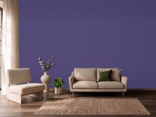 Imperial PurplePPG 1175-7
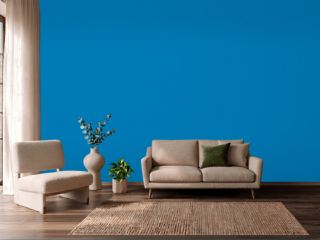 Deep RiverBehr P500-6
 Misty BlueBenjamin Moore 820
 ImaginationBehr P550-1
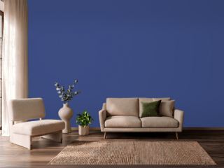 Morning GlorySherwin-Williams SW 6971
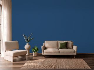 CommodoreSherwin-Williams SW 6524
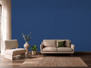 Enchanted NavyValspar 4010-8
 Simply SparklingDutch Boy DCP-0594
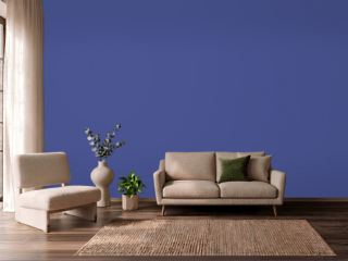 Canyon IrisBehr P540-7
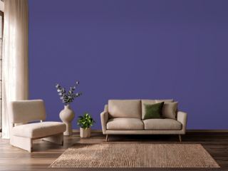 Fully PurpleSherwin-Williams SW 6983
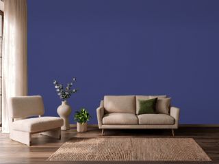 Valiant VioletSherwin-Williams SW 6818
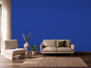 Blue RoyaleDutch Boy VS-9550
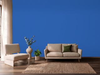 Blue SeaDutch Boy VS-9451
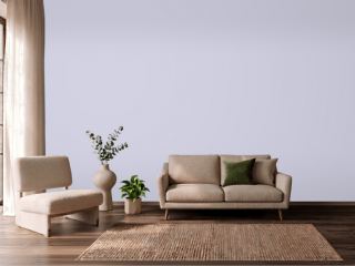 Lavender MistBenjamin Moore 2070-60