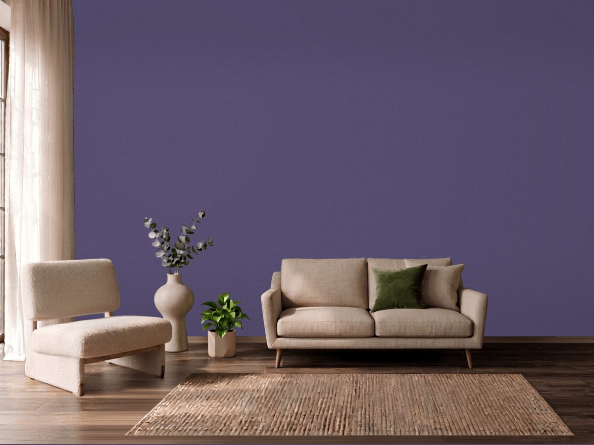
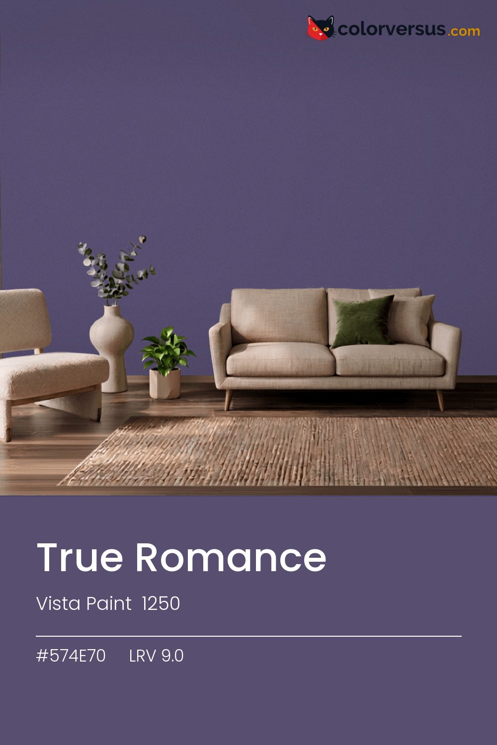
Vista Paint 1250Vista Paint 1250
This is depth rather than color in the usual sense - the violet gives it a direction, but the darkness is the point. In the Vista Paint lineup this is 1250.
9.0 on the light-reflectance scale is near the floor - this color adds shadow to a room rather than taking it away. Direct light is where the violet actually shows - raking light across the wall, a lamp placed close, morning sun through a nearby window.
This color sits right on the line between blue and purple - cooler light nudges it toward purple, warmer light keeps it in blue (about 7° apart on the color wheel, for anyone measuring). Rooms already built around yellows and warm gold are the hardest fit for this color - the two are opposites, and opposites next to each other rarely feel calm.
Anything pale placed against this wall will look paler than it is; anything warm-metal will look warmer. Neither is an illusion the color plays deliberately - it is simple contrast, but worth planning rather than discovering. For layering, pair this with a clearly lighter mid-tone on a secondary wall or cabinetry, and keep the ceiling close to white. The gap between each step should be big enough to see without thinking about it (roughly 9.0 / 47 / 85 on the reflectance scale).
Whole rooms in it work when the room is used mainly after dark and lit warmly rather than relying on daylight. If a second wall color is wanted in the same room, Vista Paint Quincy Granite keeps the jump obvious rather than muddy (roughly 36 LRV points from this one).
A color this deep already reads as dramatic; a low-sheen finish lets the color carry that without competing highlights.
Benjamin Moore Dark Lilac (2070-30) runs close enough - delta-E 1.58 - that swapping brands should not change how the room looks. This is a relatively uncrowded spot in the spectrum - just 1 color from other brands come this close.
It is lighter than 4 percent of the Vista Paint range. This is a crowded part of the scale - 442 colors measure within a point of 9.0 - so most brands will have something close. Vista Paint lists it in the C codes, alongside 1,421 other colors.
Vista Paint True Romance sits between warm and cool: its hue angle is 303° in CIE Lab at a chroma of 21.6, with a violet.
The light reflectance value (LRV) of Vista Paint True Romance (1250) is 9.0, on a scale where 0 is absolute black and 100 is absolute white, which makes it a very dark color.
Measured on the color wheel, Vista Paint True Romance pairs with Valspar Graceful Green (6001-6C, complement), Benjamin Moore Fire and Ice (1392, analogous, warmer), Benjamin Moore Stunning (826, analogous, cooler), Vista Paint Quincy Granite (H0143, soft accent).
Vista Paint True Romance's hex value is #574E70, RGB 87, 78, 112.
Vista Paint True Romance is classified as a blue, with a violet.
The nearest Pantone TCX color to Vista Paint True Romance is 18-3620 TCX Mystical, delta-E 3.41; the nearest RAL Classic is RAL 5000 Violet blue, delta-E 10.27. Neither is an exact match.
The closest cross-brand match to Vista Paint True Romance is Benjamin Moore Dark Lilac (2070-30), at a delta-E of 1.58.
| HEX | #574E70 |
| RGB | 87, 78, 112 |
| CMYK | 22%, 30%, 0%, 56% |
| HSL | 256°, 18%, 37% |
| HSV | 256°, 30%, 44% |
| CIE Lab | 35.29, 11.6, -18.18 |
| LCh | 35.29, 21.57, 302.5° |
| XYZ | 9.58, 8.64, 16.49 |
| Pantone (nearest) | 18-3620 TCX Mystical · ΔE 3.41 |
| RAL (nearest) | RAL 5000 Violet blue · ΔE 10.27 |
| 18-3620 TCX Mystical | ΔE 3.41 | |
| 19-3622 TCX Loganberry | ΔE 4.45 | |
| 19-3620 TCX Purple Reign | ΔE 5.12 | |
| RAL 5000 Violet blue | ΔE 10.27 |
Pantone TCX and RAL Classic are physical standards; these are their published sRGB approximations, so check a fan deck before specifying. Pantone® and RAL are trademarks of their respective owners.
Shades mix the color toward black, tints toward white. Click any step to find the paint colors closest to it.
One image with True Romance and its closest color at every other brand, measured by delta-E.
 BellflowerBehr 610D-4
 Dried LavenderSherwin-Williams SW 9072
 Misty BlueBenjamin Moore 820
 Imperial PurplePPG 1175-7
 Deep RiverBehr P500-6
 ImaginationBehr P550-1
 Morning GlorySherwin-Williams SW 6971
 ProvinceVista Paint 7194
 CommodoreSherwin-Williams SW 6524
 Simply SparklingDutch Boy DCP-0594
 Canyon IrisBehr P540-7
 Enchanted NavyValspar 4010-8
 Lavender MistBenjamin Moore 2070-60
 BayouBehr 570B-4
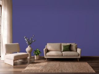 Fully PurpleSherwin-Williams SW 6983
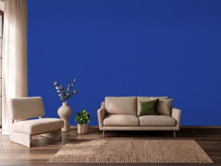 Blue RoyaleDutch Boy VS-9550