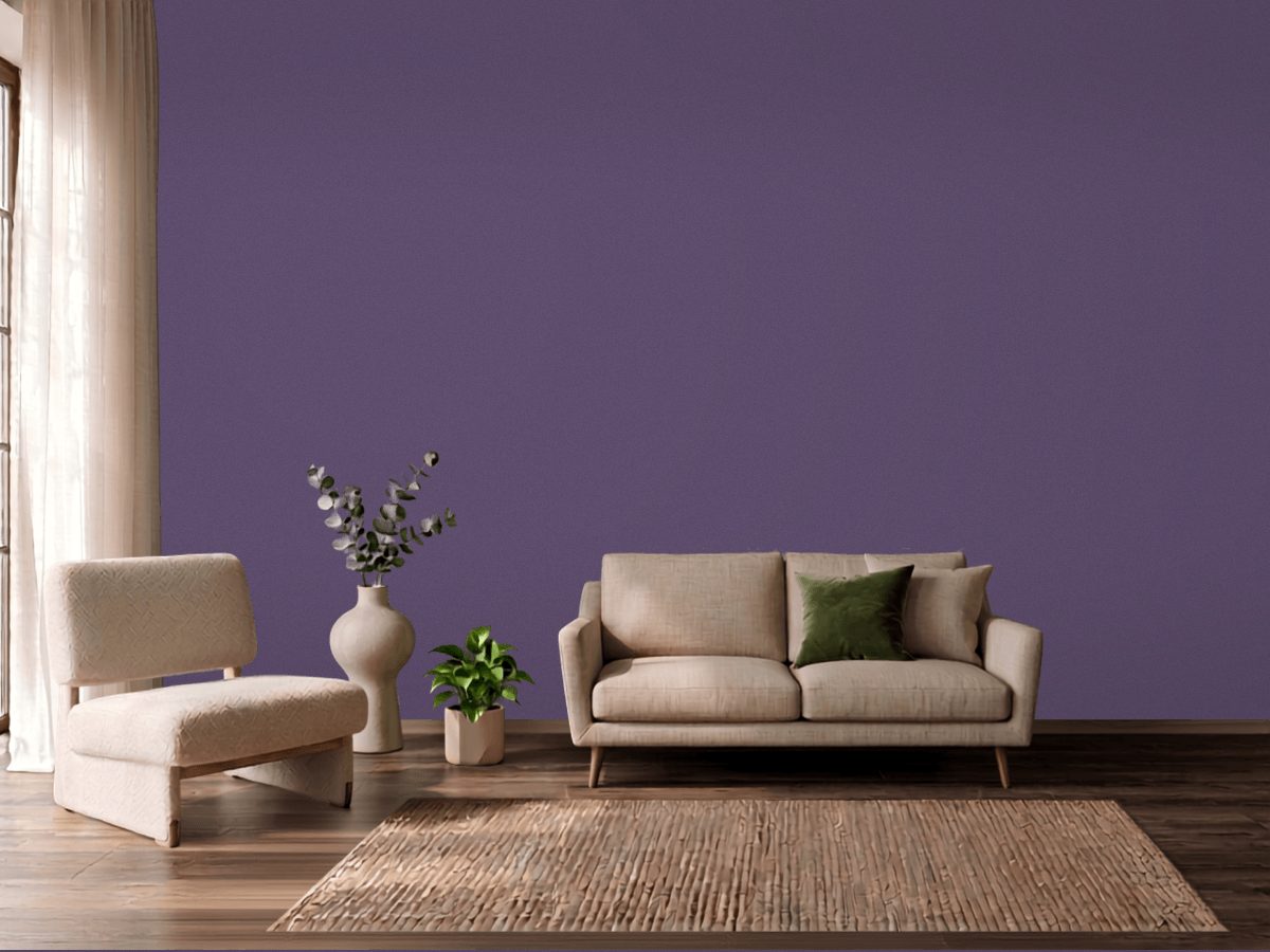
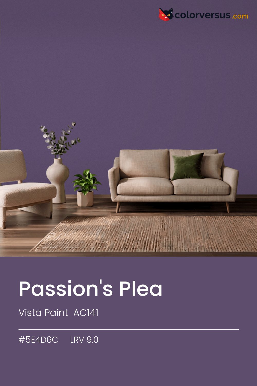
Vista Paint AC141Vista Paint AC141
It is dark enough that the room, not the paint, becomes the thing you notice - though the violet keeps it from reading as flat black. Vista Paint's designation for it is AC141.
At 9.0, light hits this wall and mostly stops there - plan the room's lighting as if the walls were not helping at all. Warm bulbs pull the violet forward, close to the surface; daylight bulbs flatten it back into something closer to plain black.
Worth checking before committing to a full wall: yellows and warm gold nearby - in a floor, a rug, a piece of furniture - will read as a clash here, not a complement, since the two colors sit at opposite ends of the spectrum.
Wood tones next to this read darker and richer than they do against a paler wall; it is one of the more dependable effects of putting a light-absorbing color next to anything reflective. The safest multi-color scheme moves from this dark wall to a noticeably lighter secondary tone, then to a near-white ceiling - three genuinely different depths rather than three shades of the same idea (LRV 9.0, 47 and 85, if you're matching by the numbers).
It belongs on a feature wall in a room that already has light to spare, rather than on every wall of a room that needs brightening. Sherwin-Williams Mineral Deposit pairs well as a second surface - close enough in feel to belong in the same room, far enough in lightness to read as two distinct walls (about 33.6 points apart on the reflectance scale).
Eggshell can work if the wall is in excellent condition, but matte is the more forgiving default for a color at the bottom of the scale.
Switching brands, Behr Crowning (650D-7) is the closest equivalent at delta-E 2.72, near enough for most rooms. No other brand has a color within delta-E 2 of this one - a genuinely uncommon shade.
It is lighter than 4 percent of the Vista Paint range. This is a crowded part of the scale - 442 colors measure within a point of 9.0 - so most brands will have something close. Vista Paint lists it in the K codes, alongside 1,318 other colors.
Vista Paint Passion's Plea sits between warm and cool: its hue angle is 312° in CIE Lab at a chroma of 20.5, with a violet.
The light reflectance value (LRV) of Vista Paint Passion's Plea (AC141) is 9.0, on a scale where 0 is absolute black and 100 is absolute white, which makes it a very dark color.
Measured on the color wheel, Vista Paint Passion's Plea pairs with Behr Mown Grass (M370-7, complement), Sherwin-Williams Vigorous Violet (SW 6838, analogous, warmer), Behr Lunar Eclipse (S-H-630, analogous, cooler), Sherwin-Williams Mineral Deposit (SW 7652, soft accent).
Vista Paint Passion's Plea's hex value is #5E4D6C, RGB 94, 77, 108.
Vista Paint Passion's Plea is classified as a purple, with a violet.
The nearest Pantone TCX color to Vista Paint Passion's Plea is 18-3620 TCX Mystical, delta-E 3.07; the nearest RAL Classic is RAL 4012 Pearl blackberry, delta-E 12.2. Neither is an exact match.
The closest cross-brand match to Vista Paint Passion's Plea is Behr Crowning (650D-7), at a delta-E of 2.72.
| HEX | #5E4D6C |
| RGB | 94, 77, 108 |
| CMYK | 13%, 29%, 0%, 58% |
| HSL | 273°, 17%, 36% |
| HSV | 273°, 29%, 42% |
| CIE Lab | 35.54, 13.71, -15.24 |
| LCh | 35.54, 20.5, 312° |
| XYZ | 9.98, 8.77, 15.35 |
| Pantone (nearest) | 18-3620 TCX Mystical · ΔE 3.07 |
| RAL (nearest) | RAL 4012 Pearl blackberry · ΔE 12.2 |
| 18-3620 TCX Mystical | ΔE 3.07 | |
| 19-3622 TCX Loganberry | ΔE 3.12 | |
| 18-3513 TCX Grape Compote | ΔE 4.87 | |
| RAL 4012 Pearl blackberry | ΔE 12.2 |
Pantone TCX and RAL Classic are physical standards; these are their published sRGB approximations, so check a fan deck before specifying. Pantone® and RAL are trademarks of their respective owners.
Shades mix the color toward black, tints toward white. Click any step to find the paint colors closest to it.
One image with Passion's Plea and its closest color at every other brand, measured by delta-E.
 Passionate PurpleSherwin-Williams SW 6981
 Smashed GrapeDunn-Edwards DE5963
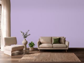 MagicalSherwin-Williams SW 6829
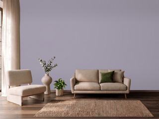 Ash VioletSherwin-Williams SW 6549
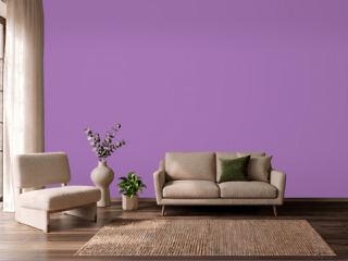 Bell HeatherPPG 1250-6
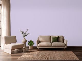 Lavender LilacVista Paint 7153
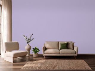 Orchid HouseValspar 1001-6A
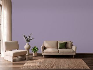 Berry CreamSherwin-Williams SW 9075
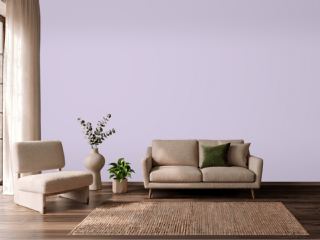 Rhapsody LilacSherwin-Williams SW 6828
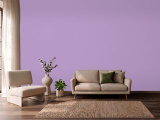 Atlantic TulipBehr 660B-5
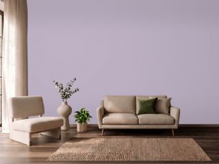 Courtly PurpleBehr S100-3
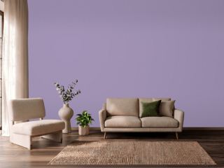 Iris BlossomValspar 1001-5C
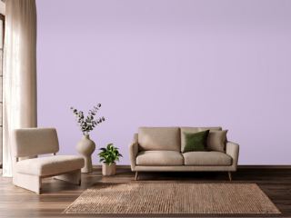 Plum CakeVista Paint 1232
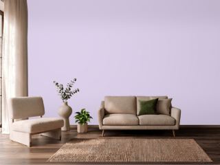 Plum's the WordVista Paint 1239
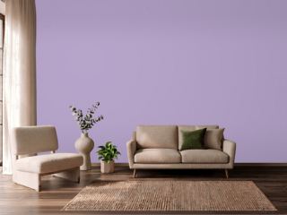 Berry FrappéSherwin-Williams SW 9068
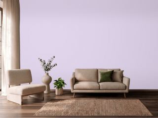 Teary EyedBehr P570-1