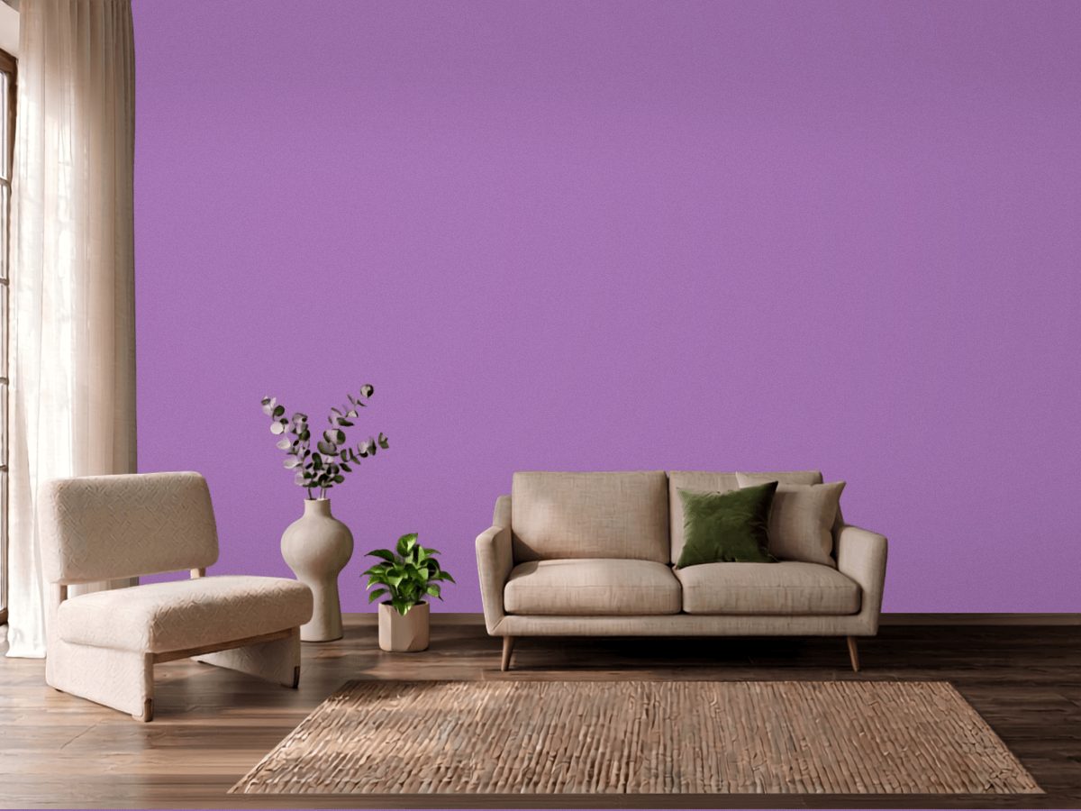
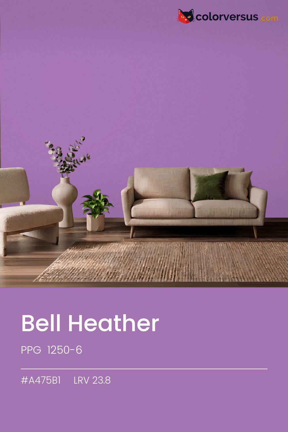
PPG 1250-6PPG 1250-6
| Color family | Purple |
| Code family | 1000 series |
| Hex | #A475B1 |
| RGB | 164, 117, 177 |
| CIE L*a*b* | 55.88, 29.13, -24.64 |
| Light reflectance | 25.0 |
Hex and LRV verified against PPG’s published color data · 2026
A color built for commitment, not for blending in. 1250-6, from PPG.
A chroma of 38.2 is well into the range where the color affects everything nearby - light fixtures, glossy surfaces, even skin tones under it. A powder room or a nook is often the right scale for a color this strong - enough impact without living with it in every sightline.
A warm bulb is the easiest fix if this reads colder than expected once it is on the wall. Light reflectance reads 25.0, though with this much color in it that number is the smaller half of the story.
If the room already has greens in the floor, a rug, or the furniture, this color will fight it rather than sit well beside it - the two sit at opposite ends of the color spectrum, which is exactly why they clash instead of blend.
Warm metals - brass, aged gold, unlacquered fixtures - gain a contrast against this that they do not have against a lighter wall; it is a common reason people choose a color this deep in the first place. A natural scheme here moves in three clear steps: this color on the main wall, a noticeably lighter mid-tone for a second wall or built-in, and a near-white on the ceiling. Each jump should be obvious at a glance, not something you have to squint to tell apart (roughly 25.0, 55 and 85 on the light-reflectance scale, for reference).
PPG Aria makes a good second wall color here - different enough to read as a real choice, close enough to still feel related (about 52 points apart in light reflectance). This is not a color that benefits from shine - the saturation does the work, and a flat finish lets it do that evenly.
Dunn-Edwards Purple Pride (DE5991) runs close enough - delta-E 2.87 - that swapping brands should not change how the room looks. Across the other brands, nothing lands within delta-E 2 of this one - there is no easy substitute.
It is lighter than 26 percent of the PPG range. Among purples it is one of the strongest: only 3 percent of them carry more colour. PPG lists it in the 1000 series, alongside 1,736 other colors.
PPG Bell Heather sits between warm and cool: its hue angle is 320° in CIE Lab at a chroma of 38.2, with a violet.
The light reflectance value (LRV) of PPG Bell Heather (1250-6) is 25.0, on a scale where 0 is absolute black and 100 is absolute white, which makes it a dark color.
Measured on the color wheel, PPG Bell Heather pairs with Dunn-Edwards Fresh Cut Grass (DE5599, complement), Behr Joie De Vivre (MQ4-60, analogous, warmer), Dunn-Edwards Mardi Gras (DE5943, analogous, cooler), PPG Aria (1001-2, soft accent).
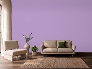
PPG Bell Heather's hex value is #A475B1, RGB 164, 117, 177.
PPG Bell Heather is classified as a purple, with a violet.
The nearest Pantone TCX color to PPG Bell Heather is 17-3619 TCX Hyacinth, delta-E 5.15; the nearest RAL Classic is RAL 4005 Blue lilac, delta-E 10.05. Neither is an exact match.
The closest cross-brand match to PPG Bell Heather is Dunn-Edwards Purple Pride (DE5991), at a delta-E of 2.87.
| HEX | #A475B1 |
| RGB | 164, 117, 177 |
| CMYK | 7%, 34%, 0%, 31% |
| HSL | 287°, 28%, 58% |
| HSV | 287°, 34%, 69% |
| CIE Lab | 55.88, 29.13, -24.64 |
| LCh | 55.88, 38.15, 319.8° |
| XYZ | 29.61, 23.79, 44.62 |
| Pantone (nearest) | 17-3619 TCX Hyacinth · ΔE 5.15 |
| RAL (nearest) | RAL 4005 Blue lilac · ΔE 10.05 |
| 17-3619 TCX Hyacinth | ΔE 5.15 | |
| 18-3628 TCX Bellflower | ΔE 5.43 | |
| 17-3628 TCX Amethyst Orchid | ΔE 5.54 | |
| RAL 4005 Blue lilac | ΔE 10.05 |
Pantone TCX and RAL Classic are physical standards; these are their published sRGB approximations, so check a fan deck before specifying. Pantone® and RAL are trademarks of their respective owners.
Shades mix the color toward black, tints toward white. Click any step to find the paint colors closest to it.
One image with Bell Heather and its closest color at every other brand, measured by delta-E.
 Passionate PurpleSherwin-Williams SW 6981
 Smashed GrapeDunn-Edwards DE5963
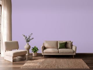 MagicalSherwin-Williams SW 6829
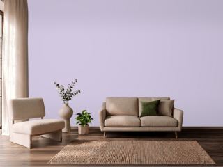 Lavender LilacVista Paint 7153
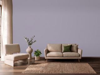 Ash VioletSherwin-Williams SW 6549
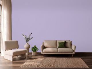 Orchid HouseValspar 1001-6A
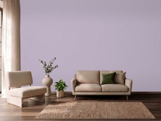 Courtly PurpleBehr S100-3
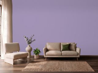 Iris BlossomValspar 1001-5C
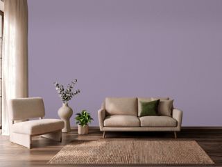 Berry CreamSherwin-Williams SW 9075
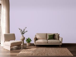 Rhapsody LilacSherwin-Williams SW 6828
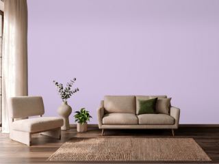 Plum CakeVista Paint 1232
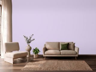 Plum's the WordVista Paint 1239
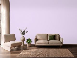 Pouty PurpleDunn-Edwards DE5967
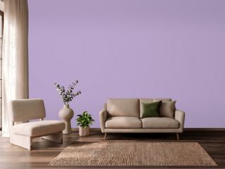 Violet FieldsBehr 650B-4
 Atlantic TulipBehr 660B-5
 Berry FrappéSherwin-Williams SW 9068