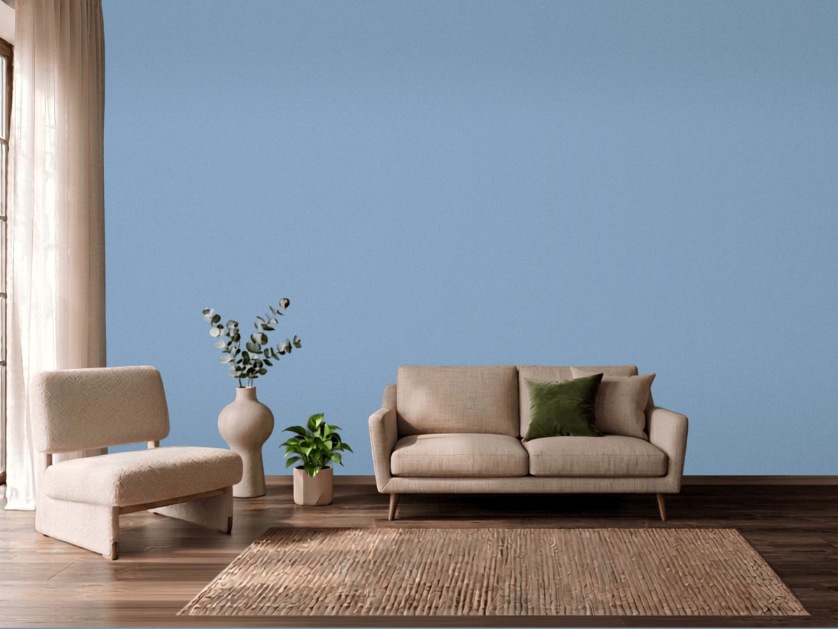
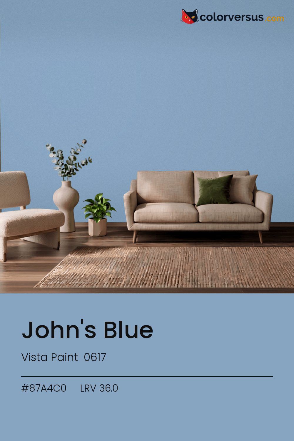
Vista Paint 0617Vista Paint 0617
This is the kind of blue that works in more rooms than it does not, which is rarer than it sounds. John's Blue is Vista Paint's 0617.
36.0 on the light-reflectance scale puts it in the middle third, which is the part of the scale with the fewest surprises. Chroma 18.0 sits in a comfortable middle: present enough to notice, restrained enough to live with.
Bedrooms and living rooms, where it is seen in lamplight as much as daylight. Warm bulbs will soften it; daylight bulbs push it further cool. For a secondary wall, Dunn-Edwards Lighthouse gives a natural step up in brightness without feeling like a mismatch (roughly 54.3 LRV points apart).
This color and oranges and warm terracotta don't get along in the same room - they sit on opposite sides of the spectrum, so pairing them tends to feel like tension rather than contrast.
Wood tones next to this read darker and richer than they do against a paler wall; it is one of the more dependable effects of putting a light-absorbing color next to anything reflective. If the room needs more than one wall color, keep the steps far apart: this color, then something clearly lighter for a second surface, then a bright white above. Two similar tones just look like a mismatch; three distinct ones read as a plan (about 36.0 to 61 to 85 in LRV terms).
Behr Hawaiian Sky (PPU14-07) runs close enough - delta-E 1.26 - that swapping brands should not change how the room looks. Only 1 other-brand color land within delta-E 2 of this one, which makes it comparatively unusual. A satin finish is worth it in a room that needs to be wiped down often, at the cost of showing a bit more of the wall's surface than a flat finish would.
It is lighter than 33 percent of the Vista Paint range. This is a crowded part of the scale - 378 colors measure within a point of 36.0 - so most brands will have something close. The name is not unique: Dutch Boy DCP-0617 also sells a color called John's Blue, and it is not the same shade. Vista Paint lists it in the C codes, alongside 1,421 other colors.
Vista Paint John's Blue is a cool color: its hue angle is 259° in CIE Lab at a chroma of 18, with a blue.
The light reflectance value (LRV) of Vista Paint John's Blue (0617) is 36.0, on a scale where 0 is absolute black and 100 is absolute white, which makes it a mid-tone color.
Measured on the color wheel, Vista Paint John's Blue pairs with Vista Paint Coastal Sand (H0122, complement), Behr Water Hyacinth (P550-4, analogous, warmer), Behr Surfer (510D-5, analogous, cooler), Dunn-Edwards Lighthouse (DEW385, soft accent).
Vista Paint John's Blue's hex value is #87A4C0, RGB 135, 164, 192.
Vista Paint John's Blue is classified as a blue, with a blue.
The nearest Pantone TCX color to Vista Paint John's Blue is 16-4120 TCX Dusk Blue, delta-E 3.65; the nearest RAL Classic is RAL 5024 Pastel blue, delta-E 7.98. Neither is an exact match.
The closest cross-brand match to Vista Paint John's Blue is Behr Hawaiian Sky (PPU14-07), at a delta-E of 1.26.
| HEX | #87A4C0 |
| RGB | 135, 164, 192 |
| CMYK | 30%, 15%, 0%, 25% |
| HSL | 209°, 31%, 64% |
| HSV | 209°, 30%, 75% |
| CIE Lab | 66.14, -3.42, -17.65 |
| LCh | 66.14, 17.98, 259° |
| XYZ | 32.78, 35.51, 54.99 |
| Pantone (nearest) | 16-4120 TCX Dusk Blue · ΔE 3.65 |
| RAL (nearest) | RAL 5024 Pastel blue · ΔE 7.98 |
| 16-4120 TCX Dusk Blue | ΔE 3.65 | |
| 16-4019 TCX Forever Blue | ΔE 4.52 | |
| 14-4214 TCX Powder Blue | ΔE 5.84 | |
| RAL 5024 Pastel blue | ΔE 7.98 |
Pantone TCX and RAL Classic are physical standards; these are their published sRGB approximations, so check a fan deck before specifying. Pantone® and RAL are trademarks of their respective owners.
Shades mix the color toward black, tints toward white. Click any step to find the paint colors closest to it.
One image with John's Blue and its closest color at every other brand, measured by delta-E.
 BellflowerBehr 610D-4
 Dried LavenderSherwin-Williams SW 9072
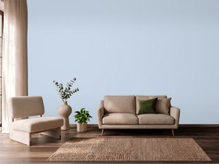 Misty BlueBenjamin Moore 820
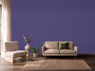 Imperial PurplePPG 1175-7
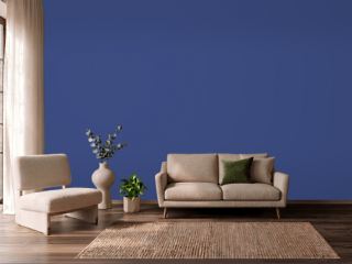 Morning GlorySherwin-Williams SW 6971
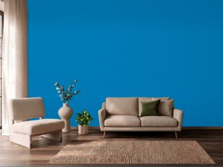 Deep RiverBehr P500-6
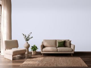 ImaginationBehr P550-1
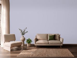 ProvinceVista Paint 7194
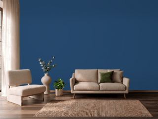 CommodoreSherwin-Williams SW 6524
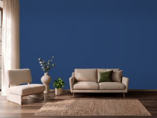 Enchanted NavyValspar 4010-8
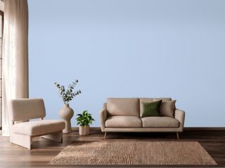 Simply SparklingDutch Boy DCP-0594
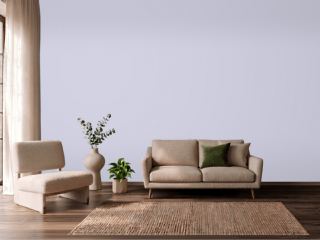 Lavender MistBenjamin Moore 2070-60
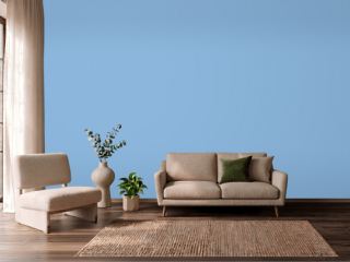 BayouBehr 570B-4
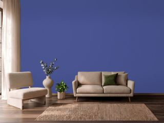 Canyon IrisBehr P540-7
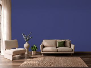 Valiant VioletSherwin-Williams SW 6818
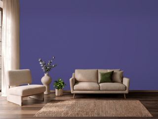 Fully PurpleSherwin-Williams SW 6983