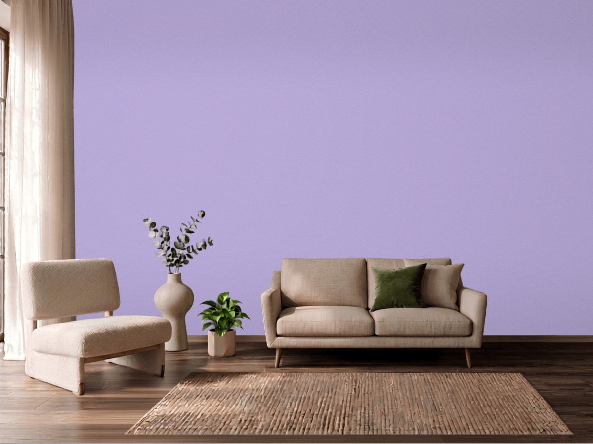
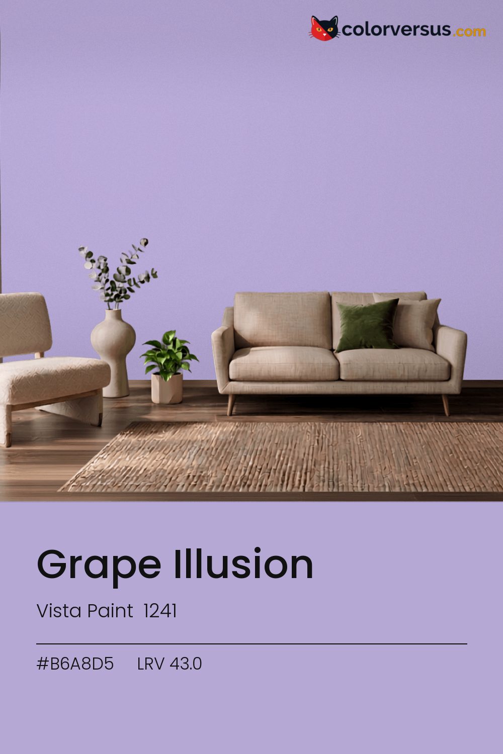
Vista Paint 1241Vista Paint 1241
There is nothing quiet about this one - it is meant to be noticed. Grape Illusion is Vista Paint's 1241.
Chroma 25.2 is high enough to dominate a room's palette rather than join it. On one wall of an otherwise neutral room, this reads as a deliberate choice rather than an overwhelming one.
A warm bulb is the easiest fix if this reads colder than expected once it is on the wall. LRV 43.0 puts it in the middle of the scale, but saturation, not lightness, is what you will react to.
This color sits right on the line between blue and purple - cooler light nudges it toward purple, warmer light keeps it in blue (about 10° apart on the color wheel, for anyone measuring). This color and yellows and warm gold don't get along in the same room - they sit on opposite sides of the spectrum, so pairing them tends to feel like tension rather than contrast.
Next to it, white trim reads brighter and cooler than it does anywhere else in the house - the gap in light reflectance is what does that, not the trim paint itself. If the room needs more than one wall color, keep the steps far apart: this color, then something clearly lighter for a second surface, then a bright white above. Two similar tones just look like a mismatch; three distinct ones read as a plan (about 43.0 to 64 to 85 in LRV terms).
For a secondary wall, Benjamin Moore Distant Gray gives a natural step up in brightness without feeling like a mismatch (roughly 46.9 LRV points apart). If the wall needs to be washable, eggshell is the highest sheen worth considering before the color starts looking artificial under light.
For anyone tied to a different brand, PPG Puturple (1248-5) is the nearest stand-in, at a delta-E of 2.73. No other brand has a color within delta-E 2 of this one - a genuinely uncommon shade.
It is lighter than 44 percent of the Vista Paint range. Vista Paint lists it in the C codes, alongside 1,421 other colors.
Vista Paint Grape Illusion sits between warm and cool: its hue angle is 304° in CIE Lab at a chroma of 25.2, with a violet.
The light reflectance value (LRV) of Vista Paint Grape Illusion (1241) is 43.0, on a scale where 0 is absolute black and 100 is absolute white, which makes it a mid-tone color.
Measured on the color wheel, Vista Paint Grape Illusion pairs with Benjamin Moore Potpourri Green (2029-50, complement), Vista Paint Glittering Gemstone (1190, analogous, warmer), Vista Paint Velvet Robe (1276, analogous, cooler), Benjamin Moore Distant Gray (OC-68, soft accent).
Vista Paint Grape Illusion's hex value is #B6A8D5, RGB 182, 168, 213.
Vista Paint Grape Illusion is classified as a blue, with a violet.
The nearest Pantone TCX color to Vista Paint Grape Illusion is 15-3817 TCX Lavender, delta-E 2.62; the nearest RAL Classic is RAL 4011 Pearl violet, delta-E 19.87.
The closest cross-brand match to Vista Paint Grape Illusion is PPG Puturple (1248-5), at a delta-E of 2.73.
| HEX | #B6A8D5 |
| RGB | 182, 168, 213 |
| CMYK | 15%, 21%, 0%, 16% |
| HSL | 259°, 35%, 75% |
| HSV | 259°, 21%, 84% |
| CIE Lab | 71.39, 13.9, -20.97 |
| LCh | 71.39, 25.16, 303.5° |
| XYZ | 45.3, 42.75, 68.8 |
| Pantone (nearest) | 15-3817 TCX Lavender · ΔE 2.62 |
| RAL (nearest) | RAL 4011 Pearl violet · ΔE 19.87 |
| 15-3817 TCX Lavender | ΔE 2.62 | |
| 15-3716 TCX Purple Rose | ΔE 3.46 | |
| 15-3720 TCX Lilac Breeze | ΔE 3.8 | |
| RAL 4011 Pearl violet | ΔE 19.87 |
Pantone TCX and RAL Classic are physical standards; these are their published sRGB approximations, so check a fan deck before specifying. Pantone® and RAL are trademarks of their respective owners.
Shades mix the color toward black, tints toward white. Click any step to find the paint colors closest to it.
One image with Grape Illusion and its closest color at every other brand, measured by delta-E.
 BellflowerBehr 610D-4
 Dried LavenderSherwin-Williams SW 9072
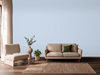 Misty BlueBenjamin Moore 820
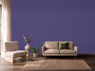 Imperial PurplePPG 1175-7
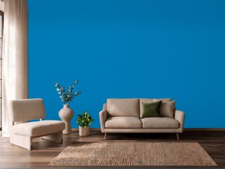 Deep RiverBehr P500-6
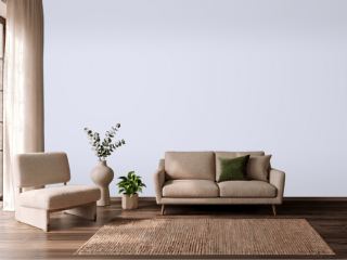 ImaginationBehr P550-1
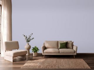 ProvinceVista Paint 7194
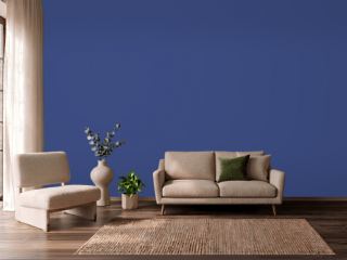 Morning GlorySherwin-Williams SW 6971
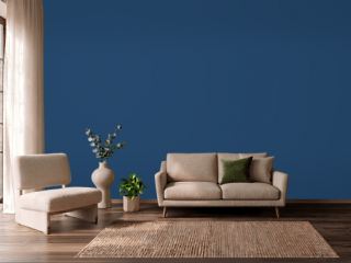 CommodoreSherwin-Williams SW 6524
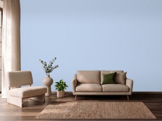 Simply SparklingDutch Boy DCP-0594
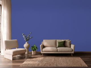 Canyon IrisBehr P540-7
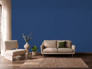 Enchanted NavyValspar 4010-8
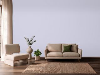 Lavender MistBenjamin Moore 2070-60
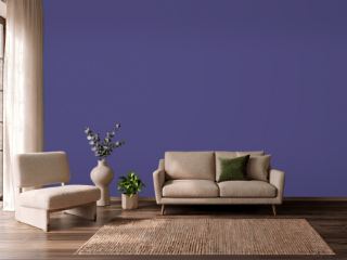 Fully PurpleSherwin-Williams SW 6983
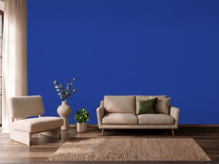 Blue RoyaleDutch Boy VS-9550
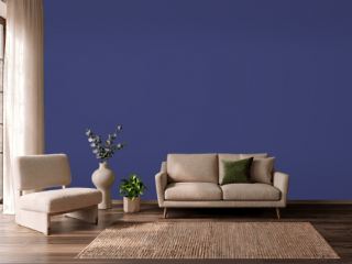 Valiant VioletSherwin-Williams SW 6818