 ComparisonComparison
Sherwin-Williams SW 0039 and Vista Paint 1010, ΔE 5.51 apart
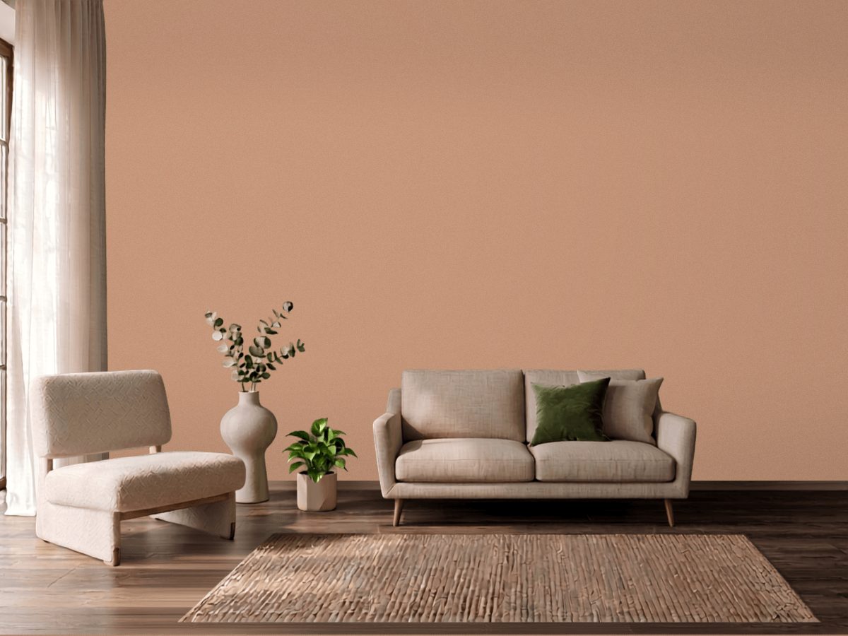
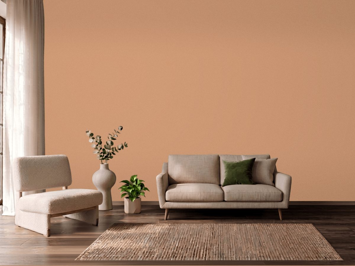
Sherwin-Williams Portrait Tone (SW 0039) and Vista Paint Peanut Brittle (1010) measure a delta-E of 5.51 apart. Peanut Brittle is 2.4 LRV points lighter, which is the difference you notice first. Peanut Brittle holds more color, chroma 30.4 against 25.3, so it grays out less in dim light. These read as related but distinct. Sample both before committing. If you need the Portrait Tone depth in Vista Paint's line, start from its LRV of 34.6 rather than matching by name.
Sherwin-Williams Portrait Tone and Vista Paint Peanut Brittle are delta-E 5.51 apart - a difference that shows up on a wall, not just side by side on two chips.
The measured color distance between Sherwin-Williams Portrait Tone and Vista Paint Peanut Brittle is delta-E 5.51.
Vista Paint Peanut Brittle is lighter than Sherwin-Williams Portrait Tone by 2.4 points of light reflectance (LRV).
Vista Paint Peanut Brittle carries more color than Sherwin-Williams Portrait Tone - a higher chroma value means a more intense, less grey color.
| Portrait Tone | Peanut Brittle | |
|---|---|---|
| Brand | Sherwin-Williams | Vista Paint |
| Code | SW 0039 | 1010 |
| Hex | #C4957A | #CD9875 |
| Light reflectance | 34.6 | 37.0 |
| Undertone | orange | orange |
| Chroma | 25.3 | 30.4 |
| Hue angle | 56.4° | 59.4° |
| Color family | orange | orange |