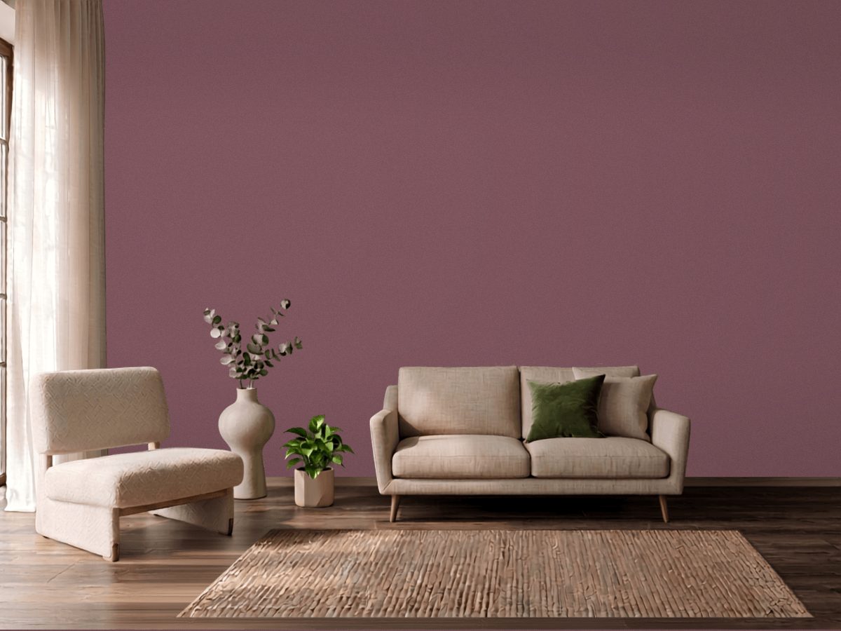
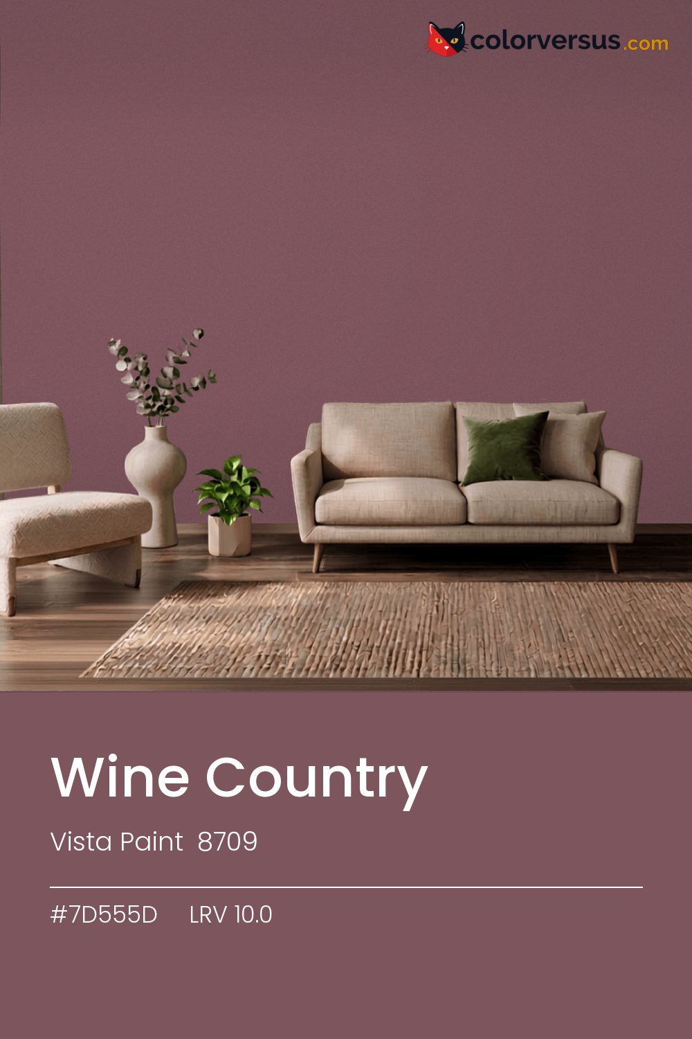
Vista Paint 8709Vista Paint 8709
It is dark enough that the room, not the paint, becomes the thing you notice - though the pink keeps it from reading as flat black. Vista Paint's designation for it is 8709.
At 10.0, light hits this wall and mostly stops there - plan the room's lighting as if the walls were not helping at all. Warm bulbs pull the pink forward, close to the surface; daylight bulbs flatten it back into something closer to plain black.
Rooms already built around greens are the hardest fit for this color - the two are opposites, and opposites next to each other rarely feel calm.
Anything pale placed against this wall will look paler than it is; anything warm-metal will look warmer. Neither is an illusion the color plays deliberately - it is simple contrast, but worth planning rather than discovering. For layering, pair this with a clearly lighter mid-tone on a secondary wall or cabinetry, and keep the ceiling close to white. The gap between each step should be big enough to see without thinking about it (roughly 10.0 / 48 / 85 on the reflectance scale).
It belongs on a feature wall in a room that already has light to spare, rather than on every wall of a room that needs brightening. Sherwin-Williams Monorail Silver pairs well as a second surface - close enough in feel to belong in the same room, far enough in lightness to read as two distinct walls (about 39.5 points apart on the reflectance scale).
Eggshell can work if the wall is in excellent condition, but matte is the more forgiving default for a color at the bottom of the scale.
For anyone tied to a different brand, Behr Rule Breaker (MQ1-1) is the nearest stand-in, at a delta-E of 2.94. Across the other brands, nothing lands within delta-E 2 of this one - there is no easy substitute.
It is lighter than 5 percent of the Vista Paint range. This is a crowded part of the scale - 533 colors measure within a point of 10.0 - so most brands will have something close. Among blacks it is one of the strongest: only 1 percent of them carry more colour. Vista Paint lists it in the K codes, alongside 1,318 other colors.
Vista Paint Wine Country is a warm color: its hue angle is 7° in CIE Lab at a chroma of 18, with a pink.
The light reflectance value (LRV) of Vista Paint Wine Country (8709) is 10.0, on a scale where 0 is absolute black and 100 is absolute white, which makes it a very dark color.
Measured on the color wheel, Vista Paint Wine Country pairs with PPG Carlisle (1141-6, complement), Benjamin Moore Sorrel Brown (1236, analogous, warmer), Vista Paint Lavender Suede (AC139, analogous, cooler), Sherwin-Williams Monorail Silver (SW 7663, soft accent).
Vista Paint Wine Country's hex value is #7D555D, RGB 125, 85, 93.
Vista Paint Wine Country is classified as a black, with a pink.
The nearest Pantone TCX color to Vista Paint Wine Country is 18-1512 TCX Rose Brown, delta-E 2.2; the nearest RAL Classic is RAL 8015 Chestnut brown, delta-E 14.76.
The closest cross-brand match to Vista Paint Wine Country is Behr Rule Breaker (MQ1-1), at a delta-E of 2.94.
| HEX | #7D555D |
| RGB | 125, 85, 93 |
| CMYK | 0%, 32%, 26%, 51% |
| HSL | 348°, 19%, 41% |
| HSV | 348°, 32%, 49% |
| CIE Lab | 40.65, 17.86, 2.1 |
| LCh | 40.65, 17.98, 6.7° |
| XYZ | 13.68, 11.65, 11.88 |
| Pantone (nearest) | 18-1512 TCX Rose Brown · ΔE 2.2 |
| RAL (nearest) | RAL 8015 Chestnut brown · ΔE 14.76 |
| 18-1512 TCX Rose Brown | ΔE 2.2 | |
| 18-1613 TCX Renaissance Rose | ΔE 4.26 | |
| 18-1418 TCX Crushed Berry | ΔE 4.48 | |
| RAL 8015 Chestnut brown | ΔE 14.76 |
Pantone TCX and RAL Classic are physical standards; these are their published sRGB approximations, so check a fan deck before specifying. Pantone® and RAL are trademarks of their respective owners.
Shades mix the color toward black, tints toward white. Click any step to find the paint colors closest to it.
One image with Wine Country and its closest color at every other brand, measured by delta-E.
 NavalSherwin-Williams SW 6244
 Pewter GreenSherwin-Williams SW 6208
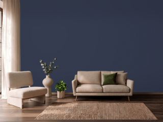 Old MillDunn-Edwards DEA185
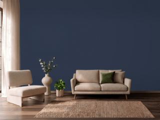 Deep RoyalBenjamin Moore 2061-10
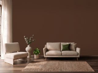 French RoastSherwin-Williams SW 6069
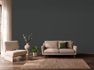 CarbonBehr N520-7
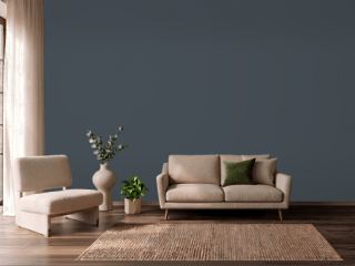 In the NavyVista Paint 8269
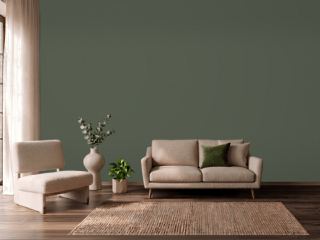 Vintage VogueBenjamin Moore 462
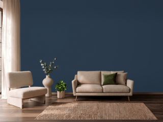 North SeaBenjamin Moore CC-932
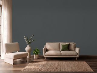 NightfallBenjamin Moore 1596
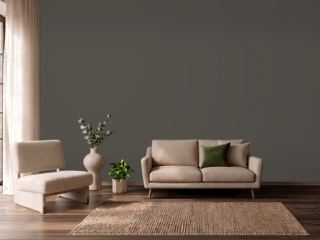 Urbane BronzeSherwin-Williams SW 7048
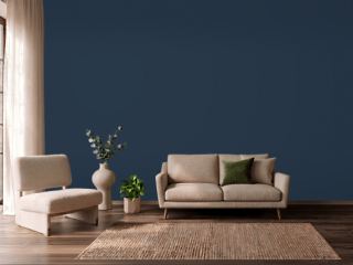 In the NavySherwin-Williams SW 9178
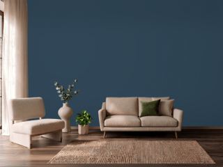 Gentleman's GrayBenjamin Moore 2062-20
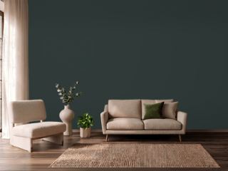 Rookwood Shutter GreenSherwin-Williams SW 2809
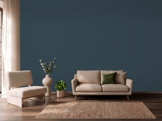 Gale ForceSherwin-Williams SW 7605
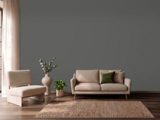 Charcoal SmudgeDunn-Edwards DE6370