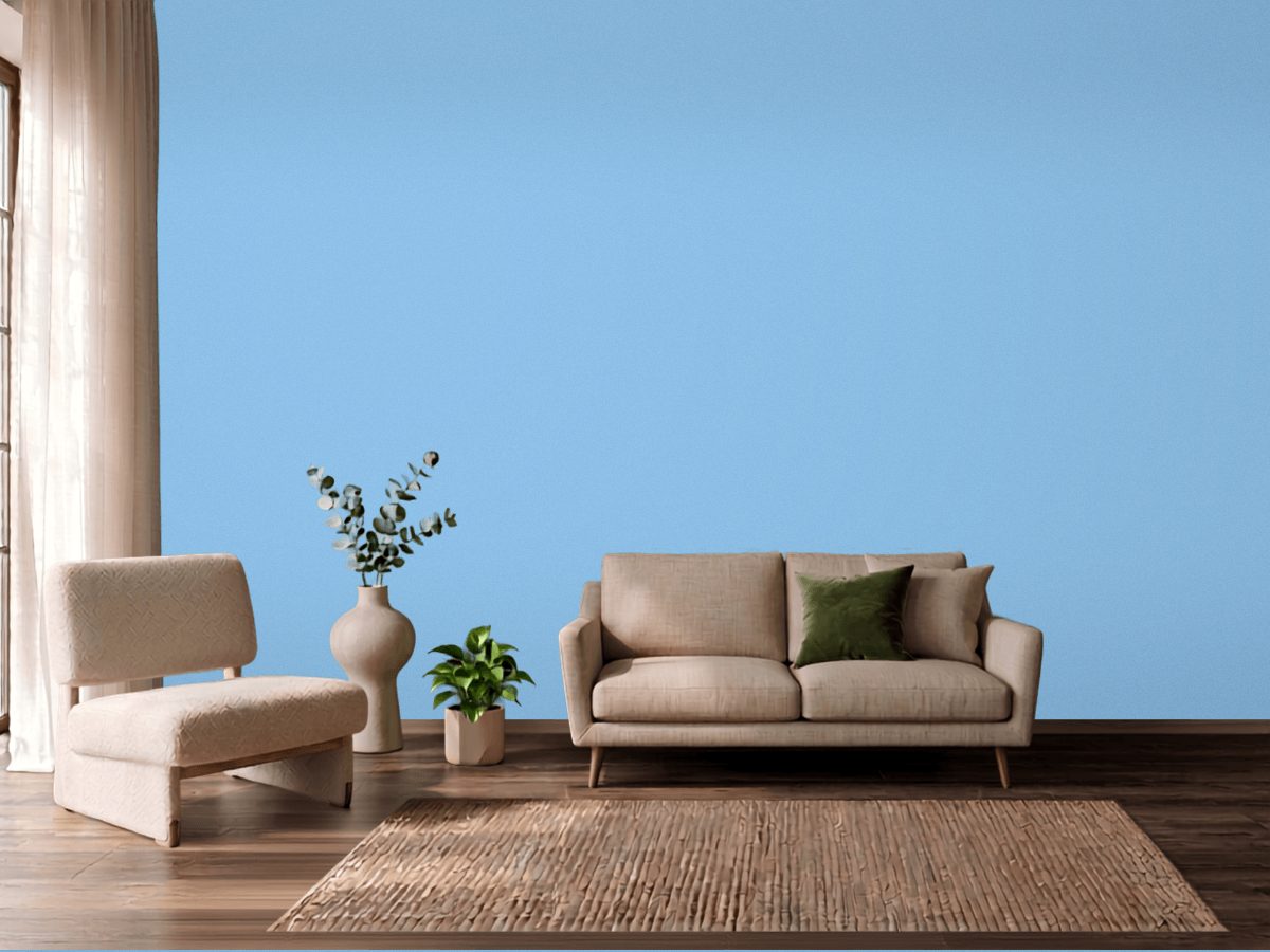
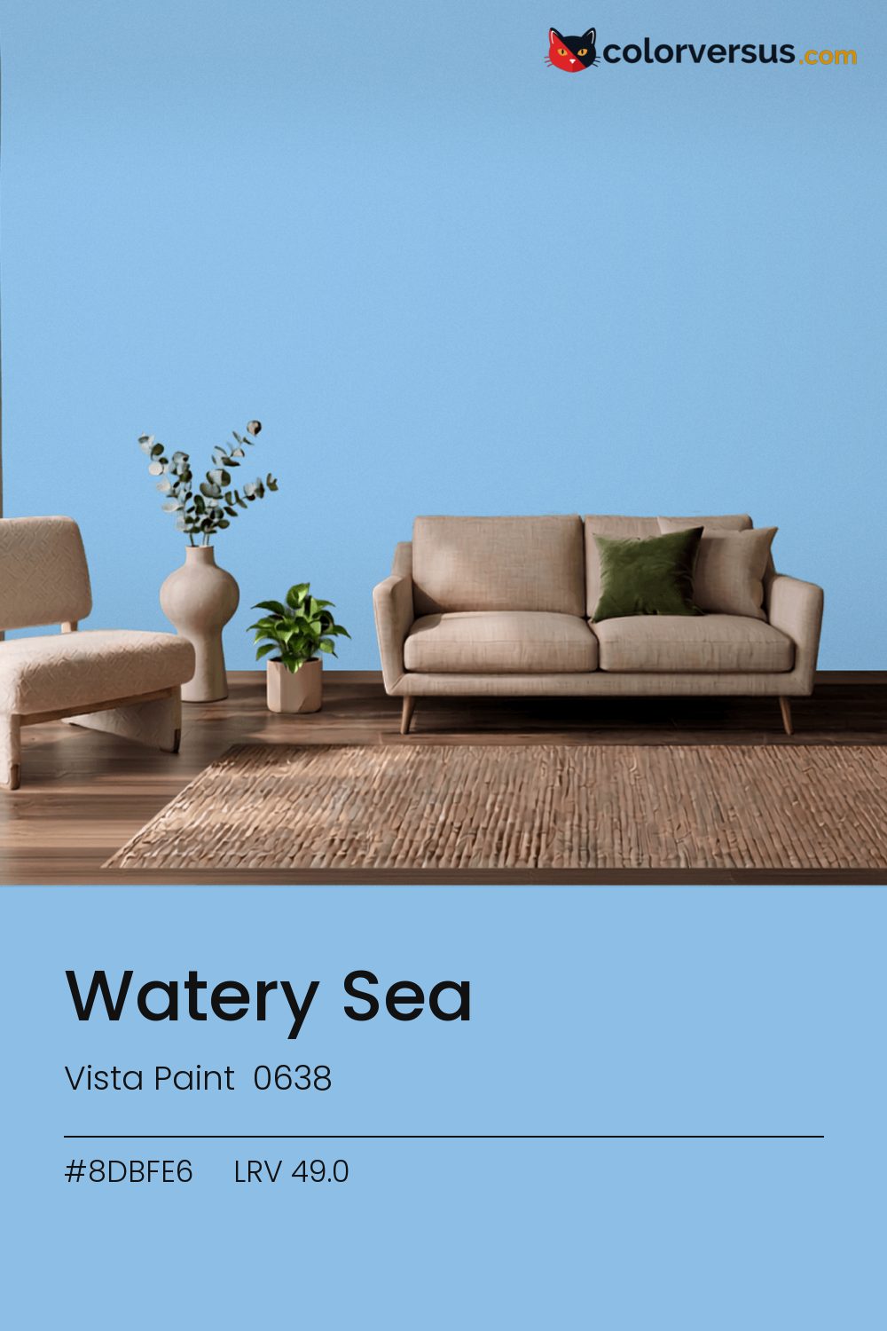
Vista Paint 0638Vista Paint 0638
A color built for commitment, not for blending in. 0638, from Vista Paint.
A chroma of 25.5 is well into the range where the color affects everything nearby - light fixtures, glossy surfaces, even skin tones under it. In a room with plenty of natural light, this can cover more wall area than it could in a dim one, where the same color reads heavier.
South light flatters it. In a north-facing room it can turn cold, so sample that wall first. Light reflectance reads 49.0, though with this much color in it that number is the smaller half of the story.
Worth checking before committing to a full wall: oranges and warm terracotta nearby - in a floor, a rug, a piece of furniture - will read as a clash here, not a complement, since the two colors sit at opposite ends of the spectrum.
The lighter the trim beside this, the more it will seem to glow - a side effect of the light-reflectance gap rather than anything special about the trim color. The safest multi-color scheme moves from this dark wall to a noticeably lighter secondary tone, then to a near-white ceiling - three genuinely different depths rather than three shades of the same idea (LRV 49.0, 67 and 85, if you're matching by the numbers).
Behr Soft Breeze makes a good second wall color here - different enough to read as a real choice, close enough to still feel related (about 39 points apart in light reflectance). This is not a color that benefits from shine - the saturation does the work, and a flat finish lets it do that evenly.
Behr Rhodes (P510-3) runs close enough - delta-E 1.58 - that swapping brands should not change how the room looks. Only 2 other-brand colors land within delta-E 2 of this one, which makes it comparatively unusual.
It is lighter than 51 percent of the Vista Paint range. Light reflectance this exact is unusual: 3 colors in the whole catalog measure within a point of 49.0. Vista Paint lists it in the C codes, alongside 1,421 other colors.
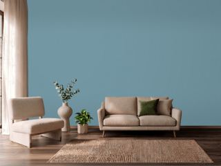
Vista Paint Watery Sea is a cool color: its hue angle is 255° in CIE Lab at a chroma of 25.5, with a blue.
The light reflectance value (LRV) of Vista Paint Watery Sea (0638) is 49.0, on a scale where 0 is absolute black and 100 is absolute white, which makes it a mid-tone color.
Measured on the color wheel, Vista Paint Watery Sea pairs with Vista Paint November Leaf (1016, complement), Dunn-Edwards Periwinkle (DE5906, analogous, warmer), Vista Paint Glorious Garden (7513, analogous, cooler), Behr Soft Breeze (W-B-610, soft accent).
Vista Paint Watery Sea's hex value is #8DBFE6, RGB 141, 191, 230.
Vista Paint Watery Sea is classified as a teal, with a blue.
The nearest Pantone TCX color to Vista Paint Watery Sea is 14-4320 TCX Baltic Sea, delta-E 5.01; the nearest RAL Classic is RAL 5024 Pastel blue, delta-E 16.96. Neither is an exact match.
The closest cross-brand match to Vista Paint Watery Sea is Behr Rhodes (P510-3), at a delta-E of 1.58.
| HEX | #8DBFE6 |
| RGB | 141, 191, 230 |
| CMYK | 39%, 17%, 0%, 10% |
| HSL | 206°, 64%, 73% |
| HSV | 206°, 39%, 90% |
| CIE Lab | 75.23, -6.72, -24.63 |
| LCh | 75.23, 25.53, 254.7° |
| XYZ | 43.89, 48.63, 81.92 |
| Pantone (nearest) | 14-4320 TCX Baltic Sea · ΔE 5.01 |
| RAL (nearest) | RAL 5024 Pastel blue · ΔE 16.96 |
| 14-4320 TCX Baltic Sea | ΔE 5.01 | |
| 14-4121 TCX Blue Bell | ΔE 5.96 | |
| RAL 5024 Pastel blue | ΔE 16.96 |
Pantone TCX and RAL Classic are physical standards; these are their published sRGB approximations, so check a fan deck before specifying. Pantone® and RAL are trademarks of their respective owners.
Shades mix the color toward black, tints toward white. Click any step to find the paint colors closest to it.
One image with Watery Sea and its closest color at every other brand, measured by delta-E.
 Palladian BlueBenjamin Moore HC-144
 Rain DanceBehr S480-1
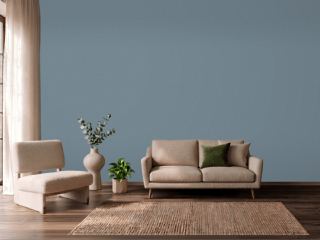 Adirondack BlueBehr N480-5
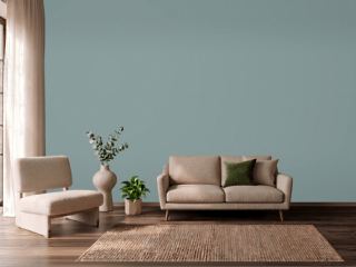 Oval Room BlueFarrow & Ball 85
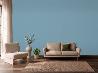 Cool DuskBehr 550F-4
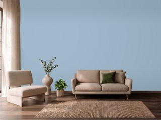 Lulworth BlueFarrow & Ball 89
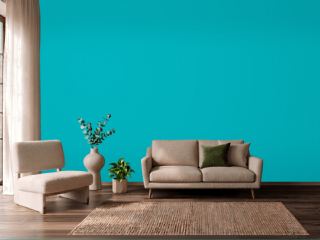 CalypsoSherwin-Williams SW 6950
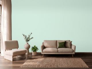 Green AquaBehr M420-2
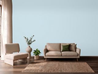 Breath of Fresh AirBenjamin Moore 806
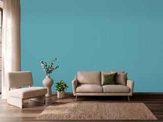 TurquoiseBehr BIC-53
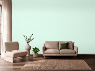 Fresh MintBenjamin Moore 2037-70
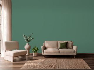 Kendal GreenSherwin-Williams SW 6467
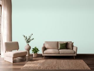 Embellished BlueSherwin-Williams SW 6749
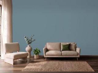 Blustery SkySherwin-Williams SW 9140
 Stone BlueFarrow & Ball 86
 Forest EdgeBehr S430-6