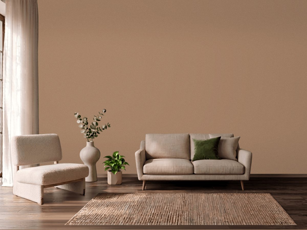
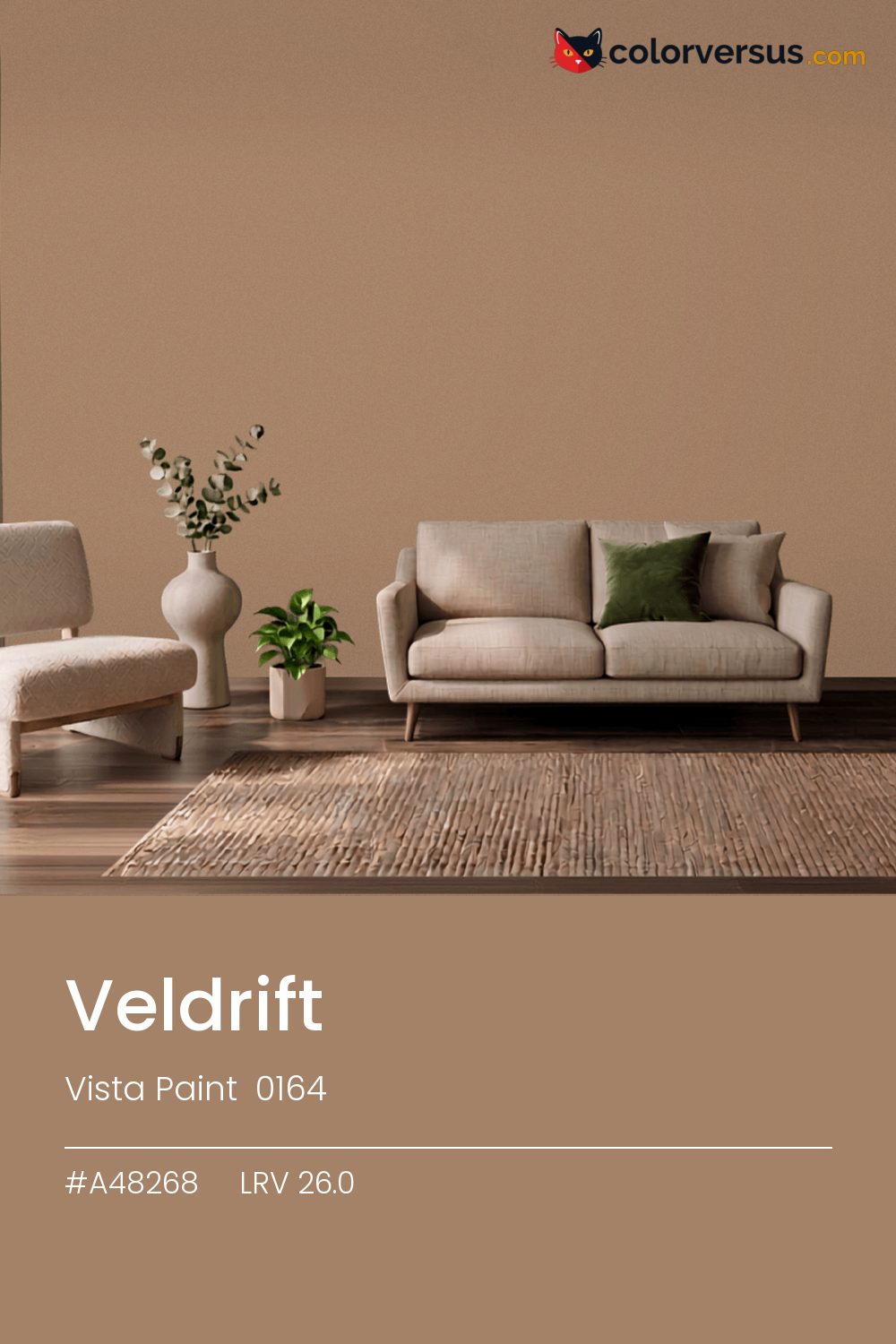
Vista Paint 0164Vista Paint 0164
This is a color that decides the room rather than supporting it. Vista Paint's designation for it is 0164.
Chroma 21.2 is high enough that the color will bounce onto light surfaces, so expect it everywhere, not only on the wall. In a room with plenty of natural light, this can cover more wall area than it could in a dim one, where the same color reads heavier.
In a room that gets little direct sun, this color's warmth does some of the work daylight would otherwise be doing. LRV 26.0 tells you how much light comes back, which matters less here than how much color comes with it.
If the room already has blues and cool greys in the floor, a rug, or the furniture, this color will fight it rather than sit well beside it - the two sit at opposite ends of the color spectrum, which is exactly why they clash instead of blend.
Next to it, white trim reads brighter and cooler than it does anywhere else in the house - the gap in light reflectance is what does that, not the trim paint itself. A natural scheme here moves in three clear steps: this color on the main wall, a noticeably lighter mid-tone for a second wall or built-in, and a near-white on the ceiling. Each jump should be obvious at a glance, not something you have to squint to tell apart (roughly 26.0, 56 and 85 on the light-reflectance scale, for reference).
Valspar Fragile Blue pairs well as a second surface - close enough in feel to belong in the same room, far enough in lightness to read as two distinct walls (about 43 points apart on the reflectance scale). Matte suits a color this strong - a glossier sheen would turn every light source in the room into a visible hotspot on the wall.
Switching brands, Behr Nutshell (S220-5) is the closest equivalent at delta-E 1.57, near enough for most rooms. This is a relatively uncrowded spot in the spectrum - just 2 colors from other brands come this close.
It is lighter than 24 percent of the Vista Paint range. This is a crowded part of the scale - 307 colors measure within a point of 26.0 - so most brands will have something close. Vista Paint lists it in the C codes, alongside 1,421 other colors.
Vista Paint Veldrift is a warm color: its hue angle is 64° in CIE Lab at a chroma of 21.2, with a orange.
The light reflectance value (LRV) of Vista Paint Veldrift (0164) is 26.0, on a scale where 0 is absolute black and 100 is absolute white, which makes it a dark color.
Measured on the color wheel, Vista Paint Veldrift pairs with Behr Brittany Blue (M510-4, complement), Sherwin-Williams Ryegrass (SW 6423, analogous, warmer), Sherwin-Williams Rambling Rose (SW 6305, analogous, cooler), Valspar Fragile Blue (7004-10, soft accent).
Vista Paint Veldrift's hex value is #A48268, RGB 164, 130, 104.
Vista Paint Veldrift is classified as a tan, with a orange.
The nearest Pantone TCX color to Vista Paint Veldrift is 17-1322 TCX Burro, delta-E 2.52; the nearest RAL Classic is RAL 1019 Grey beige, delta-E 7.9.
The closest cross-brand match to Vista Paint Veldrift is Behr Nutshell (S220-5), at a delta-E of 1.57.
| HEX | #A48268 |
| RGB | 164, 130, 104 |
| CMYK | 0%, 21%, 37%, 36% |
| HSL | 26°, 25%, 53% |
| HSV | 26°, 37%, 64% |
| CIE Lab | 56.94, 9.32, 19.05 |
| LCh | 56.94, 21.21, 63.9° |
| XYZ | 25.79, 24.86, 16.53 |
| Pantone (nearest) | 17-1322 TCX Burro · ΔE 2.52 |
| RAL (nearest) | RAL 1019 Grey beige · ΔE 7.9 |
| 17-1322 TCX Burro | ΔE 2.52 | |
| 17-1226 TCX Tawny Brown | ΔE 3.11 | |
| 17-1225 TCX Tawny Birch | ΔE 3.54 | |
| RAL 1019 Grey beige | ΔE 7.9 |
Pantone TCX and RAL Classic are physical standards; these are their published sRGB approximations, so check a fan deck before specifying. Pantone® and RAL are trademarks of their respective owners.
Shades mix the color toward black, tints toward white. Click any step to find the paint colors closest to it.
One image with Veldrift and its closest color at every other brand, measured by delta-E.
 Accessible BeigeSherwin-Williams SW 7036
 Natural LinenSherwin-Williams SW 9109
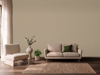 Studio TaupeSherwin-Williams SW 7549
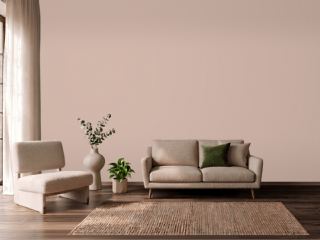 Sashay SandSherwin-Williams SW 6051
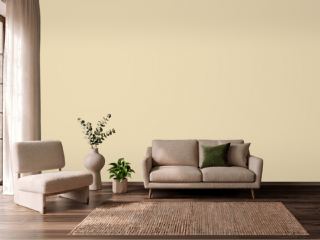 Farrow's CreamFarrow & Ball 67
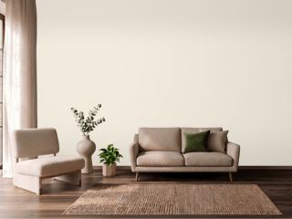 CreamySherwin-Williams SW 7012
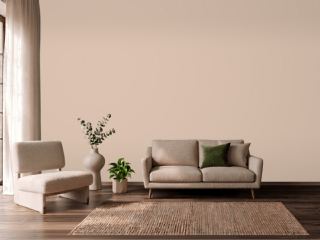 Setting PlasterFarrow & Ball 231
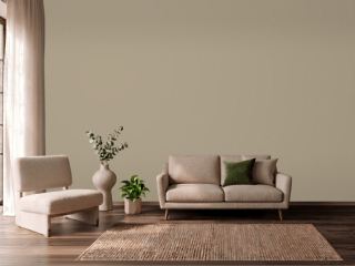 TurretBenjamin Moore CC-604
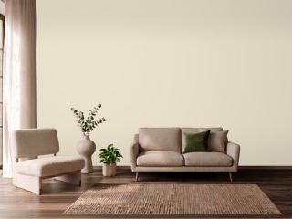 Polar BearSherwin-Williams SW 7564
 Koral KicksSherwin-Williams SW 6610
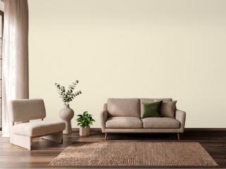 New WhiteFarrow & Ball 59
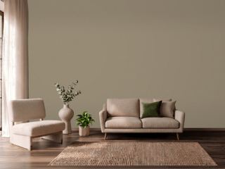 Mouse's BackFarrow & Ball 40
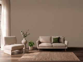 Coconut ShellBehr PPU5-05
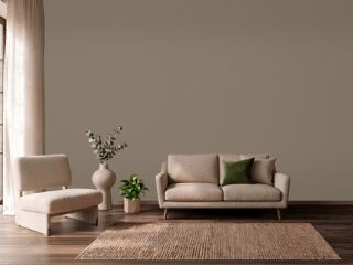 Warm StoneSherwin-Williams SW 7032
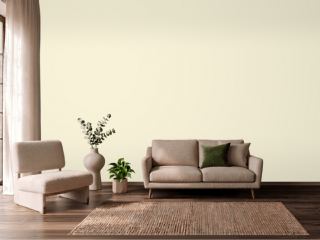 Soft CreamPPG 1205-2
 Mega GreigeSherwin-Williams SW 7031