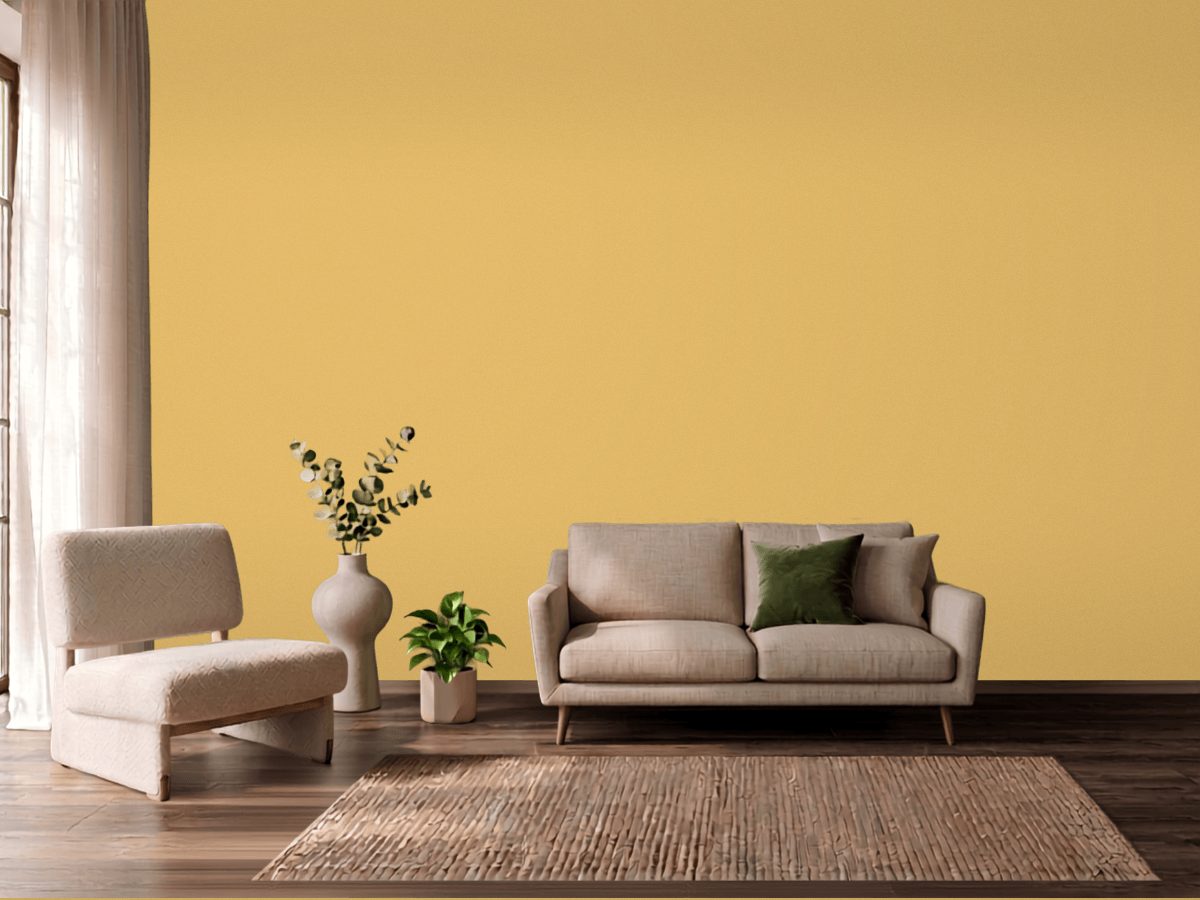
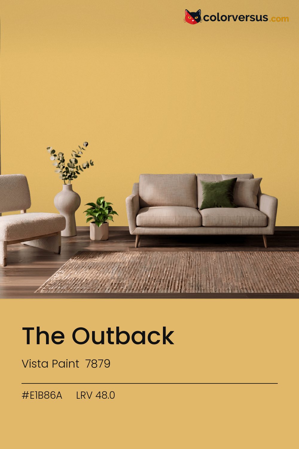
Vista Paint 7879Vista Paint 7879
This is a statement first and a wall color second. Vista Paint lists it as The Outback (7879).
At chroma 45.2 it will not sit quietly next to another strong color. Used across a whole room it needs restraint in the decor - furniture and textiles that stay quiet so the wall can carry the color.
It holds up in a north-facing room, which is where warmth is usually missing. 48.0 on the light-reflectance scale is unremarkable on its own; the chroma is what actually drives how this color behaves.
In warm light this stays orange; under cooler, daylight-style bulbs it can slide toward yellow. It's close enough to that edge that a sample is worth checking in the room's own lighting, not under a store's. If the room already has blues and cool greys in the floor, a rug, or the furniture, this color will fight it rather than sit well beside it - the two sit at opposite ends of the color spectrum, which is exactly why they clash instead of blend.
Anything pale placed against this wall will look paler than it is; anything warm-metal will look warmer. Neither is an illusion the color plays deliberately - it is simple contrast, but worth planning rather than discovering. A natural scheme here moves in three clear steps: this color on the main wall, a noticeably lighter mid-tone for a second wall or built-in, and a near-white on the ceiling. Each jump should be obvious at a glance, not something you have to squint to tell apart (roughly 48.0, 67 and 85 on the light-reflectance scale, for reference).
If a second wall color is wanted in the same room, Dunn-Edwards Boysenberry Shadow keeps the jump obvious rather than muddy (roughly 41.6 LRV points from this one). A flatter finish keeps this much color from creating harsh reflections.
Benjamin Moore Yellowstone (202) runs close enough - delta-E 2.2 - that swapping brands should not change how the room looks. Across the other brands, nothing lands within delta-E 2 of this one - there is no easy substitute.
It is lighter than 51 percent of the Vista Paint range. Vista Paint lists it in the K codes, alongside 1,318 other colors.
Vista Paint The Outback is a warm color: its hue angle is 83° in CIE Lab at a chroma of 45.2, with a yellow.
The light reflectance value (LRV) of Vista Paint The Outback (7879) is 48.0, on a scale where 0 is absolute black and 100 is absolute white, which makes it a mid-tone color.
Measured on the color wheel, Vista Paint The Outback pairs with PPG Blue Dart (1243-5, complement), Dunn-Edwards Lime Sorbet (DE5550, analogous, warmer), Valspar Flamenco Pink (2004-3B, analogous, cooler), Dunn-Edwards Boysenberry Shadow (DEW391, soft accent).
Vista Paint The Outback's hex value is #E1B86A, RGB 225, 184, 106.
Vista Paint The Outback is classified as a orange, with a yellow.
The nearest Pantone TCX color to Vista Paint The Outback is 13-0932 TCX Cornsilk, delta-E 4.07; the nearest RAL Classic is RAL 1002 Sand yellow, delta-E 9.51. Neither is an exact match.
The closest cross-brand match to Vista Paint The Outback is Benjamin Moore Yellowstone (202), at a delta-E of 2.2.
| HEX | #E1B86A |
| RGB | 225, 184, 106 |
| CMYK | 0%, 18%, 53%, 12% |
| HSL | 39°, 66%, 65% |
| HSV | 39°, 53%, 88% |
| CIE Lab | 76.88, 5.41, 44.83 |
| LCh | 76.88, 45.16, 83.1° |
| XYZ | 50.8, 51.33, 20.87 |
| Pantone (nearest) | 13-0932 TCX Cornsilk · ΔE 4.07 |
| RAL (nearest) | RAL 1002 Sand yellow · ΔE 9.51 |
| 13-0932 TCX Cornsilk | ΔE 4.07 | |
| 14-1036 TCX Ochre | ΔE 4.14 | |
| 14-0837 TCX Misted Yellow | ΔE 4.24 | |
| RAL 1002 Sand yellow | ΔE 9.51 |
Pantone TCX and RAL Classic are physical standards; these are their published sRGB approximations, so check a fan deck before specifying. Pantone® and RAL are trademarks of their respective owners.
Shades mix the color toward black, tints toward white. Click any step to find the paint colors closest to it.
One image with The Outback and its closest color at every other brand, measured by delta-E.
 Luscious LemonBehr HDC-MD-24
 Friendly TanValspar 2008-8A
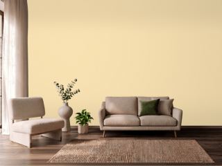 Banana CreamSherwin-Williams SW 6673
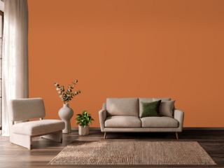 YamSherwin-Williams SW 6643
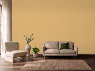 Tavern OchreBenjamin Moore CW-375
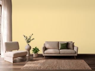 Butter UpSherwin-Williams SW 6681
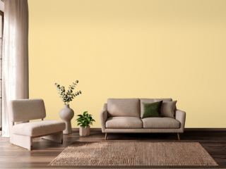 SoléSherwin-Williams SW 6896
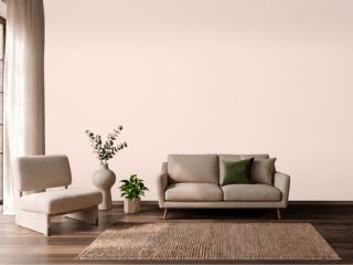 Champagne PinkValspar 2004-4C
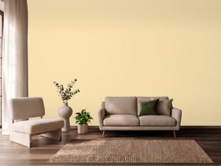 PastaDunn-Edwards DE5331
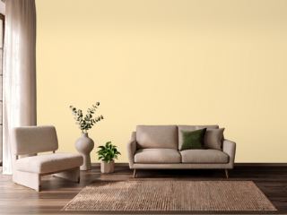 They call it MellowSherwin-Williams SW 9015
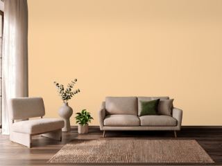 GranolaDunn-Edwards DE5296
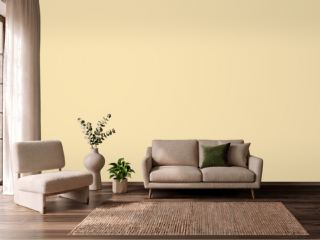 Friendly YellowSherwin-Williams SW 6680
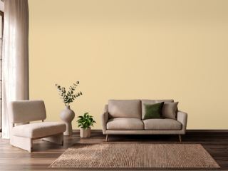 Dorset CreamFarrow & Ball 68
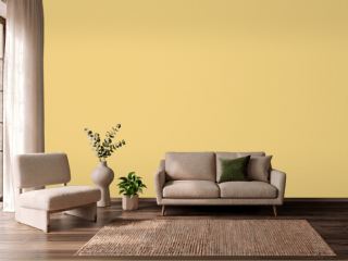 CitronFarrow & Ball 74
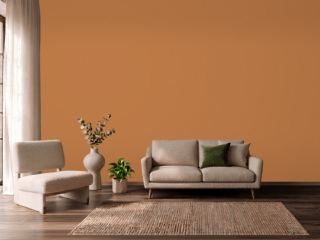 PumpkinVista Paint 1335
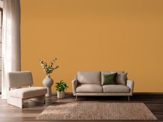 ChapultepecVista Paint 7933