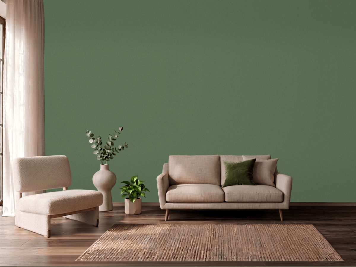
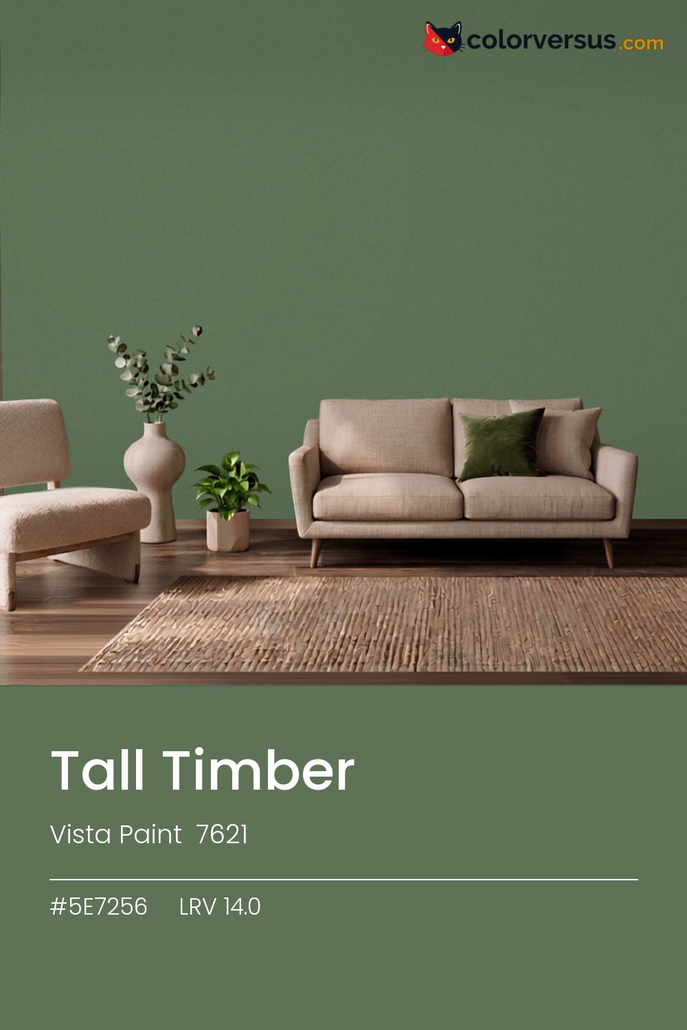
Vista Paint 7621Vista Paint 7621
A color that sits comfortably in the middle: not so light it washes out, not so dark it needs justifying, with a yellow-green that carries it. Vista Paint's designation for it is 7621.
At this LRV (14.0), a room reads as neither bright-white nor dim - a genuinely middle-of-the-road amount of light comes back off the wall. Chroma 18.6 keeps the yellow-green present without letting it run the room.
A reasonable choice for a room that needs to feel grounded without going as dark as a true accent color. Warm bulbs will soften it; daylight bulbs push it further cool. Sherwin-Williams Swanky Gray pairs well as a second surface - close enough in feel to belong in the same room, far enough in lightness to read as two distinct walls (about 30.7 points apart on the reflectance scale).
Depending on the bulb, this can genuinely read as green or as yellow - it sits right on the border between the two, only 9° apart. If the room already has purples in the floor, a rug, or the furniture, this color will fight it rather than sit well beside it - the two sit at opposite ends of the color spectrum, which is exactly why they clash instead of blend.
Anything pale placed against this wall will look paler than it is; anything warm-metal will look warmer. Neither is an illusion the color plays deliberately - it is simple contrast, but worth planning rather than discovering. A natural scheme here moves in three clear steps: this color on the main wall, a noticeably lighter mid-tone for a second wall or built-in, and a near-white on the ceiling. Each jump should be obvious at a glance, not something you have to squint to tell apart (roughly 14.0, 50 and 85 on the light-reflectance scale, for reference).
Behr Willow Leaf (QE-39) runs close enough - delta-E 1.74 - that swapping brands should not change how the room looks. This is a relatively uncrowded spot in the spectrum - just 1 color from other brands come this close. This color reads consistently across most finishes, so the choice can come down to durability needs rather than how it changes the color.
It is lighter than 11 percent of the Vista Paint range. This is a crowded part of the scale - 310 colors measure within a point of 14.0 - so most brands will have something close. Vista Paint lists it in the K codes, alongside 1,318 other colors.
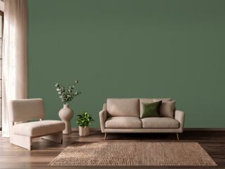
Vista Paint Tall Timber sits between warm and cool: its hue angle is 135° in CIE Lab at a chroma of 18.6, with a yellow-green.
The light reflectance value (LRV) of Vista Paint Tall Timber (7621) is 14.0, on a scale where 0 is absolute black and 100 is absolute white, which makes it a very dark color.
Measured on the color wheel, Vista Paint Tall Timber pairs with Sherwin-Williams Passionate Purple (SW 6981, complement), Behr Garden Greenery (BIC-55, analogous, warmer), Vista Paint Delicious (0438, analogous, cooler), Sherwin-Williams Swanky Gray (SW 6261, soft accent).
Vista Paint Tall Timber's hex value is #5E7256, RGB 94, 114, 86.
Vista Paint Tall Timber is classified as a green, with a yellow-green.
The nearest Pantone TCX color to Vista Paint Tall Timber is 18-0117 TCX Vineyard Green, delta-E 1.21; the nearest RAL Classic is RAL 6011 Reseda green, delta-E 8.55.
The closest cross-brand match to Vista Paint Tall Timber is Behr Willow Leaf (QE-39), at a delta-E of 1.74.
| HEX | #5E7256 |
| RGB | 94, 114, 86 |
| CMYK | 18%, 0%, 25%, 55% |
| HSL | 103°, 14%, 39% |
| HSV | 103°, 25%, 45% |
| CIE Lab | 45.75, -13.18, 13.13 |
| LCh | 45.75, 18.6, 135.1° |
| XYZ | 12.31, 15.09, 11.07 |
| Pantone (nearest) | 18-0117 TCX Vineyard Green · ΔE 1.21 |
| RAL (nearest) | RAL 6011 Reseda green · ΔE 8.55 |
| 18-0117 TCX Vineyard Green | ΔE 1.21 | |
| 18-0121 TCX Elm Green | ΔE 3.58 | |
| 18-6216 TCX Comfrey | ΔE 4.98 | |
| RAL 6011 Reseda green | ΔE 8.55 |
Pantone TCX and RAL Classic are physical standards; these are their published sRGB approximations, so check a fan deck before specifying. Pantone® and RAL are trademarks of their respective owners.
Shades mix the color toward black, tints toward white. Click any step to find the paint colors closest to it.
One image with Tall Timber and its closest color at every other brand, measured by delta-E.
 Green SmokeFarrow & Ball 47
 Card Room GreenFarrow & Ball 79
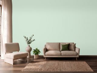 Mint ConditionSherwin-Williams SW 6743
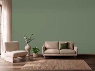 Avon GreenBenjamin Moore HC-126
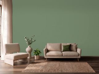 Calke GreenFarrow & Ball 34
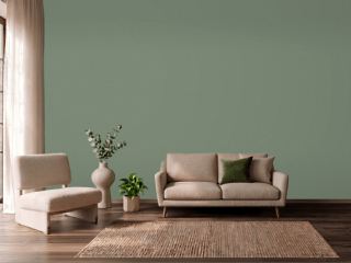 Privilege GreenSherwin-Williams SW 6193
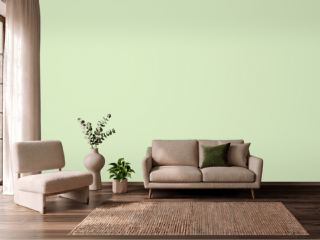 Sprig of MintValspar 6004-7B
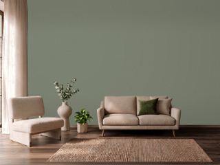 Dried ThymeSherwin-Williams SW 6186
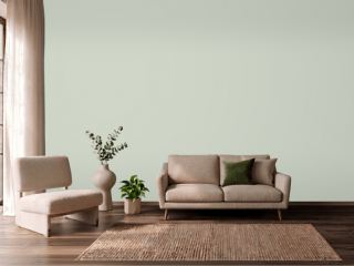 CastawayPPG 1129-3
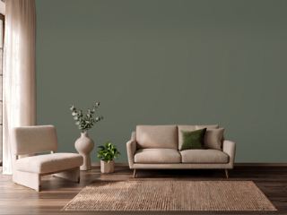 RosemarySherwin-Williams SW 6187
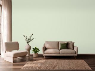 Gratifying GreenSherwin-Williams SW 6435
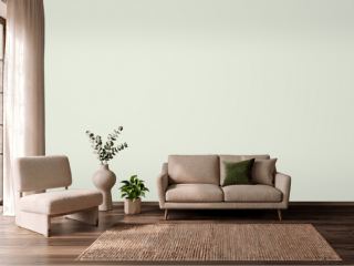 Spinach WhiteSherwin-Williams SW 6434
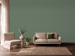 Cushing GreenBenjamin Moore HC-125
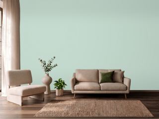 Aberdeen GreenBenjamin Moore 631
 Peale GreenBenjamin Moore HC-121
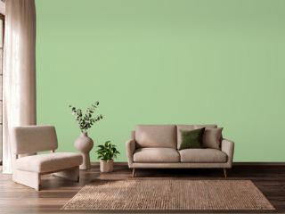 Oh PistachioSherwin-Williams SW 9033