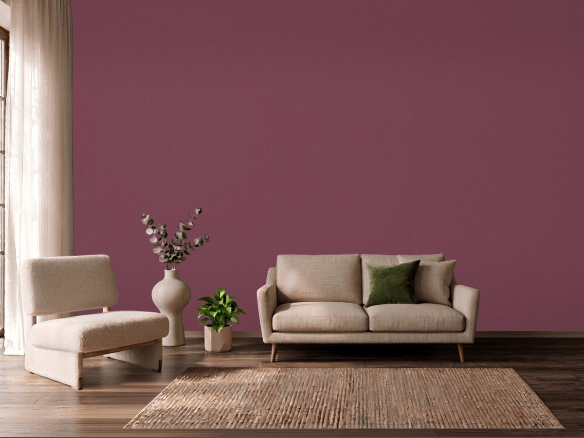
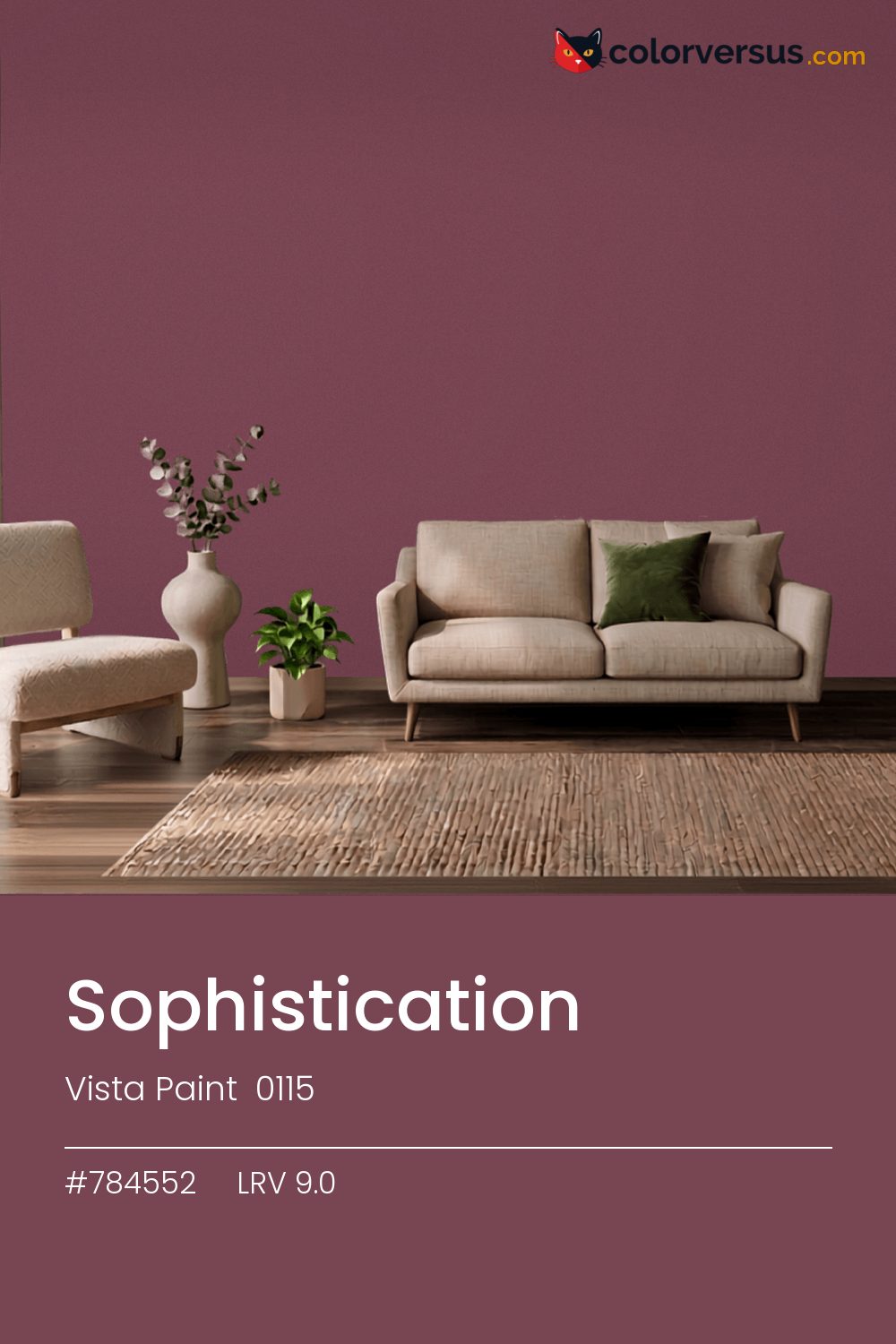
Vista Paint 0115Vista Paint 0115
Near the bottom of the LRV scale, where the pink stops being read as hue and starts being read as shadow. 0115, from Vista Paint.
At 9.0, light hits this wall and mostly stops there - plan the room's lighting as if the walls were not helping at all. In dim, ambient light this reads as a flat, undifferentiated dark; it takes a direct light source for the pink to surface at all.
This is one of the colors that can change identity with the light - somewhere between pink and red, and near enough to the line between them (1°) that both readings are fair. Rooms already built around greens are the hardest fit for this color - the two are opposites, and opposites next to each other rarely feel calm.
The lighter the trim beside this, the more it will seem to glow - a side effect of the light-reflectance gap rather than anything special about the trim color. For layering, pair this with a clearly lighter mid-tone on a secondary wall or cabinetry, and keep the ceiling close to white. The gap between each step should be big enough to see without thinking about it (roughly 9.0 / 47 / 85 on the reflectance scale).
On the wall opposite the room's main window, this catches the most daylight available and is the one wall where the color reads true rather than flat. Benjamin Moore Marina Gray makes a good second wall color here - different enough to read as a real choice, close enough to still feel related (about 35.5 points apart in light reflectance).
If the wall has any texture or repair work, matte is worth the trade-off even though it holds up to less scrubbing than a satin or eggshell.
Switching brands, Benjamin Moore Carter Plum (CW-355) is the closest equivalent at delta-E 2, near enough for most rooms. This is a relatively uncrowded spot in the spectrum - just 1 color from other brands come this close.
It is lighter than 4 percent of the Vista Paint range. This is a crowded part of the scale - 442 colors measure within a point of 9.0 - so most brands will have something close. Vista Paint lists it in the C codes, alongside 1,421 other colors.
Vista Paint Sophistication is a warm color: its hue angle is 4° in CIE Lab at a chroma of 23.7, with a pink.
The light reflectance value (LRV) of Vista Paint Sophistication (0115) is 9.0, on a scale where 0 is absolute black and 100 is absolute white, which makes it a very dark color.
Measured on the color wheel, Vista Paint Sophistication pairs with Benjamin Moore Juniper Green (601, complement), Behr Upper Eastside (MQ1-61, analogous, warmer), Valspar Magician's Cloak (1009-8, analogous, cooler), Benjamin Moore Marina Gray (1599, soft accent).
Vista Paint Sophistication's hex value is #784552, RGB 120, 69, 82.
Vista Paint Sophistication is classified as a pink, with a pink.
The nearest Pantone TCX color to Vista Paint Sophistication is 18-1614 TCX Nocturne, delta-E 2.84; the nearest RAL Classic is RAL 8015 Chestnut brown, delta-E 13.25.
The closest cross-brand match to Vista Paint Sophistication is Benjamin Moore Carter Plum (CW-355), at a delta-E of 2.
| HEX | #784552 |
| RGB | 120, 69, 82 |
| CMYK | 0%, 43%, 32%, 53% |
| HSL | 345°, 27%, 37% |
| HSV | 345°, 43%, 47% |
| CIE Lab | 35.71, 23.67, 1.74 |
| LCh | 35.71, 23.73, 4.2° |
| XYZ | 11.4, 8.86, 9.09 |
| Pantone (nearest) | 18-1614 TCX Nocturne · ΔE 2.84 |
| RAL (nearest) | RAL 8015 Chestnut brown · ΔE 13.25 |
| 18-1614 TCX Nocturne | ΔE 2.84 | |
| 18-1418 TCX Crushed Berry | ΔE 4.06 | |
| 18-1420 TCX Wild Ginger | ΔE 4.27 | |
| RAL 8015 Chestnut brown | ΔE 13.25 |
Pantone TCX and RAL Classic are physical standards; these are their published sRGB approximations, so check a fan deck before specifying. Pantone® and RAL are trademarks of their respective owners.
Shades mix the color toward black, tints toward white. Click any step to find the paint colors closest to it.
One image with Sophistication and its closest color at every other brand, measured by delta-E.
 Impatiens PetalSherwin-Williams SW 6582
 Exuberant PinkSherwin-Williams SW 6840
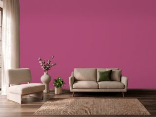 Hot PinkBehr 100B-7
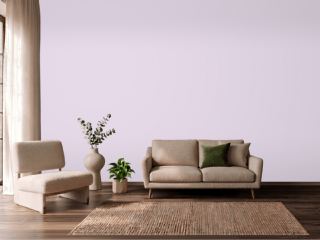 Lavender VistaPPG 1249-2
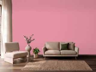 Jaipur PinkSherwin-Williams SW 6577
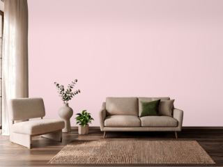 Pink DynastyBenjamin Moore 1352
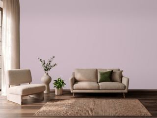 Mauve FinerySherwin-Williams SW 6282
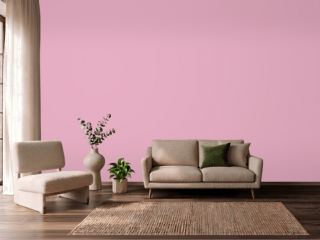 StrawberryBenjamin Moore 2085-50
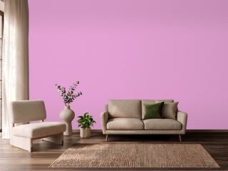 Exotic VioletDunn-Edwards DE5003
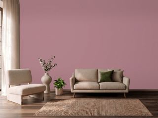 Audrey's BlushSherwin-Williams SW 9001
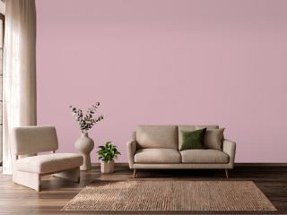 Noah's ArkVista Paint 8704
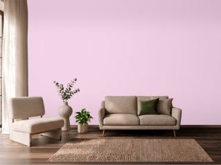 Pink OdysseyValspar 1001-2B
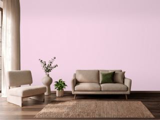 HopefulBehr 690A-2
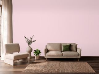 PriscillaSherwin-Williams SW 6575
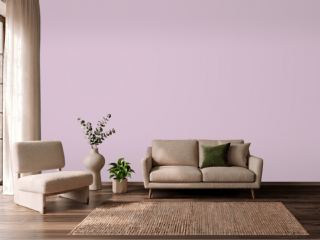 Hidden SanctuaryBenjamin Moore 1375
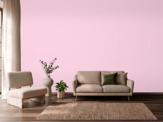 Summer CosmosVista Paint 1120