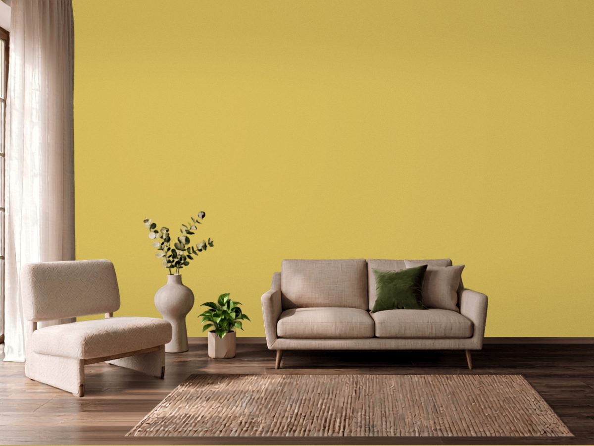
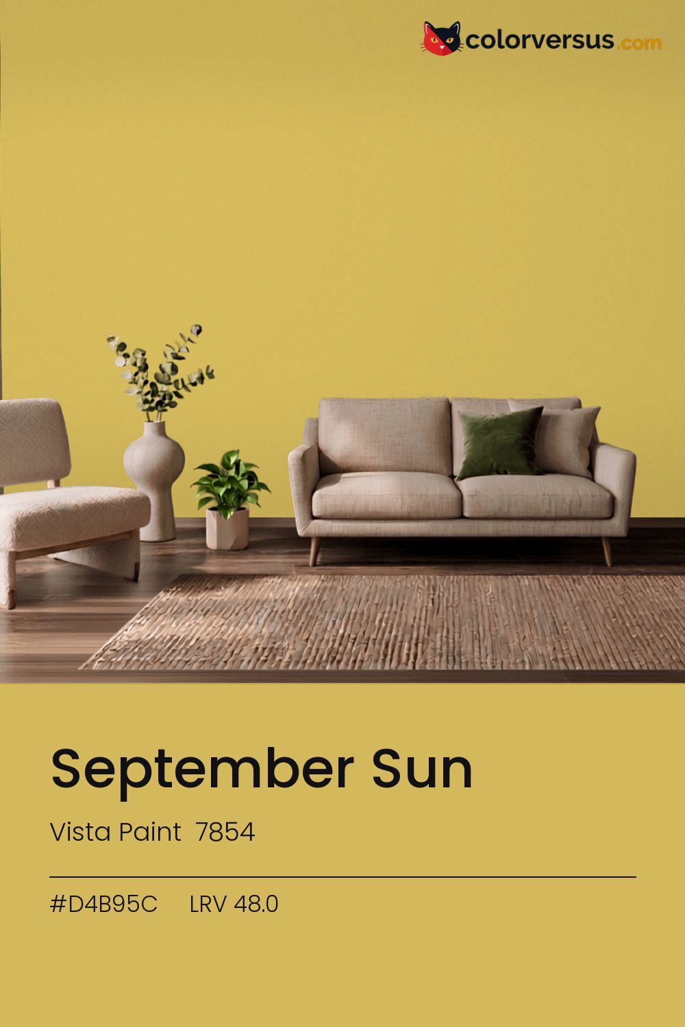
Vista Paint 7854Vista Paint 7854
A color built for commitment, not for blending in. 7854, from Vista Paint.
A chroma of 50.0 is well into the range where the color affects everything nearby - light fixtures, glossy surfaces, even skin tones under it. In a room with plenty of natural light, this can cover more wall area than it could in a dim one, where the same color reads heavier.
The yellow is more noticeable under cool, daylight-balanced bulbs than under standard warm ones, which tend to mute it. Light reflectance reads 48.0, though with this much color in it that number is the smaller half of the story.
This is one of the colors that can change identity with the light - somewhere between yellow and orange, and near enough to the line between them (1°) that both readings are fair. If the room already has blues and cool greys in the floor, a rug, or the furniture, this color will fight it rather than sit well beside it - the two sit at opposite ends of the color spectrum, which is exactly why they clash instead of blend.
The lighter the trim beside this, the more it will seem to glow - a side effect of the light-reflectance gap rather than anything special about the trim color. A natural scheme here moves in three clear steps: this color on the main wall, a noticeably lighter mid-tone for a second wall or built-in, and a near-white on the ceiling. Each jump should be obvious at a glance, not something you have to squint to tell apart (roughly 48.0, 67 and 85 on the light-reflectance scale, for reference).
Dunn-Edwards Whisper Blue makes a good second wall color here - different enough to read as a real choice, close enough to still feel related (about 32.8 points apart in light reflectance). This is not a color that benefits from shine - the saturation does the work, and a flat finish lets it do that evenly.
Across the other brands, nothing lands within delta-E 2 of this one - there is no easy substitute.
It is lighter than 51 percent of the Vista Paint range. The name is not unique: Behr QE-19 also sells a color called September Sun, and it is not the same shade. Vista Paint lists it in the K codes, alongside 1,318 other colors.
Vista Paint September Sun is a warm color: its hue angle is 92° in CIE Lab at a chroma of 50, with a yellow.
The light reflectance value (LRV) of Vista Paint September Sun (7854) is 48.0, on a scale where 0 is absolute black and 100 is absolute white, which makes it a mid-tone color.
Measured on the color wheel, Vista Paint September Sun pairs with Dutch Boy Blue Sea (VS-9451, complement), Benjamin Moore Feel the Energy (417, analogous, warmer), Benjamin Moore Corlsbud Canyon (076, analogous, cooler), Dunn-Edwards Whisper Blue (DE5910, soft accent).
Vista Paint September Sun's hex value is #D4B95C, RGB 212, 185, 92.
Vista Paint September Sun is classified as a yellow, with a yellow.
The nearest Pantone TCX color to Vista Paint September Sun is 13-0739 TCX Cream Gold, delta-E 3.5; the nearest RAL Classic is RAL 1002 Sand yellow, delta-E 16.16. Neither is an exact match.
| HEX | #D4B95C |
| RGB | 212, 185, 92 |
| CMYK | 0%, 13%, 57%, 17% |
| HSL | 46°, 58%, 60% |
| HSV | 46°, 57%, 83% |
| CIE Lab | 75.74, -1.65, 50 |
| LCh | 75.74, 50.03, 91.9° |
| XYZ | 46.43, 49.47, 17.23 |
| Pantone (nearest) | 13-0739 TCX Cream Gold · ΔE 3.5 |
| RAL (nearest) | RAL 1002 Sand yellow · ΔE 16.16 |
| 13-0739 TCX Cream Gold | ΔE 3.5 | |
| 14-0837 TCX Misted Yellow | ΔE 4.75 | |
| 14-0740 TCX Bamboo | ΔE 5.82 | |
| RAL 1002 Sand yellow | ΔE 16.16 |
Pantone TCX and RAL Classic are physical standards; these are their published sRGB approximations, so check a fan deck before specifying. Pantone® and RAL are trademarks of their respective owners.
Shades mix the color toward black, tints toward white. Click any step to find the paint colors closest to it.
One image with September Sun and its closest color at every other brand, measured by delta-E.
 Yellow FreezeBenjamin Moore 2020-70
 Banana SplitBehr 360A-3
 Clary SageSherwin-Williams SW 6178
 Queen Anne's LaceSherwin-Williams SW 6420
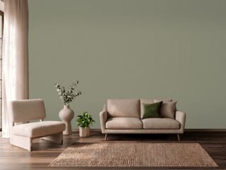 TreronFarrow & Ball 292
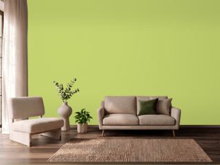 Pear GreenBenjamin Moore 2028-40
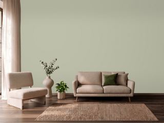 Softened GreenSherwin-Williams SW 6177
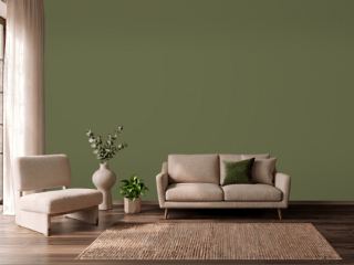 BanchaFarrow & Ball 298
 EggshellBenjamin Moore 2026-70
 Touch of SunVista Paint 0852
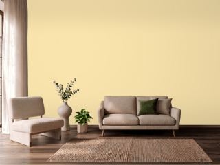 Pecan CreamValspar 3006-4B
 ButterBenjamin Moore 2023-60
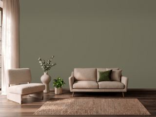 Sage Green LightSherwin-Williams SW 2851
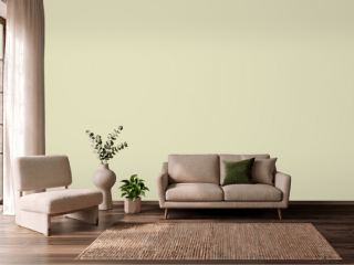 CelerySherwin-Williams SW 6421
 Soft SilverDunn-Edwards DEW359
 Crème FraicheBenjamin Moore 2023-70