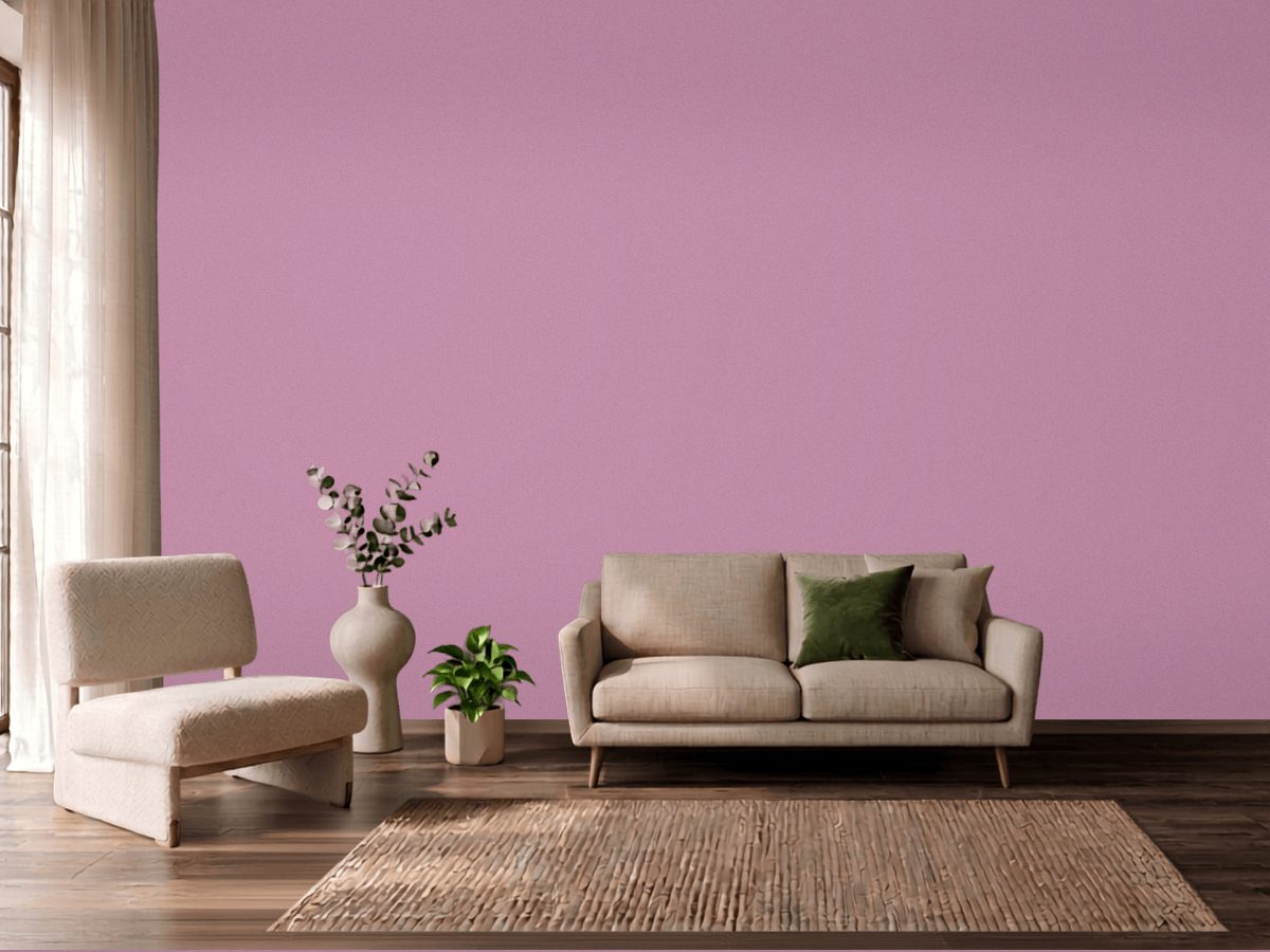
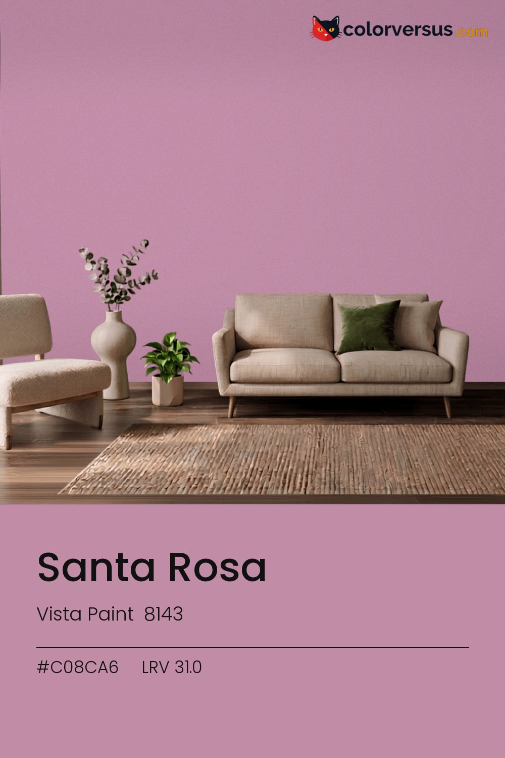
Vista Paint 8143Vista Paint 8143
There is no reading this as a background color. In the Vista Paint lineup this is 8143.
At chroma 24.5 it will not sit quietly next to another strong color. Best reserved for rooms you pass through or visit rather than ones you spend hours in - the intensity that makes a strong first impression can tire the eye over a full day.
South light flatters it. In a north-facing room it can turn cold, so sample that wall first. 31.0 on the light-reflectance scale is unremarkable on its own; the chroma is what actually drives how this color behaves.
Rooms already built around greens are the hardest fit for this color - the two are opposites, and opposites next to each other rarely feel calm.
Wood tones next to this read darker and richer than they do against a paler wall; it is one of the more dependable effects of putting a light-absorbing color next to anything reflective. For layering, pair this with a clearly lighter mid-tone on a secondary wall or cabinetry, and keep the ceiling close to white. The gap between each step should be big enough to see without thinking about it (roughly 31.0 / 58 / 85 on the reflectance scale).
If a second wall color is wanted in the same room, Dunn-Edwards Lighthouse keeps the jump obvious rather than muddy (roughly 59.3 LRV points from this one). A flatter finish keeps this much color from creating harsh reflections.
For anyone tied to a different brand, PPG Winsome Rose (1044-5) is the nearest stand-in, at a delta-E of 2.65. Across the other brands, nothing lands within delta-E 2 of this one - there is no easy substitute.
It is lighter than 28 percent of the Vista Paint range. This is a crowded part of the scale - 543 colors measure within a point of 31.0 - so most brands will have something close. The name is not unique: Benjamin Moore 1189 also sells a color called Santa Rosa, and it is not the same shade. Vista Paint lists it in the K codes, alongside 1,318 other colors.
Vista Paint Santa Rosa is a warm color: its hue angle is 346° in CIE Lab at a chroma of 24.5, with a pink.
The light reflectance value (LRV) of Vista Paint Santa Rosa (8143) is 31.0, on a scale where 0 is absolute black and 100 is absolute white, which makes it a mid-tone color.
Measured on the color wheel, Vista Paint Santa Rosa pairs with Vista Paint Aquamarine Ocean (0715, complement), Behr Lady Guinevere (MQ1-13, analogous, warmer), Dunn-Edwards Lavender Sweater (DE5998, analogous, cooler), Dunn-Edwards Lighthouse (DEW385, soft accent).
Vista Paint Santa Rosa's hex value is #C08CA6, RGB 192, 140, 166.
Vista Paint Santa Rosa is classified as a pink, with a pink.
The nearest Pantone TCX color to Vista Paint Santa Rosa is 16-2111 TCX Mauve Orchid, delta-E 4.25; the nearest RAL Classic is RAL 4009 Pastel violet, delta-E 13. Neither is an exact match.
The closest cross-brand match to Vista Paint Santa Rosa is PPG Winsome Rose (1044-5), at a delta-E of 2.65.
| HEX | #C08CA6 |
| RGB | 192, 140, 166 |
| CMYK | 0%, 27%, 14%, 25% |
| HSL | 330°, 29%, 65% |
| HSV | 330°, 27%, 75% |
| CIE Lab | 63.93, 23.81, -5.89 |
| LCh | 63.93, 24.53, 346.1° |
| XYZ | 38, 32.72, 40.38 |
| Pantone (nearest) | 16-2111 TCX Mauve Orchid · ΔE 4.25 |
| RAL (nearest) | RAL 4009 Pastel violet · ΔE 13 |
| 16-2111 TCX Mauve Orchid | ΔE 4.25 | |
| 16-3110 TCX Smoky Grape | ΔE 5.34 | |
| 16-1712 TCX Polignac | ΔE 5.77 | |
| RAL 4009 Pastel violet | ΔE 13 |
Pantone TCX and RAL Classic are physical standards; these are their published sRGB approximations, so check a fan deck before specifying. Pantone® and RAL are trademarks of their respective owners.
Shades mix the color toward black, tints toward white. Click any step to find the paint colors closest to it.
One image with Santa Rosa and its closest color at every other brand, measured by delta-E.
 Impatiens PetalSherwin-Williams SW 6582
 Exuberant PinkSherwin-Williams SW 6840
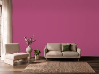 Hot PinkBehr 100B-7
 Lavender VistaPPG 1249-2
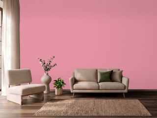 Jaipur PinkSherwin-Williams SW 6577
 Mauve FinerySherwin-Williams SW 6282
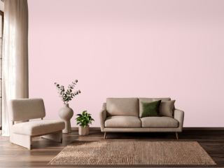 Pink DynastyBenjamin Moore 1352
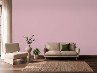 Noah's ArkVista Paint 8704
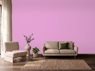 Exotic VioletDunn-Edwards DE5003
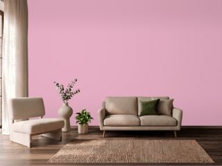 StrawberryBenjamin Moore 2085-50
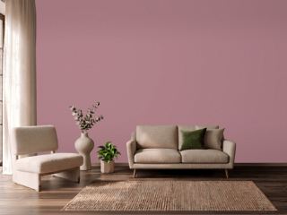 Audrey's BlushSherwin-Williams SW 9001
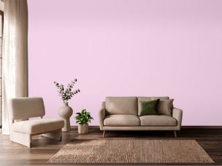 Pink OdysseyValspar 1001-2B
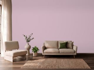 Candlelight DinnerBehr S120-3
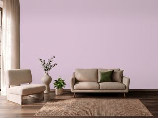 Hidden SanctuaryBenjamin Moore 1375
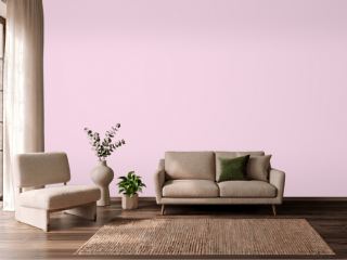 HopefulBehr 690A-2
 Summer CosmosVista Paint 1120