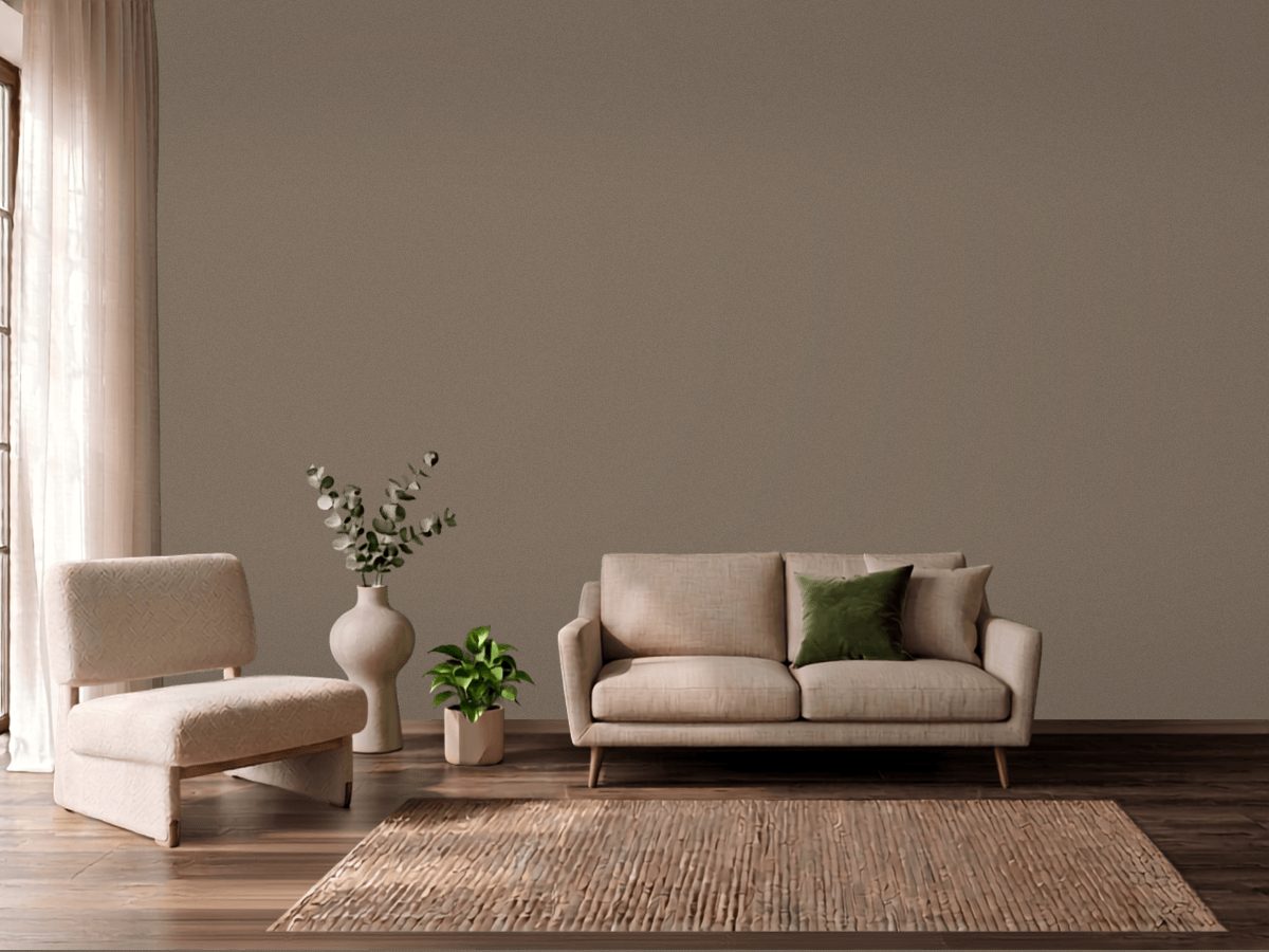
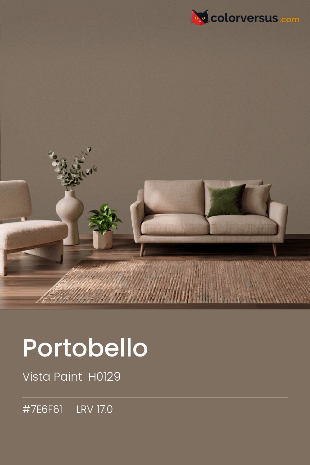
Vista Paint H0129Vista Paint H0129
Neither bold nor shy - a orange undertone with enough weight to matter and enough restraint to live with. Portobello is Vista Paint's H0129.
LRV 17.0 - comfortably in the range that suits a whole room rather than one wall. Chroma 10.5 sits in a comfortable middle: present enough to notice, restrained enough to live with.
A reasonable choice for a room that needs to feel grounded without going as dark as a true accent color. Warm bulbs make it warmer still; daylight bulbs cool it back toward neutral. For a secondary wall, Sherwin-Williams Lazy Gray gives a natural step up in brightness without feeling like a mismatch (roughly 36.2 LRV points apart).
Rooms already built around blues and cool greys are the hardest fit for this color - the two are opposites, and opposites next to each other rarely feel calm.
Wood tones next to this read darker and richer than they do against a paler wall; it is one of the more dependable effects of putting a light-absorbing color next to anything reflective. For layering, pair this with a clearly lighter mid-tone on a secondary wall or cabinetry, and keep the ceiling close to white. The gap between each step should be big enough to see without thinking about it (roughly 17.0 / 51 / 85 on the reflectance scale).
Benjamin Moore Fallen Timber (994) runs close enough - delta-E 1.38 - that swapping brands should not change how the room looks. This is not a rare shade: 3 colors from other brands sit within delta-E 2 of it. A satin finish is worth it in a room that needs to be wiped down often, at the cost of showing a bit more of the wall's surface than a flat finish would.
It is lighter than 15 percent of the Vista Paint range. The name is not unique: Kilz TB-14 also sells a color called Portobello, and it is not the same shade. Vista Paint lists it in the C codes, alongside 1,421 other colors.
Vista Paint Portobello is a warm color: its hue angle is 71° in CIE Lab at a chroma of 10.5, with a orange undertone.
The light reflectance value (LRV) of Vista Paint Portobello (H0129) is 17.0, on a scale where 0 is absolute black and 100 is absolute white, which makes it a dark color.
Measured on the color wheel, Vista Paint Portobello pairs with Behr Arrowhead Lake (PPU14-01, complement), PPG Playing Hooky (1123-6, analogous, warmer), Behr Czarina (MQ1-48, analogous, cooler), Sherwin-Williams Lazy Gray (SW 6254, soft accent).
Vista Paint Portobello's hex value is #7E6F61, RGB 126, 111, 97.
Vista Paint Portobello is classified as a tan, with a orange undertone.
The nearest Pantone TCX color to Vista Paint Portobello is 17-0909 TCX Fossil, delta-E 1.42; the nearest RAL Classic is RAL 7006 Beige grey, delta-E 4.03.
The closest cross-brand match to Vista Paint Portobello is Benjamin Moore Fallen Timber (994), at a delta-E of 1.38.
| HEX | #7E6F61 |
| RGB | 126, 111, 97 |
| CMYK | 0%, 12%, 23%, 51% |
| HSL | 29°, 13%, 44% |
| HSV | 29°, 23%, 49% |
| CIE Lab | 47.84, 3.46, 9.95 |
| LCh | 47.84, 10.53, 70.8° |
| XYZ | 16.45, 16.67, 13.66 |
| Pantone (nearest) | 17-0909 TCX Fossil · ΔE 1.42 |
| RAL (nearest) | RAL 7006 Beige grey · ΔE 4.03 |
| 17-0909 TCX Fossil | ΔE 1.42 | |
| 17-1410 TCX Pine Bark | ΔE 1.84 | |
| 18-1017 TCX Caribou | ΔE 2.39 | |
| RAL 7006 Beige grey | ΔE 4.03 |
Pantone TCX and RAL Classic are physical standards; these are their published sRGB approximations, so check a fan deck before specifying. Pantone® and RAL are trademarks of their respective owners.
Shades mix the color toward black, tints toward white. Click any step to find the paint colors closest to it.
One image with Portobello and its closest color at every other brand, measured by delta-E.
 Accessible BeigeSherwin-Williams SW 7036
 Natural LinenSherwin-Williams SW 9109
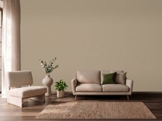 Studio TaupeSherwin-Williams SW 7549
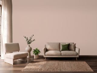 Sashay SandSherwin-Williams SW 6051
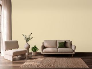 Farrow's CreamFarrow & Ball 67
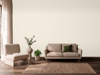 CreamySherwin-Williams SW 7012
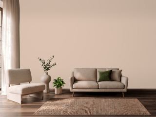 Setting PlasterFarrow & Ball 231
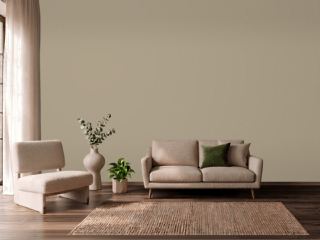 TurretBenjamin Moore CC-604
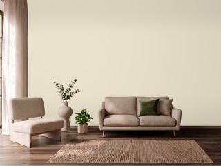 Polar BearSherwin-Williams SW 7564
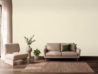 New WhiteFarrow & Ball 59
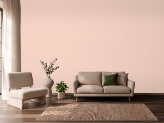 Koral KicksSherwin-Williams SW 6610
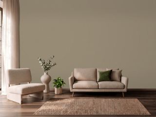 Mouse's BackFarrow & Ball 40
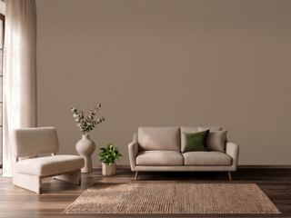 Coconut ShellBehr PPU5-05
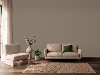 Warm StoneSherwin-Williams SW 7032
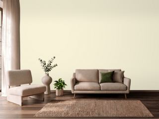 Soft CreamPPG 1205-2
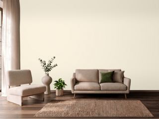 Lily of the ValleyBenjamin Moore 905