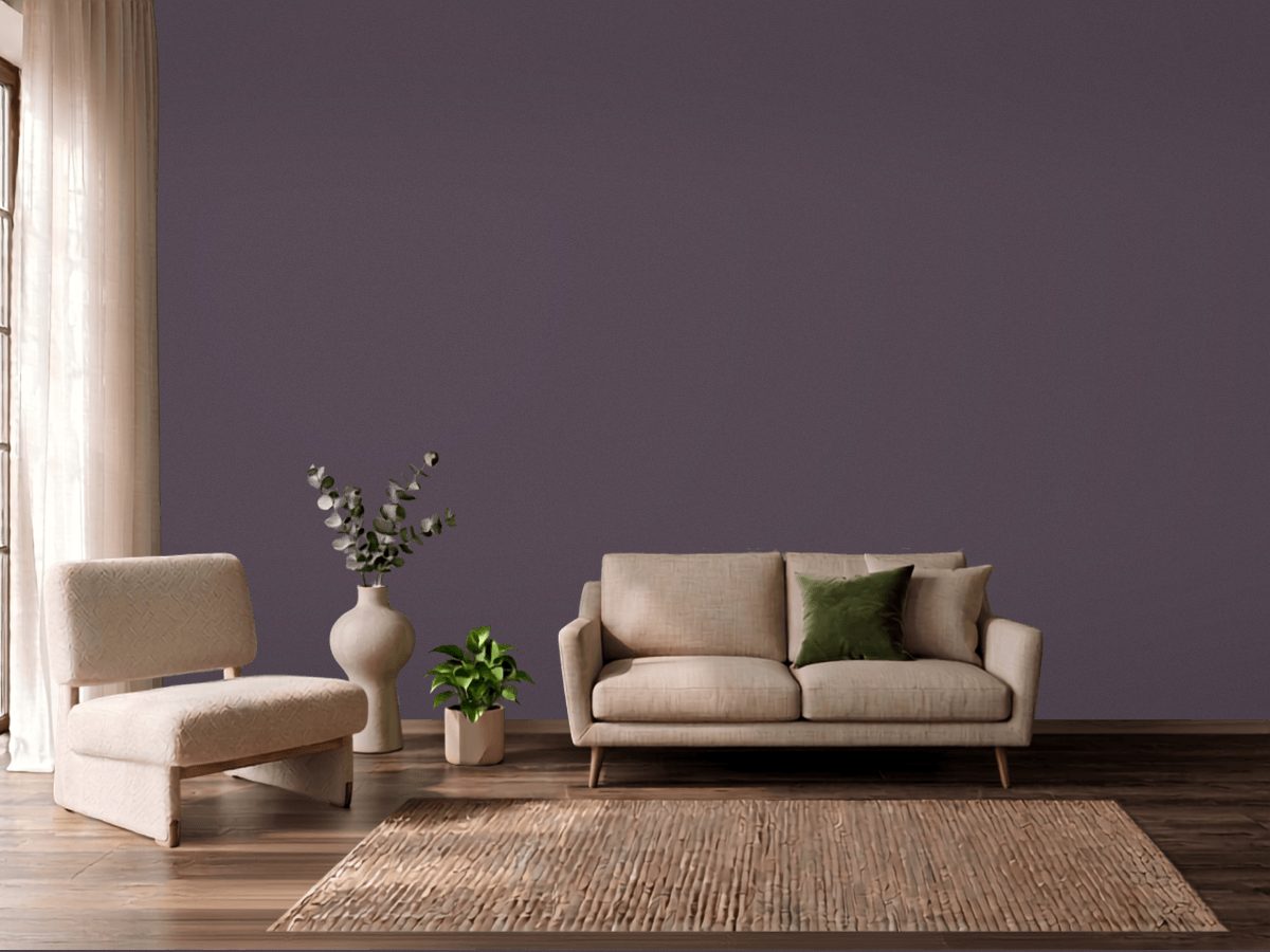
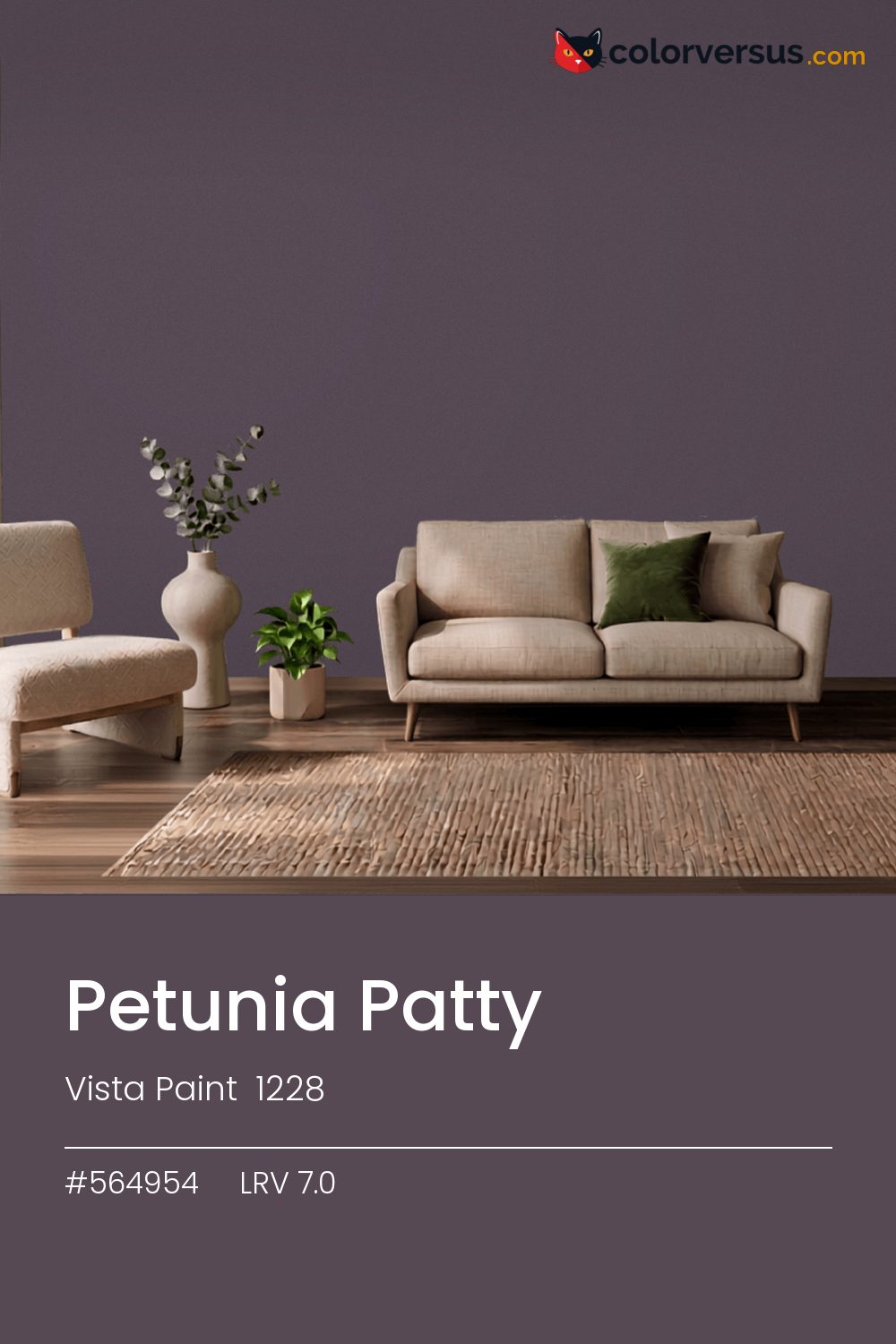
Vista Paint 1228Vista Paint 1228
Dark to the point where the light in the room matters more than the color does, and where that light is what reveals the purple undertone at all. Vista Paint lists it as Petunia Patty (1228).
7.0 on the light-reflectance scale is near the floor - this color adds shadow to a room rather than taking it away. A single accent light aimed at this wall will do more to reveal the purple undertone than any amount of ambient room lighting.
Worth checking before committing to a full wall: greens nearby - in a floor, a rug, a piece of furniture - will read as a clash here, not a complement, since the two colors sit at opposite ends of the spectrum.
Next to it, white trim reads brighter and cooler than it does anywhere else in the house - the gap in light reflectance is what does that, not the trim paint itself. The safest multi-color scheme moves from this dark wall to a noticeably lighter secondary tone, then to a near-white ceiling - three genuinely different depths rather than three shades of the same idea (LRV 7.0, 46 and 85, if you're matching by the numbers).
In a hallway or transition space that is not lived in for long stretches, the loss of reflected light matters less than it would in a living room. If a second wall color is wanted in the same room, Kilz Stone Cold keeps the jump obvious rather than muddy (roughly 28 LRV points from this one).
A color this deep already reads as dramatic; a low-sheen finish lets the color carry that without competing highlights.
Behr Deep Mulberry (BXC-51) matches it closely enough that no one will tell them apart on a wall. Only 2 other-brand colors land within delta-E 2 of this one, which makes it comparatively unusual.
Nearly everything Vista Paint makes is lighter than this: 45 of their 2,742 colors sit below it. Vista Paint lists it in the C codes, alongside 1,421 other colors.
Vista Paint Petunia Patty sits between warm and cool: its hue angle is 330° in CIE Lab at a chroma of 8.9, with a purple undertone.
The light reflectance value (LRV) of Vista Paint Petunia Patty (1228) is 7.0, on a scale where 0 is absolute black and 100 is absolute white, which makes it a very dark color.
Measured on the color wheel, Vista Paint Petunia Patty pairs with Benjamin Moore Martha's Vineyard (630, complement), Behr Urban Legend (N100-6, analogous, warmer), Sherwin-Williams Quixotic Plum (SW 6265, analogous, cooler), Kilz Stone Cold (TB-66, soft accent).
Vista Paint Petunia Patty's hex value is #564954, RGB 86, 73, 84.
Vista Paint Petunia Patty is classified as a black, with a purple undertone.
The nearest Pantone TCX color to Vista Paint Petunia Patty is 19-3915 TCX Graystone, delta-E 5.86; the nearest RAL Classic is RAL 7024 Graphite grey, delta-E 7.66. Neither is an exact match.
The closest cross-brand match to Vista Paint Petunia Patty is Behr Deep Mulberry (BXC-51), at a delta-E of 0.9 - close enough to be the same color by measurement.
| HEX | #564954 |
| RGB | 86, 73, 84 |
| CMYK | 0%, 15%, 2%, 66% |
| HSL | 309°, 8%, 31% |
| HSV | 309°, 15%, 34% |
| CIE Lab | 32.66, 7.71, -4.49 |
| LCh | 32.66, 8.92, 329.8° |
| XYZ | 7.82, 7.38, 9.4 |
| Pantone (nearest) | 19-3915 TCX Graystone · ΔE 5.86 |
| RAL (nearest) | RAL 7024 Graphite grey · ΔE 7.66 |
| 19-3915 TCX Graystone | ΔE 5.86 | |
| RAL 7024 Graphite grey | ΔE 7.66 |
Pantone TCX and RAL Classic are physical standards; these are their published sRGB approximations, so check a fan deck before specifying. Pantone® and RAL are trademarks of their respective owners.
Shades mix the color toward black, tints toward white. Click any step to find the paint colors closest to it.
One image with Petunia Patty and its closest color at every other brand, measured by delta-E.
 NavalSherwin-Williams SW 6244
 Pewter GreenSherwin-Williams SW 6208
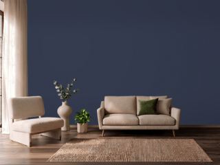 Old MillDunn-Edwards DEA185
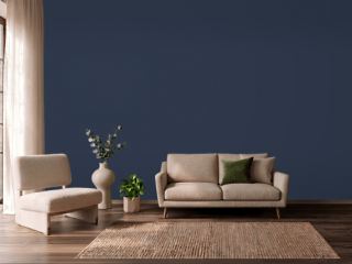 Deep RoyalBenjamin Moore 2061-10
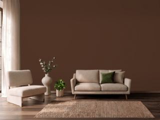 French RoastSherwin-Williams SW 6069
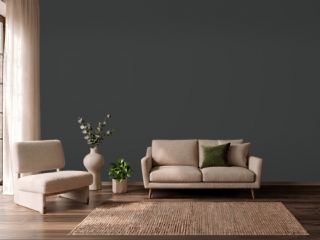 CarbonBehr N520-7
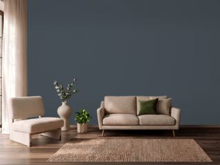 In the NavyVista Paint 8269
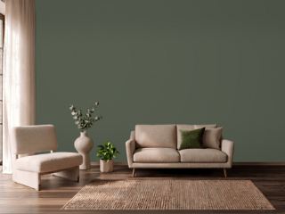 Vintage VogueBenjamin Moore 462
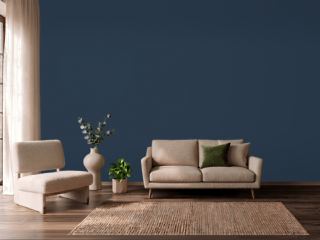 North SeaBenjamin Moore CC-932
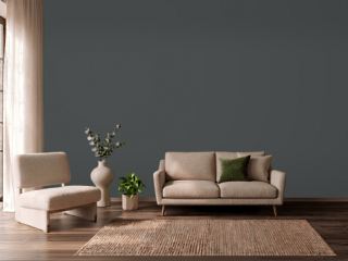 NightfallBenjamin Moore 1596
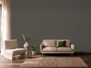 Urbane BronzeSherwin-Williams SW 7048
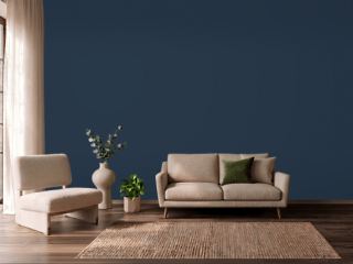 In the NavySherwin-Williams SW 9178
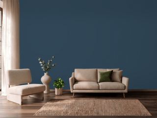 Gentleman's GrayBenjamin Moore 2062-20
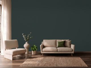 Rookwood Shutter GreenSherwin-Williams SW 2809
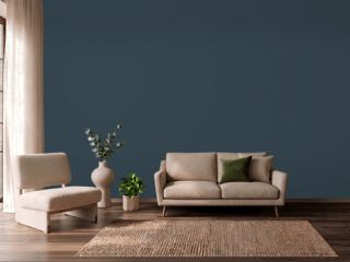 Gale ForceSherwin-Williams SW 7605
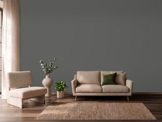 Charcoal SmudgeDunn-Edwards DE6370