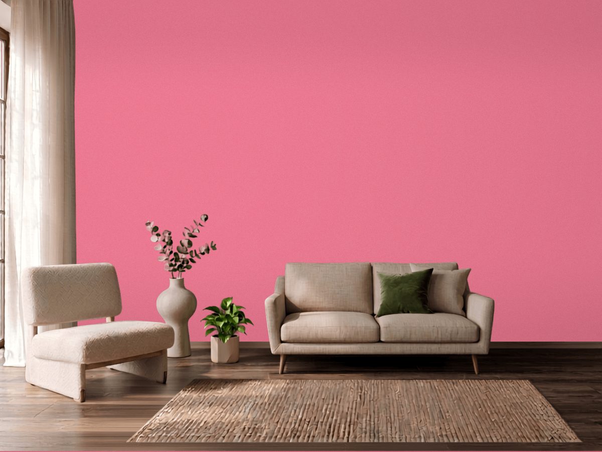
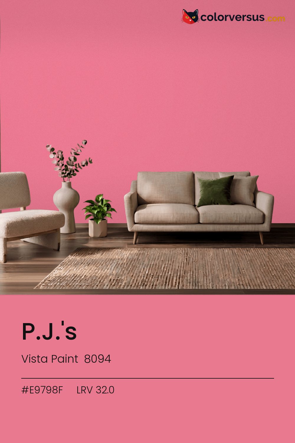
Vista Paint 8094Vista Paint 8094
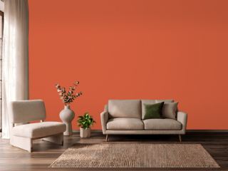
There is nothing quiet about this one - it is meant to be noticed. P.J.'s is Vista Paint's 8094.
Chroma 46.1 is high enough to dominate a room's palette rather than join it. Used across a whole room it needs restraint in the decor - furniture and textiles that stay quiet so the wall can carry the color.
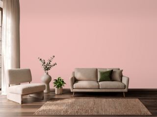
The pink leans into warm light rather than fighting it, so this is a forgiving choice under standard incandescent or warm-LED bulbs. LRV 32.0 puts it in the middle of the scale, but saturation, not lightness, is what you will react to.
This color sits right on the line between red and pink - cooler light nudges it toward pink, warmer light keeps it in red (about 2° apart on the color wheel, for anyone measuring). If the room already has greens in the floor, a rug, or the furniture, this color will fight it rather than sit well beside it - the two sit at opposite ends of the color spectrum, which is exactly why they clash instead of blend.
Next to it, white trim reads brighter and cooler than it does anywhere else in the house - the gap in light reflectance is what does that, not the trim paint itself. A natural scheme here moves in three clear steps: this color on the main wall, a noticeably lighter mid-tone for a second wall or built-in, and a near-white on the ceiling. Each jump should be obvious at a glance, not something you have to squint to tell apart (roughly 32.0, 59 and 85 on the light-reflectance scale, for reference).
For a secondary wall, Dunn-Edwards Melting Glacier gives a natural step up in brightness without feeling like a mismatch (roughly 59.7 LRV points apart). If the wall needs to be washable, eggshell is the highest sheen worth considering before the color starts looking artificial under light.
For anyone tied to a different brand, Valspar So Charming (1005-1B) is the nearest stand-in, at a delta-E of 2.24. Across the other brands, nothing lands within delta-E 2 of this one - there is no easy substitute.
It is lighter than 29 percent of the Vista Paint range. Vista Paint lists it in the K codes, alongside 1,318 other colors.
Vista Paint P.J.'s is a warm color: its hue angle is 10° in CIE Lab at a chroma of 46.1, with a pink.
The light reflectance value (LRV) of Vista Paint P.J.'s (8094) is 32.0, on a scale where 0 is absolute black and 100 is absolute white, which makes it a mid-tone color.
Measured on the color wheel, Vista Paint P.J.'s pairs with Dunn-Edwards Star Grass (DE5682, complement), Dunn-Edwards Aloha Sunset (DE5178, analogous, warmer), Dunn-Edwards Crushed Berries (DE5026, analogous, cooler), Dunn-Edwards Melting Glacier (DEW368, soft accent).
Vista Paint P.J.'s's hex value is #E9798F, RGB 233, 121, 143.
Vista Paint P.J.'s is classified as a red, with a pink.
The nearest Pantone TCX color to Vista Paint P.J.'s is 16-1723 TCX Confetti, delta-E 1.25; the nearest RAL Classic is RAL 3014 Antique pink, delta-E 10.51.
The closest cross-brand match to Vista Paint P.J.'s is Valspar So Charming (1005-1B), at a delta-E of 2.24.
| HEX | #E9798F |
| RGB | 233, 121, 143 |
| CMYK | 0%, 48%, 39%, 9% |
| HSL | 348°, 72%, 69% |
| HSV | 348°, 48%, 91% |
| CIE Lab | 64.15, 45.39, 8.1 |
| LCh | 64.15, 46.11, 10.1° |
| XYZ | 45.4, 32.99, 29.96 |
| Pantone (nearest) | 16-1723 TCX Confetti · ΔE 1.25 |
| RAL (nearest) | RAL 3014 Antique pink · ΔE 10.51 |
| 16-1723 TCX Confetti | ΔE 1.25 | |
| 17-1928 TCX Bubblegum | ΔE 3.28 | |
| 16-1731 TCX Strawberry Pink | ΔE 5.62 | |
| RAL 3014 Antique pink | ΔE 10.51 |
Pantone TCX and RAL Classic are physical standards; these are their published sRGB approximations, so check a fan deck before specifying. Pantone® and RAL are trademarks of their respective owners.
Shades mix the color toward black, tints toward white. Click any step to find the paint colors closest to it.
One image with P.J.'s and its closest color at every other brand, measured by delta-E.
 Red EarthFarrow & Ball 64
 Southwest PotteryBenjamin Moore 048
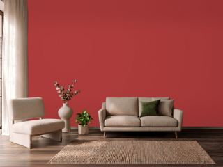 IndiscreetBehr UL110-6
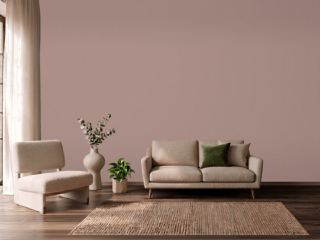 Sulking Room PinkFarrow & Ball 295
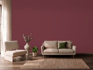 Fine WineSherwin-Williams SW 6307
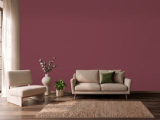 Wine TastingBehr S-H-110
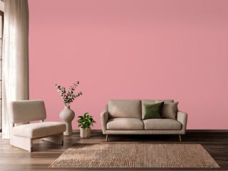 Secret GardenBenjamin Moore 1284
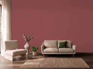 Eating Room RedFarrow & Ball 43
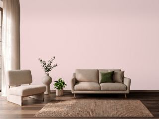 Charming PinkSherwin-Williams SW 6309
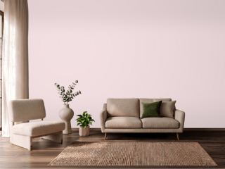 Berry TaffyValspar 1006-6C
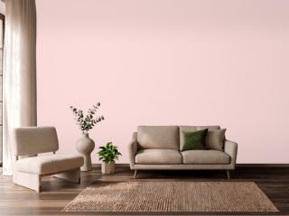 Ballet SlippersBenjamin Moore 1331
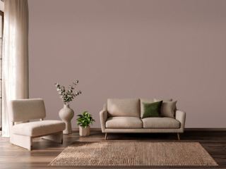 Cocoa BerrySherwin-Williams SW 9078
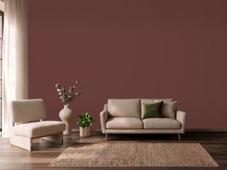 Chipotle PasteBehr PPU2-1
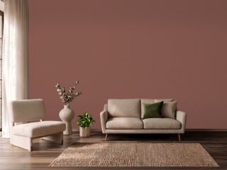 Canyon ClaySherwin-Williams SW 6054
 Charlotte's LocksFarrow & Ball 268
 Noble BlushBehr MQ4-4