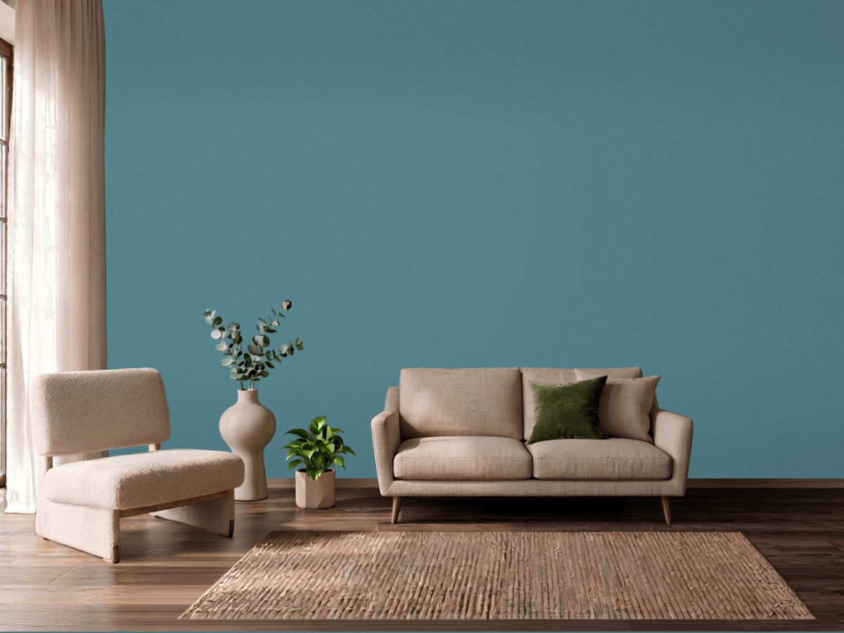
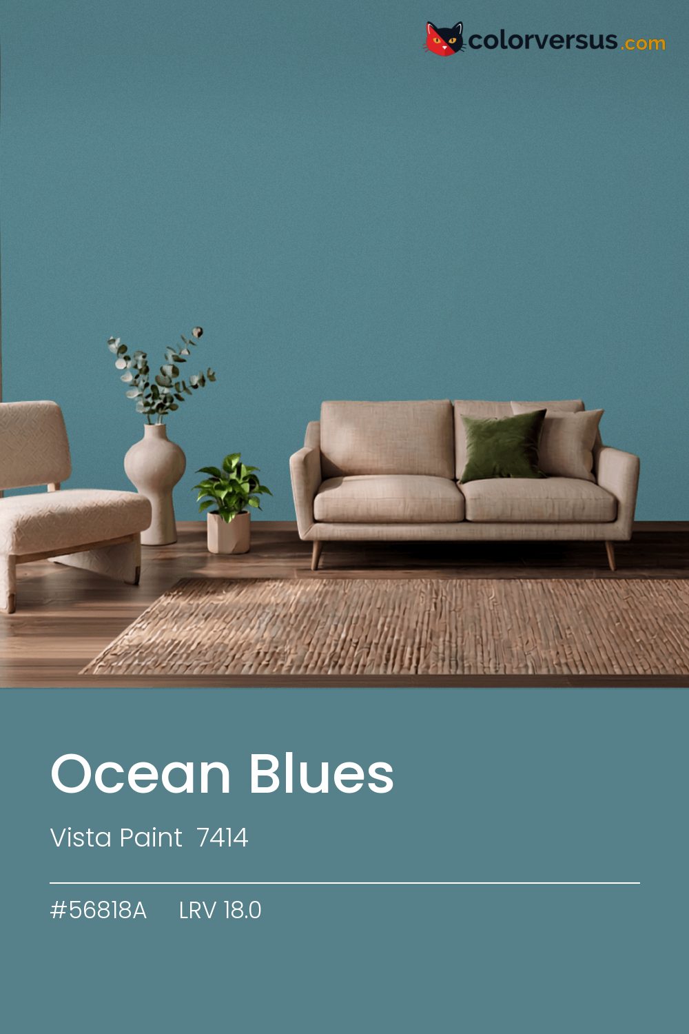
Vista Paint 7414Vista Paint 7414
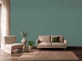
This is the kind of teal that works in more rooms than it does not, which is rarer than it sounds. Ocean Blues is Vista Paint's 7414.
Light reflectance measures 18.0, which is enough to keep a room bright without bouncing light around. Chroma 15.6 sits in a comfortable middle: present enough to notice, restrained enough to live with.
Works as a whole-room color in spaces that are lived in rather than passed through, where its depth has time to register. The teal is more noticeable under cool, daylight-balanced bulbs than under standard warm ones, which tend to mute it. For a secondary wall, Benjamin Moore Through the Looking Glass gives a natural step up in brightness without feeling like a mismatch (roughly 33 LRV points apart).
Rooms already built around reds and brick tones are the hardest fit for this color - the two are opposites, and opposites next to each other rarely feel calm.
Anything pale placed against this wall will look paler than it is; anything warm-metal will look warmer. Neither is an illusion the color plays deliberately - it is simple contrast, but worth planning rather than discovering. For layering, pair this with a clearly lighter mid-tone on a secondary wall or cabinetry, and keep the ceiling close to white. The gap between each step should be big enough to see without thinking about it (roughly 18.0 / 52 / 85 on the reflectance scale).
Benjamin Moore Baltic Sea (CSP-680) runs close enough - delta-E 2.23 - that swapping brands should not change how the room looks. Across the other brands, nothing lands within delta-E 2 of this one - there is no easy substitute. Matte or low-sheen suits it on walls; higher gloss will exaggerate the undertone.
It is lighter than 16 percent of the Vista Paint range. Vista Paint lists it in the K codes, alongside 1,318 other colors.
Vista Paint Ocean Blues is a cool color: its hue angle is 218° in CIE Lab at a chroma of 15.6, with a teal.
The light reflectance value (LRV) of Vista Paint Ocean Blues (7414) is 18.0, on a scale where 0 is absolute black and 100 is absolute white, which makes it a dark color.
Measured on the color wheel, Vista Paint Ocean Blues pairs with Behr Red Potato (S160-6, complement), PPG Blueberry Patch (1167-6, analogous, warmer), Behr Park Bench (M430-6, analogous, cooler), Benjamin Moore Through the Looking Glass (CSP-495, soft accent).
Vista Paint Ocean Blues's hex value is #56818A, RGB 86, 129, 138.
Vista Paint Ocean Blues is classified as a teal, with a teal.
The nearest Pantone TCX color to Vista Paint Ocean Blues is 18-5610 TCX Brittany Blue, delta-E 2.73; the nearest RAL Classic is RAL 7000 Squirrel grey, delta-E 11.63.
The closest cross-brand match to Vista Paint Ocean Blues is Benjamin Moore Baltic Sea (CSP-680), at a delta-E of 2.23.
| HEX | #56818A |
| RGB | 86, 129, 138 |
| CMYK | 38%, 7%, 0%, 46% |
| HSL | 190°, 23%, 44% |
| HSV | 190°, 38%, 54% |
| CIE Lab | 51.28, -12.36, -9.57 |
| LCh | 51.28, 15.63, 217.7° |
| XYZ | 16.27, 19.51, 26.95 |
| Pantone (nearest) | 18-5610 TCX Brittany Blue · ΔE 2.73 |
| RAL (nearest) | RAL 7000 Squirrel grey · ΔE 11.63 |
| 18-5610 TCX Brittany Blue | ΔE 2.73 | |
| 17-4911 TCX Arctic | ΔE 4.5 | |
| RAL 7000 Squirrel grey | ΔE 11.63 |
Pantone TCX and RAL Classic are physical standards; these are their published sRGB approximations, so check a fan deck before specifying. Pantone® and RAL are trademarks of their respective owners.
Shades mix the color toward black, tints toward white. Click any step to find the paint colors closest to it.
One image with Ocean Blues and its closest color at every other brand, measured by delta-E.
 Rain DanceBehr S480-1
 Palladian BlueBenjamin Moore HC-144
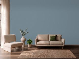 Adirondack BlueBehr N480-5
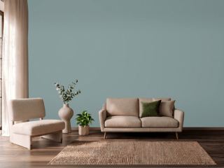 Oval Room BlueFarrow & Ball 85
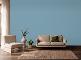 Cool DuskBehr 550F-4
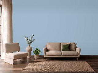 Lulworth BlueFarrow & Ball 89
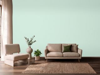 Green AquaBehr M420-2
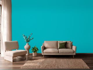 CalypsoSherwin-Williams SW 6950
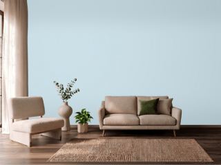 Breath of Fresh AirBenjamin Moore 806
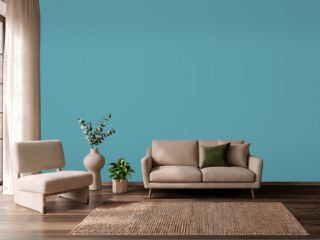 TurquoiseBehr BIC-53
 Fresh MintBenjamin Moore 2037-70
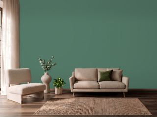 Kendal GreenSherwin-Williams SW 6467
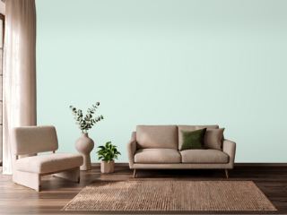 Embellished BlueSherwin-Williams SW 6749
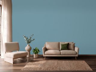 Stone BlueFarrow & Ball 86
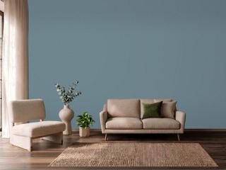 Blustery SkySherwin-Williams SW 9140
 Forest EdgeBehr S430-6