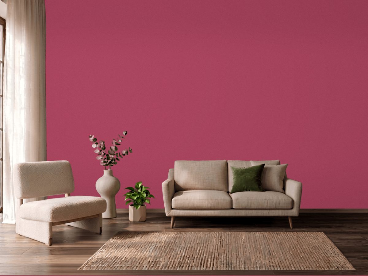
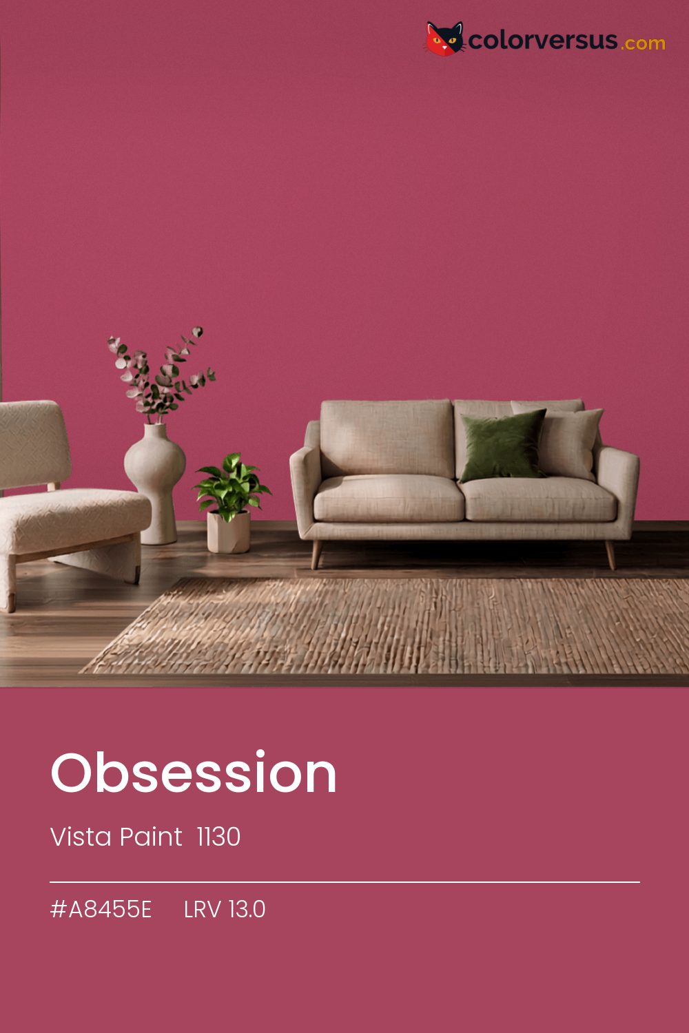
Vista Paint 1130Vista Paint 1130
This is a color that decides the room rather than supporting it. Vista Paint's designation for it is 1130.
Chroma 43.5 is high enough that the color will bounce onto light surfaces, so expect it everywhere, not only on the wall. In a room with plenty of natural light, this can cover more wall area than it could in a dim one, where the same color reads heavier.
The pink leans into warm light rather than fighting it, so this is a forgiving choice under standard incandescent or warm-LED bulbs. LRV 13.0 tells you how much light comes back, which matters less here than how much color comes with it.
This is one of the colors that can change identity with the light - somewhere between pink and red, and near enough to the line between them (1°) that both readings are fair. Worth checking before committing to a full wall: greens nearby - in a floor, a rug, a piece of furniture - will read as a clash here, not a complement, since the two colors sit at opposite ends of the spectrum.
The lighter the trim beside this, the more it will seem to glow - a side effect of the light-reflectance gap rather than anything special about the trim color. The safest multi-color scheme moves from this dark wall to a noticeably lighter secondary tone, then to a near-white ceiling - three genuinely different depths rather than three shades of the same idea (LRV 13.0, 49 and 85, if you're matching by the numbers).
Benjamin Moore Annapolis Green pairs well as a second surface - close enough in feel to belong in the same room, far enough in lightness to read as two distinct walls (about 48.3 points apart on the reflectance scale). Matte suits a color this strong - a glossier sheen would turn every light source in the room into a visible hotspot on the wall.
Switching brands, Sherwin-Williams Gala Pink (SW 6579) is the closest equivalent at delta-E 2.63, near enough for most rooms. No other brand has a color within delta-E 2 of this one - a genuinely uncommon shade.
It is lighter than 10 percent of the Vista Paint range. The name is not unique: PPG 1108-7 also sells a color called Obsession, and it is not the same shade. Among pinks it is one of the strongest: only 2 percent of them carry more colour. Vista Paint lists it in the C codes, alongside 1,421 other colors.
Vista Paint Obsession is a warm color: its hue angle is 8° in CIE Lab at a chroma of 43.5, with a pink.
The light reflectance value (LRV) of Vista Paint Obsession (1130) is 13.0, on a scale where 0 is absolute black and 100 is absolute white, which makes it a very dark color.
Measured on the color wheel, Vista Paint Obsession pairs with PPG Aloha (1229-5, complement), Benjamin Moore Montana Agate (056, analogous, warmer), Benjamin Moore Twilight Magenta (2074-30, analogous, cooler), Benjamin Moore Annapolis Green (687, soft accent).
Vista Paint Obsession's hex value is #A8455E, RGB 168, 69, 94.
Vista Paint Obsession is classified as a pink, with a pink.
The nearest Pantone TCX color to Vista Paint Obsession is 17-1633 TCX Holly Berry, delta-E 6.9; the nearest RAL Classic is RAL 4002 Red violet, delta-E 7.3. Neither is an exact match.
The closest cross-brand match to Vista Paint Obsession is Sherwin-Williams Gala Pink (SW 6579), at a delta-E of 2.63.
| HEX | #A8455E |
| RGB | 168, 69, 94 |
| CMYK | 0%, 59%, 44%, 34% |
| HSL | 345°, 42%, 46% |
| HSV | 345°, 59%, 66% |
| CIE Lab | 43.34, 43.07, 6.15 |
| LCh | 43.34, 43.51, 8.1° |
| XYZ | 20.3, 13.39, 12.1 |
| Pantone (nearest) | 17-1633 TCX Holly Berry · ΔE 6.9 |
| RAL (nearest) | RAL 4002 Red violet · ΔE 7.3 |
| 17-1633 TCX Holly Berry | ΔE 6.9 | |
| RAL 4002 Red violet | ΔE 7.3 |
Pantone TCX and RAL Classic are physical standards; these are their published sRGB approximations, so check a fan deck before specifying. Pantone® and RAL are trademarks of their respective owners.
Shades mix the color toward black, tints toward white. Click any step to find the paint colors closest to it.
One image with Obsession and its closest color at every other brand, measured by delta-E.
 Impatiens PetalSherwin-Williams SW 6582
 Exuberant PinkSherwin-Williams SW 6840
 Hot PinkBehr 100B-7
 Lavender VistaPPG 1249-2
 Jaipur PinkSherwin-Williams SW 6577
 Mauve FinerySherwin-Williams SW 6282
 Pink DynastyBenjamin Moore 1352
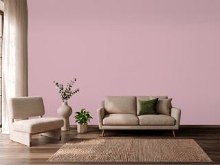 Noah's ArkVista Paint 8704
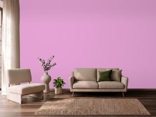 Exotic VioletDunn-Edwards DE5003
 StrawberryBenjamin Moore 2085-50
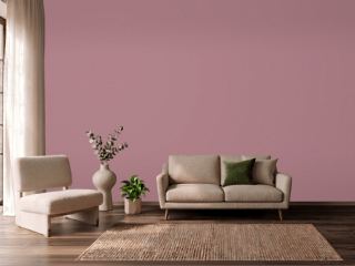 Audrey's BlushSherwin-Williams SW 9001
 Pink OdysseyValspar 1001-2B
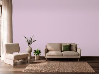 Hidden SanctuaryBenjamin Moore 1375
 HopefulBehr 690A-2
 Candlelight DinnerBehr S120-3
 Summer CosmosVista Paint 1120