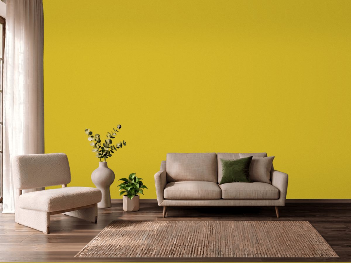
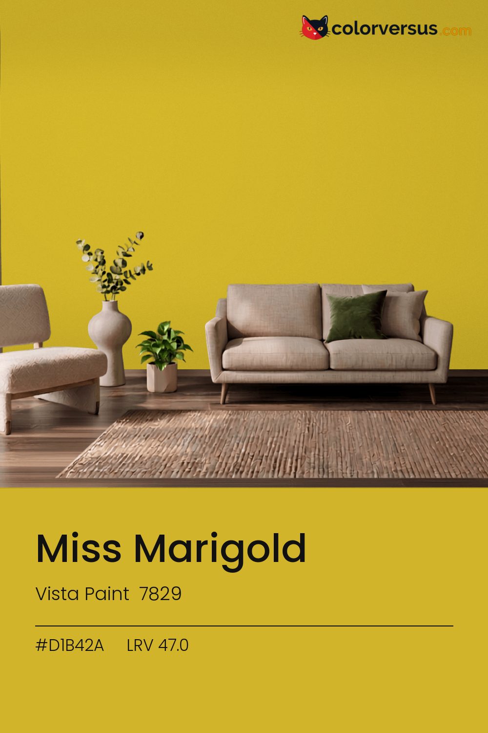
Vista Paint 7829Vista Paint 7829
Strong enough that it sets the palette for the room, not the other way around. 7829 in the Vista Paint range.
Chroma 68.2 is high enough that the color will bounce onto light surfaces, so expect it everywhere, not only on the wall. A powder room or a nook is often the right scale for a color this strong - enough impact without living with it in every sightline.
Warm bulbs will soften it; daylight bulbs push it further cool. LRV 47.0 tells you how much light comes back, which matters less here than how much color comes with it.
Not quite yellow, not quite orange - this sits right where the two meet, so the room's own lighting ends up deciding which one you actually see. Rooms already built around blues and cool greys are the hardest fit for this color - the two are opposites, and opposites next to each other rarely feel calm.
Wood tones next to this read darker and richer than they do against a paler wall; it is one of the more dependable effects of putting a light-absorbing color next to anything reflective. For layering, pair this with a clearly lighter mid-tone on a secondary wall or cabinetry, and keep the ceiling close to white. The gap between each step should be big enough to see without thinking about it (roughly 47.0 / 66 / 85 on the reflectance scale).
Vista Paint Peak of Perfection pairs well as a second surface - close enough in feel to belong in the same room, far enough in lightness to read as two distinct walls (about 9 points apart on the reflectance scale). Matte suits a color this strong - a glossier sheen would turn every light source in the room into a visible hotspot on the wall.
Switching brands, PPG Grass Daisy (1215-6) is the closest equivalent at delta-E 2.01, near enough for most rooms. Across the other brands, nothing lands within delta-E 2 of this one - there is no easy substitute.
It is lighter than 48 percent of the Vista Paint range. Among yellows it is one of the strongest: only 3 percent of them carry more colour. Vista Paint lists it in the K codes, alongside 1,318 other colors.
Vista Paint Miss Marigold is a warm color: its hue angle is 93° in CIE Lab at a chroma of 68.2, with a yellow.
The light reflectance value (LRV) of Vista Paint Miss Marigold (7829) is 47.0, on a scale where 0 is absolute black and 100 is absolute white, which makes it a mid-tone color.
Measured on the color wheel, Vista Paint Miss Marigold pairs with Dutch Boy Blue Royale (VS-9550, complement), Dutch Boy Temptations (VS-9503, analogous, warmer), Benjamin Moore Racing Orange (2169-10, analogous, cooler), Vista Paint Peak of Perfection (7209, soft accent).
Vista Paint Miss Marigold's hex value is #D1B42A, RGB 209, 180, 42.
Vista Paint Miss Marigold is classified as a yellow, with a yellow.
The nearest Pantone TCX color to Vista Paint Miss Marigold is 14-0754 TCX Super Lemon, delta-E 7.44; the nearest RAL Classic is RAL 1012 Lemon yellow, delta-E 7.86. Neither is an exact match.
The closest cross-brand match to Vista Paint Miss Marigold is PPG Grass Daisy (1215-6), at a delta-E of 2.01.
| HEX | #D1B42A |
| RGB | 209, 180, 42 |
| CMYK | 0%, 14%, 80%, 18% |
| HSL | 50°, 67%, 49% |
| HSV | 50°, 80%, 82% |
| CIE Lab | 73.78, -3.05, 68.09 |
| LCh | 73.78, 68.16, 92.6° |
| XYZ | 43.04, 46.37, 8.87 |
| Pantone (nearest) | 14-0754 TCX Super Lemon · ΔE 7.44 |
| RAL (nearest) | RAL 1012 Lemon yellow · ΔE 7.86 |
| 14-0754 TCX Super Lemon | ΔE 7.44 | |
| RAL 1012 Lemon yellow | ΔE 7.86 |
Pantone TCX and RAL Classic are physical standards; these are their published sRGB approximations, so check a fan deck before specifying. Pantone® and RAL are trademarks of their respective owners.
Shades mix the color toward black, tints toward white. Click any step to find the paint colors closest to it.
One image with Miss Marigold and its closest color at every other brand, measured by delta-E.
 Yellow FreezeBenjamin Moore 2020-70
 Banana SplitBehr 360A-3
 Clary SageSherwin-Williams SW 6178
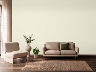 Queen Anne's LaceSherwin-Williams SW 6420
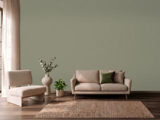 TreronFarrow & Ball 292
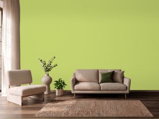 Pear GreenBenjamin Moore 2028-40
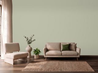 Softened GreenSherwin-Williams SW 6177
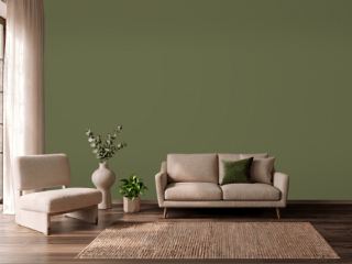 BanchaFarrow & Ball 298
 EggshellBenjamin Moore 2026-70
 Touch of SunVista Paint 0852
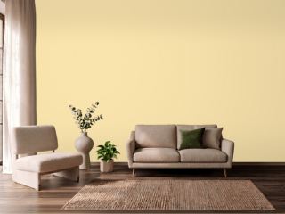 Pecan CreamValspar 3006-4B
 ButterBenjamin Moore 2023-60
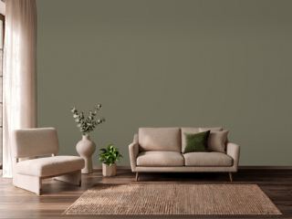 Sage Green LightSherwin-Williams SW 2851
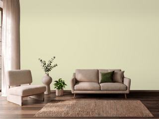 CelerySherwin-Williams SW 6421
 Soft SilverDunn-Edwards DEW359
 Crème FraicheBenjamin Moore 2023-70