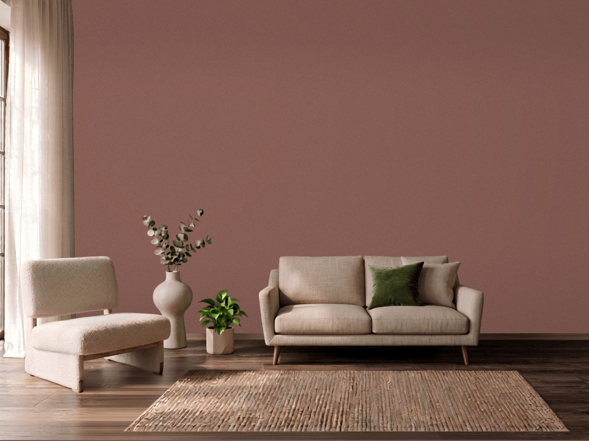
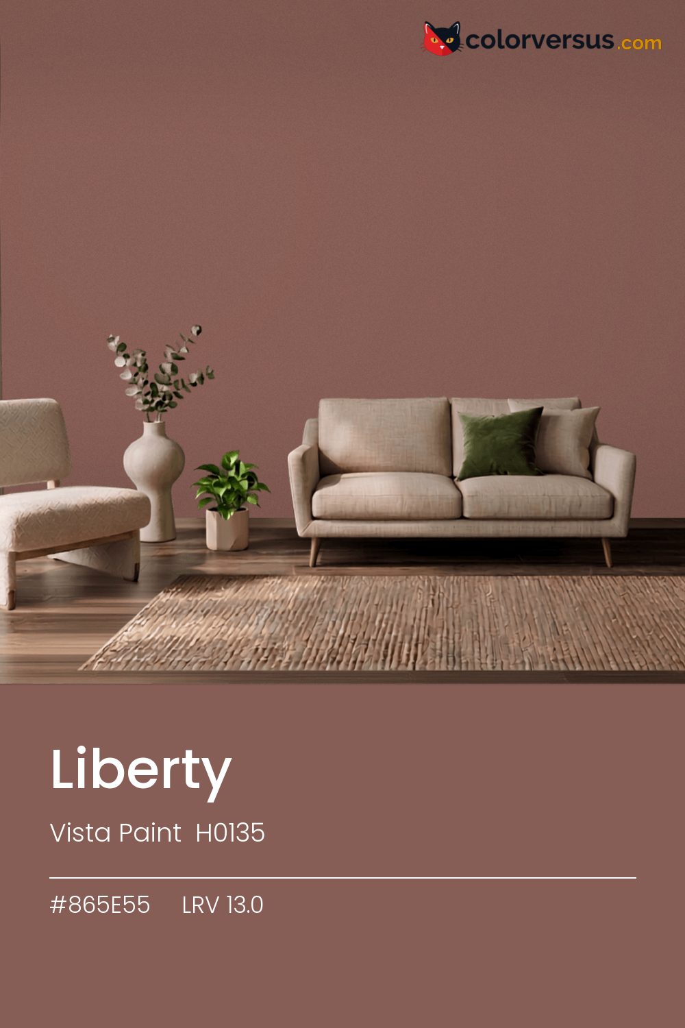
Vista Paint H0135Vista Paint H0135
A color that sits comfortably in the middle: not so light it washes out, not so dark it needs justifying, with a red that carries it. H0135 in the Vista Paint range.
At this LRV (13.0), a room reads as neither bright-white nor dim - a genuinely middle-of-the-road amount of light comes back off the wall. Chroma 19.1 keeps the red present without letting it run the room.
Bedrooms and living rooms, where it is seen in lamplight as much as daylight. Afternoon sun will push the red further warm; if that reads as too much, a cooler bulb in the room can pull it back. Benjamin Moore Eternity pairs well as a second surface - close enough in feel to belong in the same room, far enough in lightness to read as two distinct walls (about 39.2 points apart on the reflectance scale).
This color sits right on the line between red and orange - cooler light nudges it toward orange, warmer light keeps it in red (about 5° apart on the color wheel, for anyone measuring). Rooms already built around blues and cool greys are the hardest fit for this color - the two are opposites, and opposites next to each other rarely feel calm.
Warm metals - brass, aged gold, unlacquered fixtures - gain a contrast against this that they do not have against a lighter wall; it is a common reason people choose a color this deep in the first place. For layering, pair this with a clearly lighter mid-tone on a secondary wall or cabinetry, and keep the ceiling close to white. The gap between each step should be big enough to see without thinking about it (roughly 13.0 / 49 / 85 on the reflectance scale).
For anyone tied to a different brand, PPG Raspberry Truffle (1060-6) is the nearest stand-in, at a delta-E of 2.32. Across the other brands, nothing lands within delta-E 2 of this one - there is no easy substitute. Matte holds the color truest; a subtle sheen will lift it half a shade under lamps.
It is lighter than 10 percent of the Vista Paint range. The name is not unique: Behr 580D-6 also sells a color called Liberty, and it is not the same shade. Vista Paint lists it in the C codes, alongside 1,421 other colors.
Vista Paint Liberty is a warm color: its hue angle is 38° in CIE Lab at a chroma of 19.1, with a red.
The light reflectance value (LRV) of Vista Paint Liberty (H0135) is 13.0, on a scale where 0 is absolute black and 100 is absolute white, which makes it a very dark color.
Measured on the color wheel, Vista Paint Liberty pairs with Behr Blue Square (S460-5, complement), Dunn-Edwards Ridgecrest (DE6174, analogous, warmer), Behr Maroon (100D-7, analogous, cooler), Benjamin Moore Eternity (AF-695, soft accent).
Vista Paint Liberty's hex value is #865E55, RGB 134, 94, 85.
Vista Paint Liberty is classified as a red, with a red.
The nearest Pantone TCX color to Vista Paint Liberty is 18-1320 TCX Clove, delta-E 2.07; the nearest RAL Classic is RAL 8002 Signal brown, delta-E 7.13.
The closest cross-brand match to Vista Paint Liberty is PPG Raspberry Truffle (1060-6), at a delta-E of 2.32.
| HEX | #865E55 |
| RGB | 134, 94, 85 |
| CMYK | 0%, 30%, 37%, 47% |
| HSL | 11°, 22%, 43% |
| HSV | 11°, 37%, 53% |
| CIE Lab | 43.84, 15.08, 11.67 |
| LCh | 43.84, 19.07, 37.7° |
| XYZ | 15.47, 13.73, 10.43 |
| Pantone (nearest) | 18-1320 TCX Clove · ΔE 2.07 |
| RAL (nearest) | RAL 8002 Signal brown · ΔE 7.13 |
| 18-1320 TCX Clove | ΔE 2.07 | |
| 18-1421 TCX Cognac | ΔE 2.39 | |
| 18-1326 TCX Nutmeg | ΔE 3.21 | |
| RAL 8002 Signal brown | ΔE 7.13 |
Pantone TCX and RAL Classic are physical standards; these are their published sRGB approximations, so check a fan deck before specifying. Pantone® and RAL are trademarks of their respective owners.
Shades mix the color toward black, tints toward white. Click any step to find the paint colors closest to it.
One image with Liberty and its closest color at every other brand, measured by delta-E.
 Red EarthFarrow & Ball 64
 Southwest PotteryBenjamin Moore 048
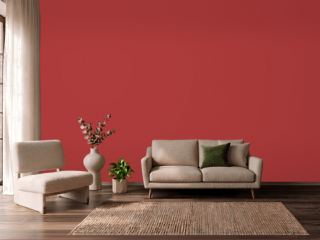 IndiscreetBehr UL110-6
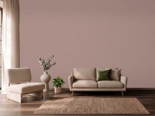 Sulking Room PinkFarrow & Ball 295
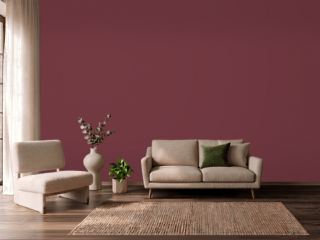 Fine WineSherwin-Williams SW 6307
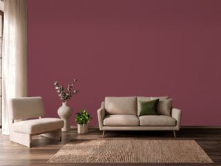 Wine TastingBehr S-H-110
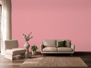 Secret GardenBenjamin Moore 1284
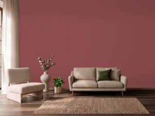 Eating Room RedFarrow & Ball 43
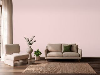 Charming PinkSherwin-Williams SW 6309
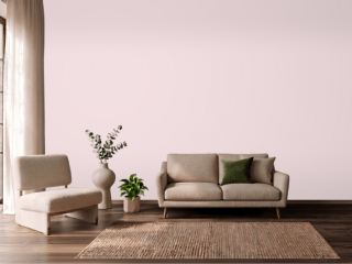 Berry TaffyValspar 1006-6C
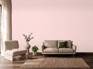 Ballet SlippersBenjamin Moore 1331
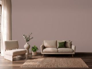 Cocoa BerrySherwin-Williams SW 9078
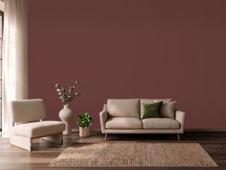 Chipotle PasteBehr PPU2-1
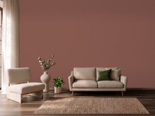 Canyon ClaySherwin-Williams SW 6054
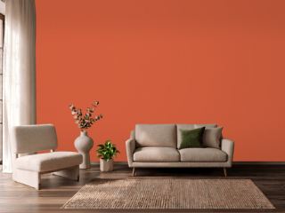 Charlotte's LocksFarrow & Ball 268
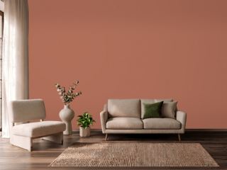 Sunset OrangeBehr BXC-39