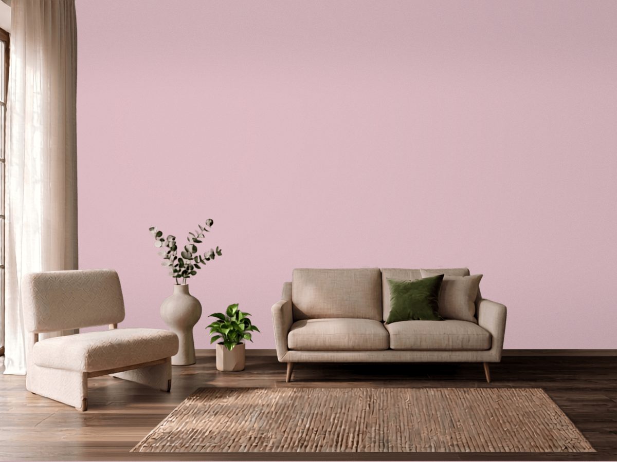
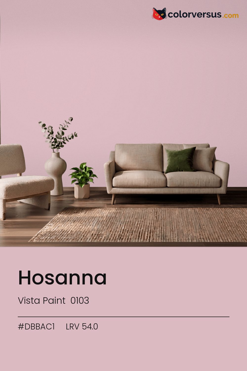
Vista Paint 0103Vista Paint 0103
A dependable middle ground, carried by a pink undertone that reads clearly without needing bright light to prove it. Vista Paint catalogs it as Hosanna, 0103.
54.0 on the light-reflectance scale puts it in the middle third, which is the part of the scale with the fewest surprises. A chroma of 13.0 is enough to register as a real color choice, without the intensity that would force the rest of a room to match it.
Bedrooms and living rooms, where it is seen in lamplight as much as daylight. This is a color worth testing in the specific room it is going in - cool colors shift more than warm ones do between north and south walls. Dunn-Edwards Lighthouse makes a good second wall color here - different enough to read as a real choice, close enough to still feel related (about 36.3 points apart in light reflectance).
In warm light this stays pink; under cooler, daylight-style bulbs it can slide toward red. It's close enough to that edge that a sample is worth checking in the room's own lighting, not under a store's. Rooms already built around greens are the hardest fit for this color - the two are opposites, and opposites next to each other rarely feel calm.
Warm metals - brass, aged gold, unlacquered fixtures - gain a contrast against this that they do not have against a lighter wall; it is a common reason people choose a color this deep in the first place. For layering, pair this with a clearly lighter mid-tone on a secondary wall or cabinetry, and keep the ceiling close to white. The gap between each step should be big enough to see without thinking about it (roughly 54.0 / 70 / 85 on the reflectance scale).
PPG Nostalgia (1049-3) runs close enough - delta-E 1.83 - that swapping brands should not change how the room looks. This is a relatively uncrowded spot in the spectrum - just 1 color from other brands come this close. A satin finish is worth it in a room that needs to be wiped down often, at the cost of showing a bit more of the wall's surface than a flat finish would.
It is lighter than 58 percent of the Vista Paint range. Vista Paint lists it in the C codes, alongside 1,421 other colors.
Vista Paint Hosanna is a warm color: its hue angle is 4° in CIE Lab at a chroma of 12.9, with a pink undertone.
The light reflectance value (LRV) of Vista Paint Hosanna (0103) is 54.0, on a scale where 0 is absolute black and 100 is absolute white, which makes it a light-to-mid color.
Measured on the color wheel, Vista Paint Hosanna pairs with PPG Serendipity (1230-2, complement), PPG Blossom Pink (1016-2, analogous, warmer), Behr Heart To Heart (M120-4, analogous, cooler), Dunn-Edwards Lighthouse (DEW385, soft accent).
Vista Paint Hosanna's hex value is #DBBAC1, RGB 219, 186, 193.
Vista Paint Hosanna is classified as a pink, with a pink undertone.
The nearest Pantone TCX color to Vista Paint Hosanna is 13-1904 TCX Chalk Pink, delta-E 4.06; the nearest RAL Classic is RAL 3015 Light pink, delta-E 11.66. Neither is an exact match.
The closest cross-brand match to Vista Paint Hosanna is PPG Nostalgia (1049-3), at a delta-E of 1.83.
| HEX | #DBBAC1 |
| RGB | 219, 186, 193 |
| CMYK | 0%, 15%, 12%, 14% |
| HSL | 347°, 31%, 79% |
| HSV | 347°, 15%, 86% |
| CIE Lab | 78.48, 12.92, 0.85 |
| LCh | 78.48, 12.95, 3.8° |
| XYZ | 56.4, 54.03, 57.9 |
| Pantone (nearest) | 13-1904 TCX Chalk Pink · ΔE 4.06 |
| RAL (nearest) | RAL 3015 Light pink · ΔE 11.66 |
| 13-1904 TCX Chalk Pink | ΔE 4.06 | |
| 13-2803 TCX Pale Lilac | ΔE 4.5 | |
| 14-1905 TCX Lotus | ΔE 4.83 | |
| RAL 3015 Light pink | ΔE 11.66 |
Pantone TCX and RAL Classic are physical standards; these are their published sRGB approximations, so check a fan deck before specifying. Pantone® and RAL are trademarks of their respective owners.
Shades mix the color toward black, tints toward white. Click any step to find the paint colors closest to it.
One image with Hosanna and its closest color at every other brand, measured by delta-E.
 Impatiens PetalSherwin-Williams SW 6582
 Exuberant PinkSherwin-Williams SW 6840
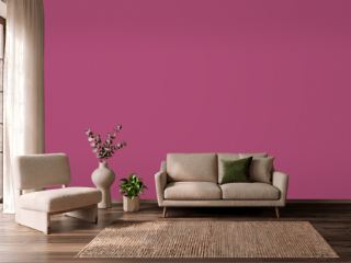 Hot PinkBehr 100B-7
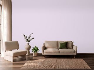 Lavender VistaPPG 1249-2
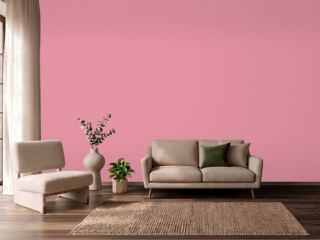 Jaipur PinkSherwin-Williams SW 6577
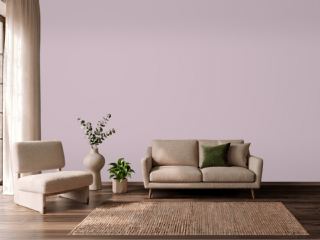 Mauve FinerySherwin-Williams SW 6282
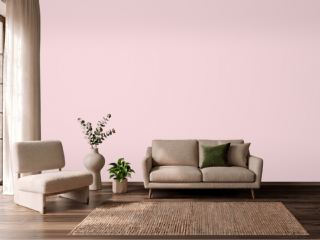 Pink DynastyBenjamin Moore 1352
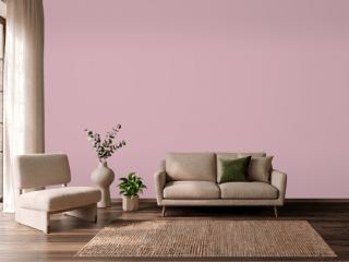 Noah's ArkVista Paint 8704
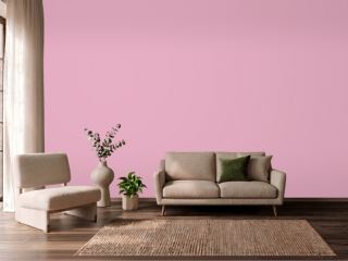 StrawberryBenjamin Moore 2085-50
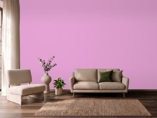 Exotic VioletDunn-Edwards DE5003
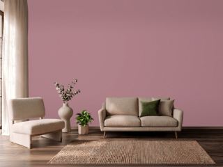 Audrey's BlushSherwin-Williams SW 9001
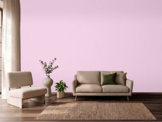 Pink OdysseyValspar 1001-2B
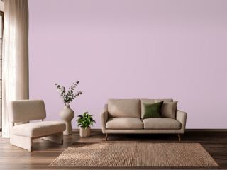 Hidden SanctuaryBenjamin Moore 1375
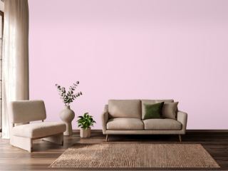 HopefulBehr 690A-2
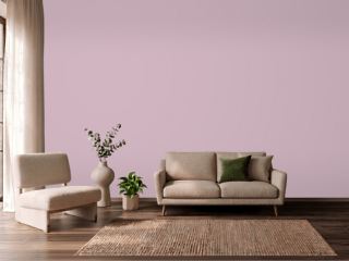 Candlelight DinnerBehr S120-3
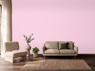 Summer CosmosVista Paint 1120