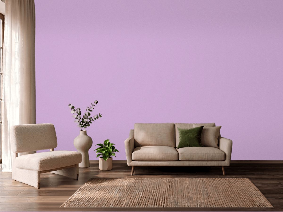
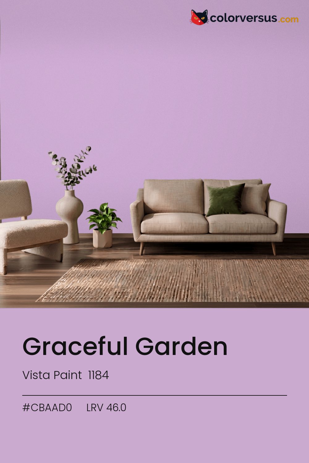
Vista Paint 1184Vista Paint 1184
There is nothing quiet about this one - it is meant to be noticed. Graceful Garden is Vista Paint's 1184.
Chroma 23.8 is high enough to dominate a room's palette rather than join it. Used across a whole room it needs restraint in the decor - furniture and textiles that stay quiet so the wall can carry the color.
This is a color worth testing in the specific room it is going in - cool colors shift more than warm ones do between north and south walls. LRV 46.0 puts it in the middle of the scale, but saturation, not lightness, is what you will react to.
If the room already has greens in the floor, a rug, or the furniture, this color will fight it rather than sit well beside it - the two sit at opposite ends of the color spectrum, which is exactly why they clash instead of blend.
The lighter the trim beside this, the more it will seem to glow - a side effect of the light-reflectance gap rather than anything special about the trim color. A natural scheme here moves in three clear steps: this color on the main wall, a noticeably lighter mid-tone for a second wall or built-in, and a near-white on the ceiling. Each jump should be obvious at a glance, not something you have to squint to tell apart (roughly 46.0, 66 and 85 on the light-reflectance scale, for reference).
For a secondary wall, Dunn-Edwards Lighthouse gives a natural step up in brightness without feeling like a mismatch (roughly 44.3 LRV points apart). If the wall needs to be washable, eggshell is the highest sheen worth considering before the color starts looking artificial under light.
Switching brands, Valspar Plink (4001-10A) is the closest equivalent at delta-E 2.28, near enough for most rooms. Across the other brands, nothing lands within delta-E 2 of this one - there is no easy substitute.
It is lighter than 48 percent of the Vista Paint range. Vista Paint lists it in the C codes, alongside 1,421 other colors.
Vista Paint Graceful Garden sits between warm and cool: its hue angle is 322° in CIE Lab at a chroma of 23.8, with a purple.
The light reflectance value (LRV) of Vista Paint Graceful Garden (1184) is 46.0, on a scale where 0 is absolute black and 100 is absolute white, which makes it a mid-tone color.
Measured on the color wheel, Vista Paint Graceful Garden pairs with Vista Paint Celtic Spring (0728, complement), Vista Paint Noteworthy (1204, analogous, warmer), Dunn-Edwards Ode to Purple (DE5962, analogous, cooler), Dunn-Edwards Lighthouse (DEW385, soft accent).
Vista Paint Graceful Garden's hex value is #CBAAD0, RGB 203, 170, 208.
Vista Paint Graceful Garden is classified as a pink, with a purple.
The nearest Pantone TCX color to Vista Paint Graceful Garden is 15-3412 TCX Orchid Bouquet, delta-E 2.85; the nearest RAL Classic is RAL 4009 Pastel violet, delta-E 19.55.
The closest cross-brand match to Vista Paint Graceful Garden is Valspar Plink (4001-10A), at a delta-E of 2.28.
| HEX | #CBAAD0 |
| RGB | 203, 170, 208 |
| CMYK | 2%, 18%, 0%, 18% |
| HSL | 292°, 29%, 74% |
| HSV | 292°, 18%, 82% |
| CIE Lab | 73.55, 18.7, -14.78 |
| LCh | 73.55, 23.84, 321.7° |
| XYZ | 50.39, 46, 65.89 |
| Pantone (nearest) | 15-3412 TCX Orchid Bouquet · ΔE 2.85 |
| RAL (nearest) | RAL 4009 Pastel violet · ΔE 19.55 |
| 15-3412 TCX Orchid Bouquet | ΔE 2.85 | |
| 15-3620 TCX Lavendula | ΔE 4.46 | |
| 14-3612 TCX Orchid Bloom | ΔE 4.57 | |
| RAL 4009 Pastel violet | ΔE 19.55 |
Pantone TCX and RAL Classic are physical standards; these are their published sRGB approximations, so check a fan deck before specifying. Pantone® and RAL are trademarks of their respective owners.
Shades mix the color toward black, tints toward white. Click any step to find the paint colors closest to it.
One image with Graceful Garden and its closest color at every other brand, measured by delta-E.
 Impatiens PetalSherwin-Williams SW 6582
 Exuberant PinkSherwin-Williams SW 6840
 Hot PinkBehr 100B-7
 Lavender VistaPPG 1249-2
 Jaipur PinkSherwin-Williams SW 6577
 Mauve FinerySherwin-Williams SW 6282
 Pink DynastyBenjamin Moore 1352
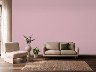 Noah's ArkVista Paint 8704
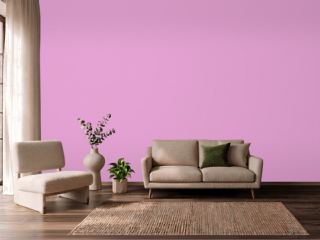 Exotic VioletDunn-Edwards DE5003
 StrawberryBenjamin Moore 2085-50
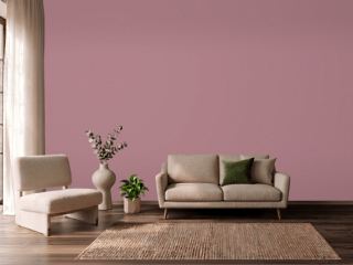 Audrey's BlushSherwin-Williams SW 9001
 Pink OdysseyValspar 1001-2B
 Candlelight DinnerBehr S120-3
 Hidden SanctuaryBenjamin Moore 1375
 HopefulBehr 690A-2
 Summer CosmosVista Paint 1120