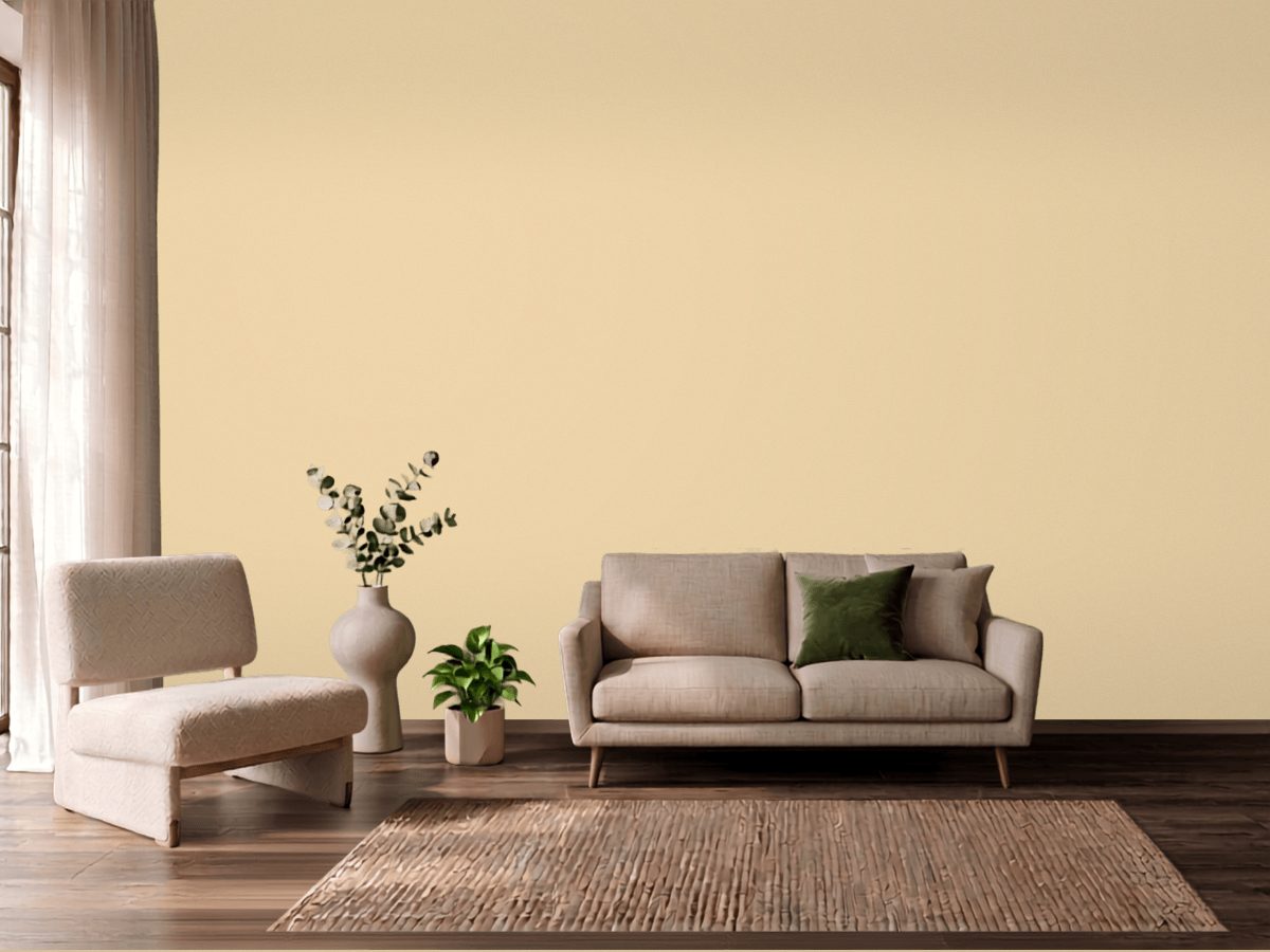
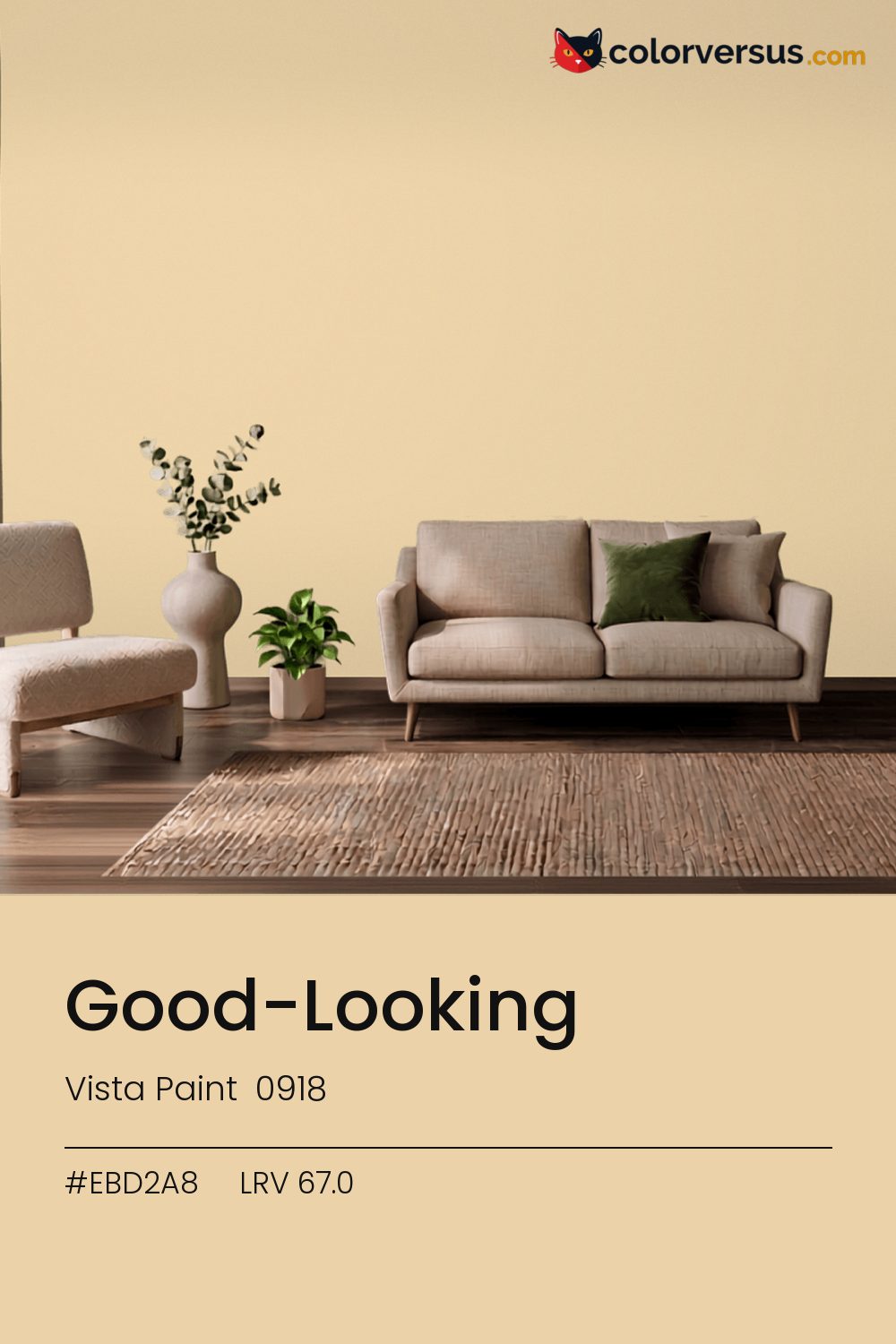
Vista Paint 0918Vista Paint 0918
There is no reading this as a background color. In the Vista Paint lineup this is 0918.
At chroma 24.2 it will not sit quietly next to another strong color. Best reserved for rooms you pass through or visit rather than ones you spend hours in - the intensity that makes a strong first impression can tire the eye over a full day.
It holds up in a north-facing room, which is where warmth is usually missing. 67.0 on the light-reflectance scale is unremarkable on its own; the chroma is what actually drives how this color behaves.
This color and blues and cool greys don't get along in the same room - they sit on opposite sides of the spectrum, so pairing them tends to feel like tension rather than contrast.
Anything pale placed against this wall will look paler than it is; anything warm-metal will look warmer. Neither is an illusion the color plays deliberately - it is simple contrast, but worth planning rather than discovering.
If a second wall color is wanted in the same room, Dunn-Edwards Boysenberry Shadow keeps the jump obvious rather than muddy (roughly 22.6 LRV points from this one). A flatter finish keeps this much color from creating harsh reflections.
If the brand is not fixed, Benjamin Moore Safari (AF-335) is the same color by measurement - delta-E 0.41. 5 other-brand colors land within delta-E 2 of this one - a well-populated part of the spectrum with several near-equivalents to choose from.
It is lighter than 69 percent of the Vista Paint range. Among tans it is one of the strongest: only 1 percent of them carry more colour. Vista Paint lists it in the C codes, alongside 1,421 other colors.
Vista Paint Good-Looking is a warm color: its hue angle is 84° in CIE Lab at a chroma of 24.2, with a yellow.
The light reflectance value (LRV) of Vista Paint Good-Looking (0918) is 67.0, on a scale where 0 is absolute black and 100 is absolute white, which makes it a light-to-mid color.
Measured on the color wheel, Vista Paint Good-Looking pairs with Dunn-Edwards Sky High (DE5891, complement), PPG Spring Blossom (1216-3, analogous, warmer), Behr Modestly Peach (160B-4, analogous, cooler), Dunn-Edwards Boysenberry Shadow (DEW391, soft accent).
Vista Paint Good-Looking's hex value is #EBD2A8, RGB 235, 210, 168.
Vista Paint Good-Looking is classified as a tan, with a yellow.
The nearest Pantone TCX color to Vista Paint Good-Looking is 13-0916 TCX Chamomile, delta-E 1; the nearest RAL Classic is RAL 1014 Ivory, delta-E 5.02.
The closest cross-brand match to Vista Paint Good-Looking is Benjamin Moore Safari (AF-335), at a delta-E of 0.41 - close enough to be the same color by measurement.
| HEX | #EBD2A8 |
| RGB | 235, 210, 168 |
| CMYK | 0%, 11%, 29%, 8% |
| HSL | 38°, 63%, 79% |
| HSV | 38°, 29%, 92% |
| CIE Lab | 85.29, 2.49, 24.03 |
| LCh | 85.29, 24.16, 84.1° |
| XYZ | 64.38, 66.58, 46.5 |
| Pantone (nearest) | 13-0916 TCX Chamomile · ΔE 1 |
| RAL (nearest) | RAL 1014 Ivory · ΔE 5.02 |
| 13-0916 TCX Chamomile | ΔE 1 | |
| 12-0714 TCX Cornhusk | ΔE 2.3 | |
| 13-0814 TCX Summer Melon | ΔE 2.79 | |
| RAL 1014 Ivory | ΔE 5.02 |
Pantone TCX and RAL Classic are physical standards; these are their published sRGB approximations, so check a fan deck before specifying. Pantone® and RAL are trademarks of their respective owners.
Shades mix the color toward black, tints toward white. Click any step to find the paint colors closest to it.
One image with Good-Looking and its closest color at every other brand, measured by delta-E.
 Accessible BeigeSherwin-Williams SW 7036
 Natural LinenSherwin-Williams SW 9109
 Studio TaupeSherwin-Williams SW 7549
 Sashay SandSherwin-Williams SW 6051
 Farrow's CreamFarrow & Ball 67
 CreamySherwin-Williams SW 7012
 Setting PlasterFarrow & Ball 231
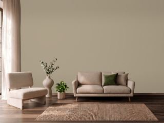 TurretBenjamin Moore CC-604
 Polar BearSherwin-Williams SW 7564
 New WhiteFarrow & Ball 59
 Koral KicksSherwin-Williams SW 6610
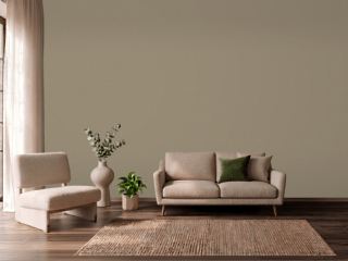 Mouse's BackFarrow & Ball 40
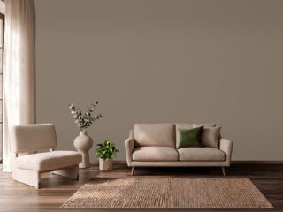 Warm StoneSherwin-Williams SW 7032
 Soft CreamPPG 1205-2
 Lily of the ValleyBenjamin Moore 905
 Coconut ShellBehr PPU5-05