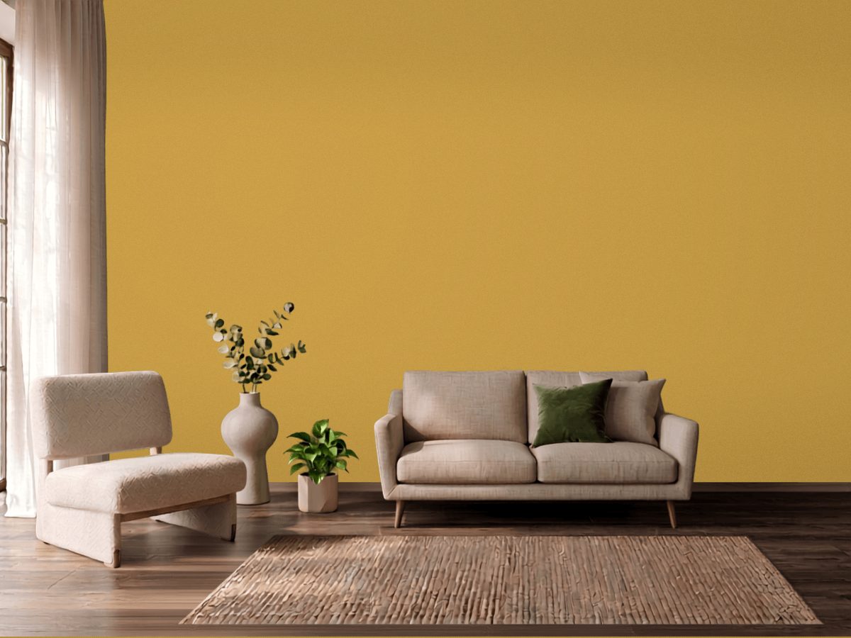
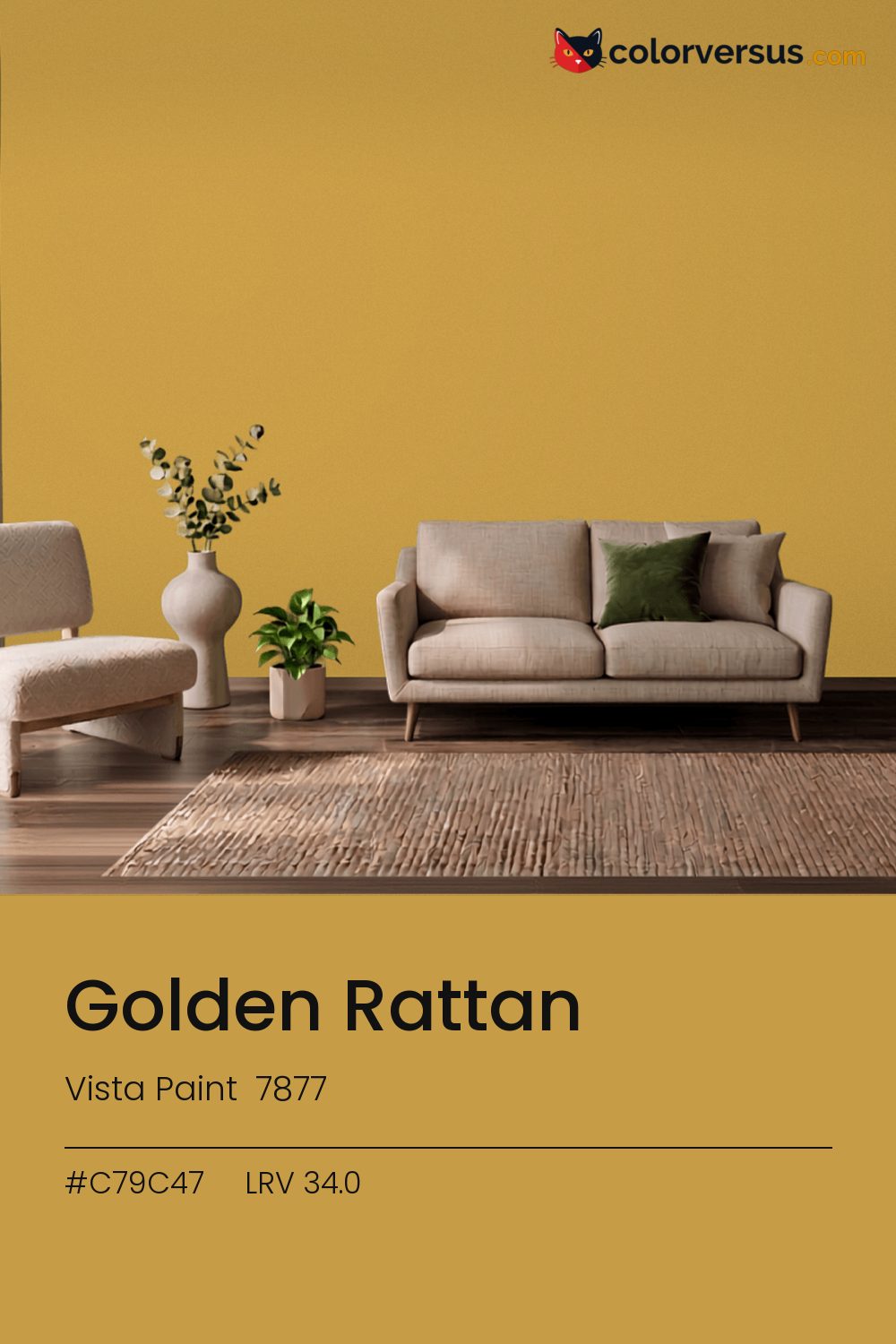
Vista Paint 7877Vista Paint 7877
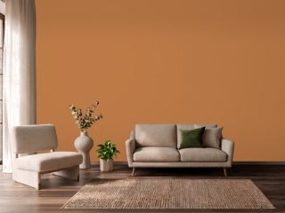
Strong enough that it sets the palette for the room, not the other way around. 7877 in the Vista Paint range.
Chroma 49.9 is high enough that the color will bounce onto light surfaces, so expect it everywhere, not only on the wall. In a room with plenty of natural light, this can cover more wall area than it could in a dim one, where the same color reads heavier.
In a room that gets little direct sun, this color's warmth does some of the work daylight would otherwise be doing. LRV 34.0 tells you how much light comes back, which matters less here than how much color comes with it.
Not quite orange, not quite yellow - this sits right where the two meet, so the room's own lighting ends up deciding which one you actually see. Worth checking before committing to a full wall: blues and cool greys nearby - in a floor, a rug, a piece of furniture - will read as a clash here, not a complement, since the two colors sit at opposite ends of the spectrum.
Next to it, white trim reads brighter and cooler than it does anywhere else in the house - the gap in light reflectance is what does that, not the trim paint itself. The safest multi-color scheme moves from this dark wall to a noticeably lighter secondary tone, then to a near-white ceiling - three genuinely different depths rather than three shades of the same idea (LRV 34.0, 60 and 85, if you're matching by the numbers).
Benjamin Moore Celestia Blue pairs well as a second surface - close enough in feel to belong in the same room, far enough in lightness to read as two distinct walls (about 32.1 points apart on the reflectance scale). Matte suits a color this strong - a glossier sheen would turn every light source in the room into a visible hotspot on the wall.
For anyone tied to a different brand, Benjamin Moore Fields of Gold (203) is the nearest stand-in, at a delta-E of 2.53. No other brand has a color within delta-E 2 of this one - a genuinely uncommon shade.
It is lighter than 32 percent of the Vista Paint range. Vista Paint lists it in the K codes, alongside 1,318 other colors.
Vista Paint Golden Rattan is a warm color: its hue angle is 82° in CIE Lab at a chroma of 49.9, with a yellow.
The light reflectance value (LRV) of Vista Paint Golden Rattan (7877) is 34.0, on a scale where 0 is absolute black and 100 is absolute white, which makes it a mid-tone color.
Measured on the color wheel, Vista Paint Golden Rattan pairs with Dutch Boy Blue Sea (VS-9451, complement), Dunn-Edwards Asparagus Fern (DE5551, analogous, warmer), Behr Glowing Firelight (S-G-200, analogous, cooler), Benjamin Moore Celestia Blue (1429, soft accent).
Vista Paint Golden Rattan's hex value is #C79C47, RGB 199, 156, 71.
Vista Paint Golden Rattan is classified as a orange, with a yellow.
The nearest Pantone TCX color to Vista Paint Golden Rattan is 15-0948 TCX Chinese Yellow, delta-E 3.1; the nearest RAL Classic is RAL 1024 Ochre yellow, delta-E 9.49. Neither is an exact match.
The closest cross-brand match to Vista Paint Golden Rattan is Benjamin Moore Fields of Gold (203), at a delta-E of 2.53.
| HEX | #C79C47 |
| RGB | 199, 156, 71 |
| CMYK | 0%, 22%, 64%, 22% |
| HSL | 40°, 53%, 53% |
| HSV | 40°, 64%, 78% |
| CIE Lab | 66.8, 6.78, 49.47 |
| LCh | 66.8, 49.93, 82.2° |
| XYZ | 36.58, 36.38, 11.05 |
| Pantone (nearest) | 15-0948 TCX Chinese Yellow · ΔE 3.1 |
| RAL (nearest) | RAL 1024 Ochre yellow · ΔE 9.49 |
| 15-0948 TCX Chinese Yellow | ΔE 3.1 | |
| 16-0947 TCX Bright Gold | ΔE 4.38 | |
| 16-0946 TCX Honey | ΔE 4.69 | |
| RAL 1024 Ochre yellow | ΔE 9.49 |
Pantone TCX and RAL Classic are physical standards; these are their published sRGB approximations, so check a fan deck before specifying. Pantone® and RAL are trademarks of their respective owners.
Shades mix the color toward black, tints toward white. Click any step to find the paint colors closest to it.
One image with Golden Rattan and its closest color at every other brand, measured by delta-E.
 Luscious LemonBehr HDC-MD-24
 Friendly TanValspar 2008-8A
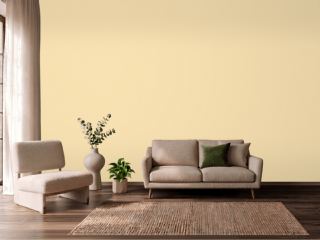 Banana CreamSherwin-Williams SW 6673
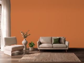 YamSherwin-Williams SW 6643
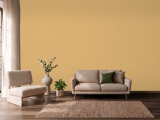 Tavern OchreBenjamin Moore CW-375
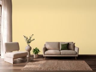 Butter UpSherwin-Williams SW 6681
 Champagne PinkValspar 2004-4C
 SoléSherwin-Williams SW 6896
 PastaDunn-Edwards DE5331
 GranolaDunn-Edwards DE5296
 They call it MellowSherwin-Williams SW 9015
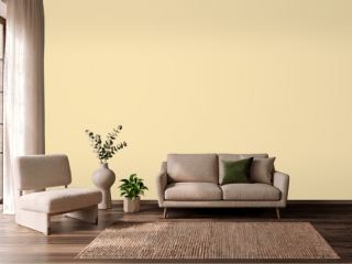 Friendly YellowSherwin-Williams SW 6680
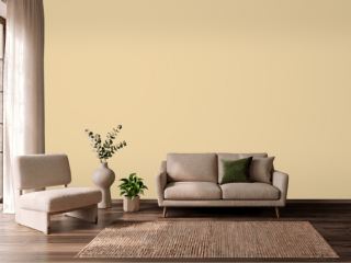 Dorset CreamFarrow & Ball 68
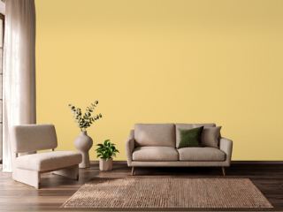 CitronFarrow & Ball 74
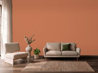 Brick OrangeDutch Boy 7476
 PumpkinVista Paint 1335