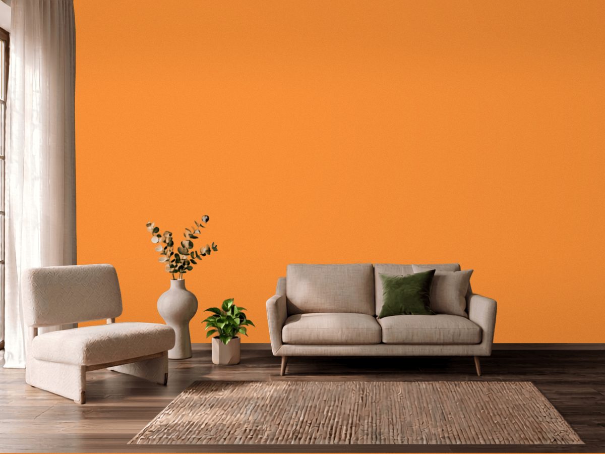
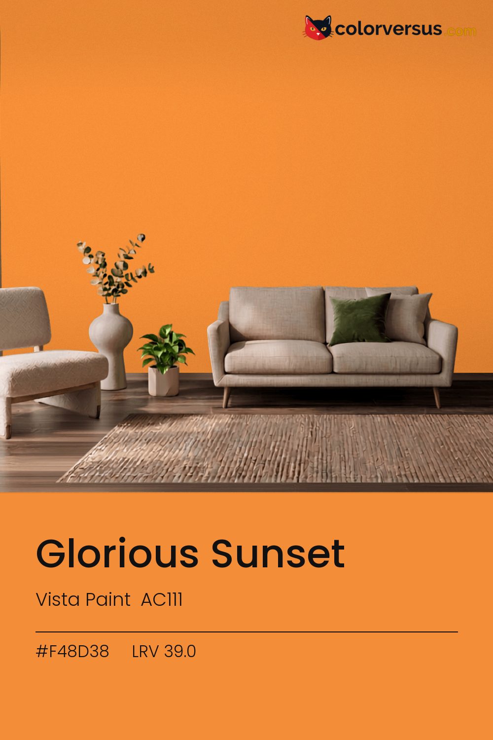
Vista Paint AC111Vista Paint AC111
This is a statement first and a wall color second. Vista Paint lists it as Glorious Sunset (AC111).
At chroma 68.0 it will not sit quietly next to another strong color. Used across a whole room it needs restraint in the decor - furniture and textiles that stay quiet so the wall can carry the color.
In a room that gets little direct sun, this color's warmth does some of the work daylight would otherwise be doing. 39.0 on the light-reflectance scale is unremarkable on its own; the chroma is what actually drives how this color behaves.
Depending on the bulb, this can genuinely read as orange or as red - it sits right on the border between the two, only 11° apart. Worth checking before committing to a full wall: blues and cool greys nearby - in a floor, a rug, a piece of furniture - will read as a clash here, not a complement, since the two colors sit at opposite ends of the spectrum.
Wood tones next to this read darker and richer than they do against a paler wall; it is one of the more dependable effects of putting a light-absorbing color next to anything reflective. The safest multi-color scheme moves from this dark wall to a noticeably lighter secondary tone, then to a near-white ceiling - three genuinely different depths rather than three shades of the same idea (LRV 39.0, 62 and 85, if you're matching by the numbers).
If a second wall color is wanted in the same room, Benjamin Moore White Satin keeps the jump obvious rather than muddy (roughly 37.5 LRV points from this one). A flatter finish keeps this much color from creating harsh reflections.
No other brand has a color within delta-E 2 of this one - a genuinely uncommon shade.
It is lighter than 39 percent of the Vista Paint range. This is a crowded part of the scale - 540 colors measure within a point of 39.0 - so most brands will have something close. Among oranges it is one of the strongest: only 6 percent of them carry more colour. Vista Paint lists it in the K codes, alongside 1,318 other colors.
Vista Paint Glorious Sunset is a warm color: its hue angle is 61° in CIE Lab at a chroma of 68, with a orange.
The light reflectance value (LRV) of Vista Paint Glorious Sunset (AC111) is 39.0, on a scale where 0 is absolute black and 100 is absolute white, which makes it a mid-tone color.
Measured on the color wheel, Vista Paint Glorious Sunset pairs with PPG Magical Merlin (1241-5, complement), PPG Citrus Spice (1216-6, analogous, warmer), Benjamin Moore Orange (2011-10, analogous, cooler), Benjamin Moore White Satin (2067-70, soft accent).
Vista Paint Glorious Sunset's hex value is #F48D38, RGB 244, 141, 56.
Vista Paint Glorious Sunset is classified as a orange, with a orange.
The nearest Pantone TCX color to Vista Paint Glorious Sunset is 15-1153 TCX Apricot, delta-E 3.19; the nearest RAL Classic is RAL 2011 Deep orange, delta-E 7.36. Neither is an exact match.
| HEX | #F48D38 |
| RGB | 244, 141, 56 |
| CMYK | 0%, 42%, 77%, 4% |
| HSL | 27°, 90%, 59% |
| HSV | 27°, 77%, 96% |
| CIE Lab | 68.44, 32.96, 59.51 |
| LCh | 68.44, 68.03, 61° |
| XYZ | 47.55, 38.57, 8.68 |
| Pantone (nearest) | 15-1153 TCX Apricot · ΔE 3.19 |
| RAL (nearest) | RAL 2011 Deep orange · ΔE 7.36 |
| 15-1153 TCX Apricot | ΔE 3.19 | |
| 15-1151 TCX Iceland Poppy | ΔE 5.13 | |
| RAL 2011 Deep orange | ΔE 7.36 |
Pantone TCX and RAL Classic are physical standards; these are their published sRGB approximations, so check a fan deck before specifying. Pantone® and RAL are trademarks of their respective owners.
Shades mix the color toward black, tints toward white. Click any step to find the paint colors closest to it.
One image with Glorious Sunset and its closest color at every other brand, measured by delta-E.
 Luscious LemonBehr HDC-MD-24
 Friendly TanValspar 2008-8A
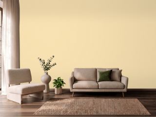 Banana CreamSherwin-Williams SW 6673
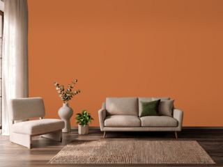 YamSherwin-Williams SW 6643
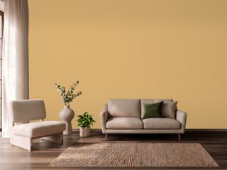 Tavern OchreBenjamin Moore CW-375
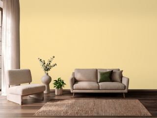 SoléSherwin-Williams SW 6896
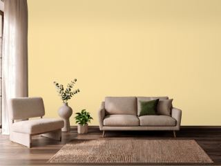 Butter UpSherwin-Williams SW 6681
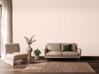 Champagne PinkValspar 2004-4C
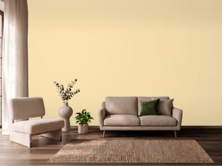 PastaDunn-Edwards DE5331
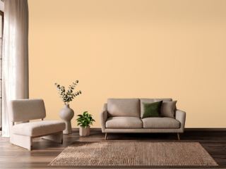 GranolaDunn-Edwards DE5296
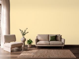 They call it MellowSherwin-Williams SW 9015
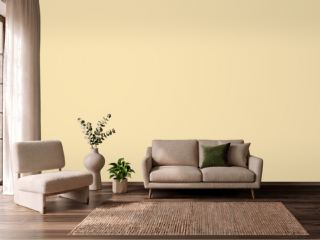 Friendly YellowSherwin-Williams SW 6680
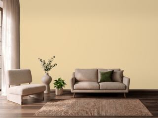 Dorset CreamFarrow & Ball 68
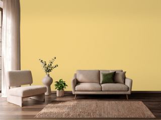 CitronFarrow & Ball 74
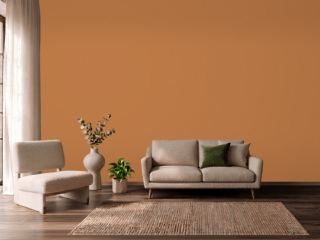 PumpkinVista Paint 1335
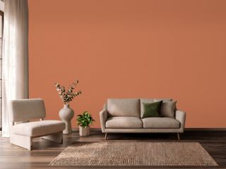 Brick OrangeDutch Boy 7476