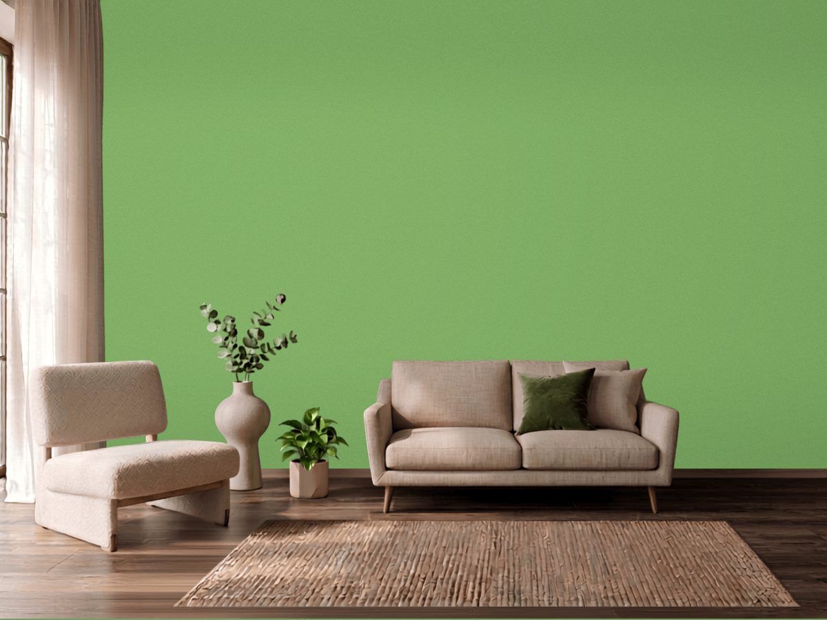
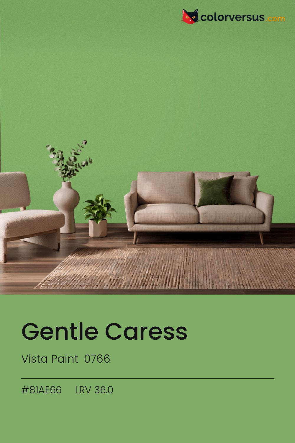
Vista Paint 0766Vista Paint 0766
A color built for commitment, not for blending in. 0766, from Vista Paint.
A chroma of 42.9 is well into the range where the color affects everything nearby - light fixtures, glossy surfaces, even skin tones under it. A powder room or a nook is often the right scale for a color this strong - enough impact without living with it in every sightline.
This is a color worth testing in the specific room it is going in - cool colors shift more than warm ones do between north and south walls. Light reflectance reads 36.0, though with this much color in it that number is the smaller half of the story.
This color sits right on the line between green and yellow - cooler light nudges it toward yellow, warmer light keeps it in green (about 4° apart on the color wheel, for anyone measuring). Rooms already built around purples are the hardest fit for this color - the two are opposites, and opposites next to each other rarely feel calm.
Next to it, white trim reads brighter and cooler than it does anywhere else in the house - the gap in light reflectance is what does that, not the trim paint itself. For layering, pair this with a clearly lighter mid-tone on a secondary wall or cabinetry, and keep the ceiling close to white. The gap between each step should be big enough to see without thinking about it (roughly 36.0 / 61 / 85 on the reflectance scale).
Vista Paint Easter Party makes a good second wall color here - different enough to read as a real choice, close enough to still feel related (about 33 points apart in light reflectance). This is not a color that benefits from shine - the saturation does the work, and a flat finish lets it do that evenly.
Across the other brands, nothing lands within delta-E 2 of this one - there is no easy substitute.
It is lighter than 33 percent of the Vista Paint range. This is a crowded part of the scale - 378 colors measure within a point of 36.0 - so most brands will have something close. Vista Paint lists it in the C codes, alongside 1,421 other colors.
Vista Paint Gentle Caress sits between warm and cool: its hue angle is 131° in CIE Lab at a chroma of 42.9, with a yellow-green.
The light reflectance value (LRV) of Vista Paint Gentle Caress (0766) is 36.0, on a scale where 0 is absolute black and 100 is absolute white, which makes it a mid-tone color.
Measured on the color wheel, Vista Paint Gentle Caress pairs with Dunn-Edwards Purple Pride (DE5991, complement), Vista Paint Lucerne (0730, analogous, warmer), PPG Do Not Disturb (1117-6, analogous, cooler), Vista Paint Easter Party (7187, soft accent).
Vista Paint Gentle Caress's hex value is #81AE66, RGB 129, 174, 102.
Vista Paint Gentle Caress is classified as a green, with a yellow-green.
The nearest Pantone TCX color to Vista Paint Gentle Caress is 15-6437 TCX Grass Green, delta-E 4.26; the nearest RAL Classic is RAL 6017 May green, delta-E 17.54. Neither is an exact match.
| HEX | #81AE66 |
| RGB | 129, 174, 102 |
| CMYK | 26%, 0%, 41%, 32% |
| HSL | 98°, 31%, 54% |
| HSV | 98°, 41%, 68% |
| CIE Lab | 66.44, -28.35, 32.18 |
| LCh | 66.44, 42.89, 131.4° |
| XYZ | 26.59, 35.9, 18.1 |
| Pantone (nearest) | 15-6437 TCX Grass Green · ΔE 4.26 |
| RAL (nearest) | RAL 6017 May green · ΔE 17.54 |
| 15-6437 TCX Grass Green | ΔE 4.26 | |
| RAL 6017 May green | ΔE 17.54 |
Pantone TCX and RAL Classic are physical standards; these are their published sRGB approximations, so check a fan deck before specifying. Pantone® and RAL are trademarks of their respective owners.
Shades mix the color toward black, tints toward white. Click any step to find the paint colors closest to it.
One image with Gentle Caress and its closest color at every other brand, measured by delta-E.
 Green SmokeFarrow & Ball 47
 Card Room GreenFarrow & Ball 79
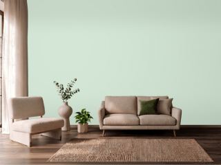 Mint ConditionSherwin-Williams SW 6743
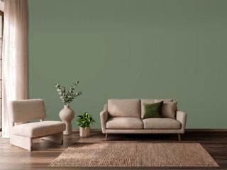 Avon GreenBenjamin Moore HC-126
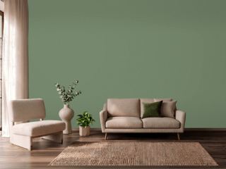 Calke GreenFarrow & Ball 34
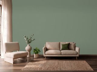 Privilege GreenSherwin-Williams SW 6193
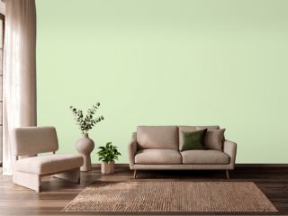 Sprig of MintValspar 6004-7B
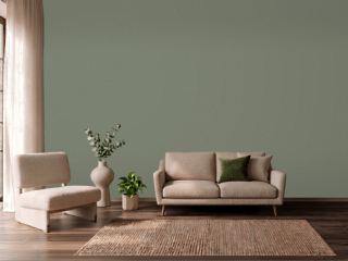 Dried ThymeSherwin-Williams SW 6186
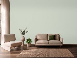 CastawayPPG 1129-3
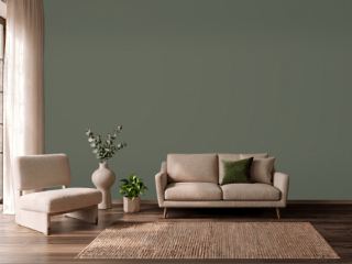 RosemarySherwin-Williams SW 6187
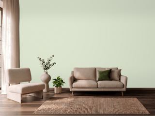 Gratifying GreenSherwin-Williams SW 6435
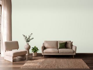 Spinach WhiteSherwin-Williams SW 6434
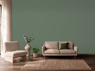 Cushing GreenBenjamin Moore HC-125
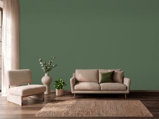 Peale GreenBenjamin Moore HC-121
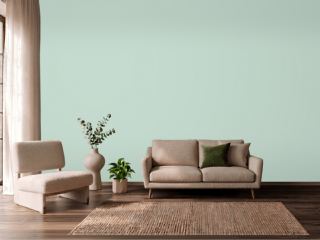 Aberdeen GreenBenjamin Moore 631
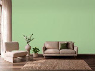 Oh PistachioSherwin-Williams SW 9033