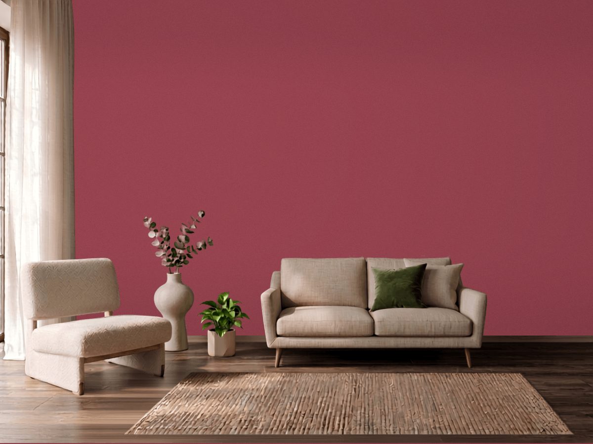
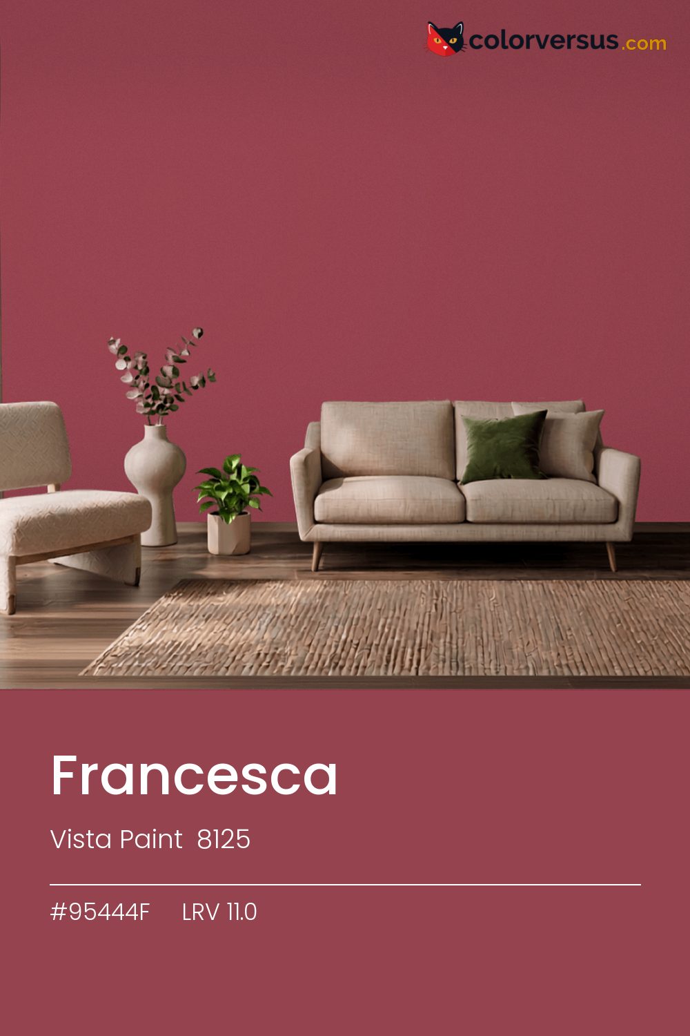
Vista Paint 8125Vista Paint 8125
At this depth the pink is not a color choice so much as a mood: it shows at the edges, in raking light, and nowhere else. Vista Paint catalogs it as Francesca, 8125.
At LRV 11.0 the walls stop contributing light altogether and the lamps have to do the work. Under warm light it softens; under daylight bulbs it goes hard and flat, with the pink only really visible in the warmer of the two.
In warm light this stays red; under cooler, daylight-style bulbs it can slide toward pink. It's close enough to that edge that a sample is worth checking in the room's own lighting, not under a store's. Worth checking before committing to a full wall: greens nearby - in a floor, a rug, a piece of furniture - will read as a clash here, not a complement, since the two colors sit at opposite ends of the spectrum.
Next to it, white trim reads brighter and cooler than it does anywhere else in the house - the gap in light reflectance is what does that, not the trim paint itself. The safest multi-color scheme moves from this dark wall to a noticeably lighter secondary tone, then to a near-white ceiling - three genuinely different depths rather than three shades of the same idea (LRV 11.0, 48 and 85, if you're matching by the numbers).
A single accent wall opposite the main window lets daylight hit it directly, which is where a color this dark actually shows its undertone. Benjamin Moore Wales Gray makes a good second wall color here - different enough to read as a real choice, close enough to still feel related (about 42.5 points apart in light reflectance).
If the wall has any texture or repair work, matte is worth the trade-off even though it holds up to less scrubbing than a satin or eggshell.
Valspar Baked Bahama (1006-3A) runs close enough - delta-E 1.09 - that swapping brands should not change how the room looks. Only 1 other-brand color land within delta-E 2 of this one, which makes it comparatively unusual.
It is lighter than 8 percent of the Vista Paint range. This is a crowded part of the scale - 546 colors measure within a point of 11.0 - so most brands will have something close. Vista Paint lists it in the K codes, alongside 1,318 other colors.
Vista Paint Francesca is a warm color: its hue angle is 16° in CIE Lab at a chroma of 36.5, with a pink.
The light reflectance value (LRV) of Vista Paint Francesca (8125) is 11.0, on a scale where 0 is absolute black and 100 is absolute white, which makes it a very dark color.
Measured on the color wheel, Vista Paint Francesca pairs with PPG Jewel Weed (1230-5, complement), Behr Smoldering Copper (QE-13, analogous, warmer), Benjamin Moore Summer Plum (2074-20, analogous, cooler), Benjamin Moore Wales Gray (1585, soft accent).
Vista Paint Francesca's hex value is #95444F, RGB 149, 68, 79.
Vista Paint Francesca is classified as a red, with a pink.
The nearest Pantone TCX color to Vista Paint Francesca is 18-1631 TCX Earth Red, delta-E 1.02; the nearest RAL Classic is RAL 4002 Red violet, delta-E 4.55.
The closest cross-brand match to Vista Paint Francesca is Valspar Baked Bahama (1006-3A), at a delta-E of 1.09.
| HEX | #95444F |
| RGB | 149, 68, 79 |
| CMYK | 0%, 54%, 47%, 42% |
| HSL | 352°, 37%, 43% |
| HSV | 352°, 54%, 58% |
| CIE Lab | 39.73, 35.13, 9.94 |
| LCh | 39.73, 36.51, 15.8° |
| XYZ | 15.87, 11.09, 8.7 |
| Pantone (nearest) | 18-1631 TCX Earth Red · ΔE 1.02 |
| RAL (nearest) | RAL 4002 Red violet · ΔE 4.55 |
| 18-1631 TCX Earth Red | ΔE 1.02 | |
| RAL 4002 Red violet | ΔE 4.55 |
Pantone TCX and RAL Classic are physical standards; these are their published sRGB approximations, so check a fan deck before specifying. Pantone® and RAL are trademarks of their respective owners.
Shades mix the color toward black, tints toward white. Click any step to find the paint colors closest to it.
One image with Francesca and its closest color at every other brand, measured by delta-E.
 Red EarthFarrow & Ball 64
 Southwest PotteryBenjamin Moore 048
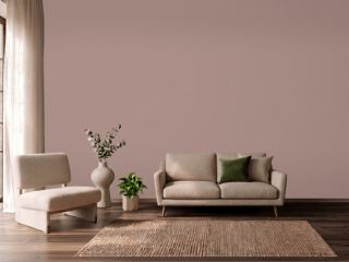 Sulking Room PinkFarrow & Ball 295
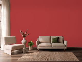 IndiscreetBehr UL110-6
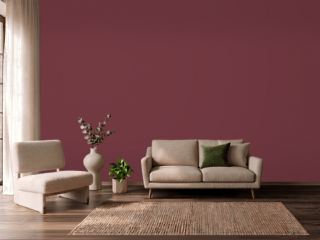 Fine WineSherwin-Williams SW 6307
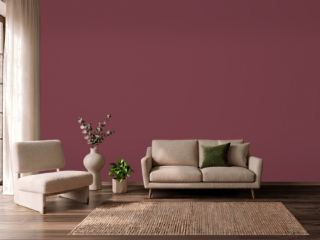 Wine TastingBehr S-H-110
 Secret GardenBenjamin Moore 1284
 Charming PinkSherwin-Williams SW 6309
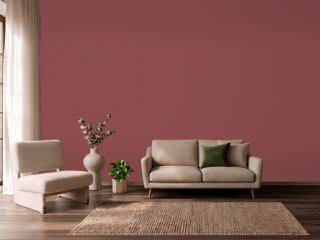 Eating Room RedFarrow & Ball 43
 Berry TaffyValspar 1006-6C
 Cocoa BerrySherwin-Williams SW 9078
 Ballet SlippersBenjamin Moore 1331
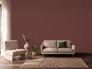 Chipotle PasteBehr PPU2-1
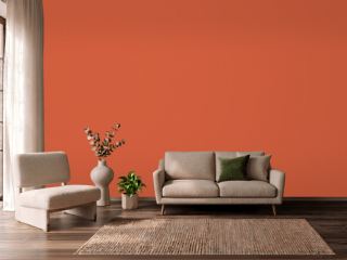 Charlotte's LocksFarrow & Ball 268
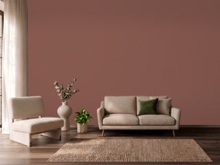 Canyon ClaySherwin-Williams SW 6054
 Sunset OrangeBehr BXC-39