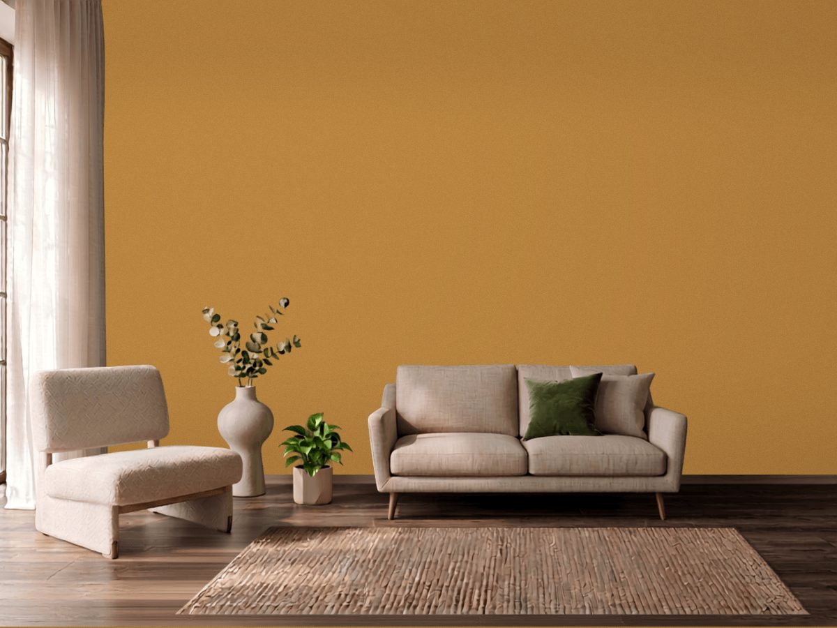
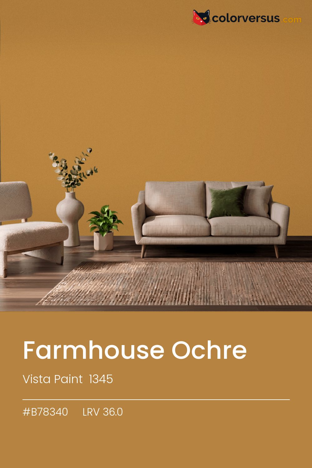
Vista Paint 1345Vista Paint 1345
A color with enough presence that "accent" is really the only honest use for it. Vista Paint catalogs it as Farmhouse Ochre, 1345.
A chroma of 45.2 is well into the range where the color affects everything nearby - light fixtures, glossy surfaces, even skin tones under it. A powder room or a nook is often the right scale for a color this strong - enough impact without living with it in every sightline.
Afternoon sun will push the yellow further warm; if that reads as too much, a cooler bulb in the room can pull it back. Light reflectance reads 36.0, though with this much color in it that number is the smaller half of the story.
This color sits right on the line between orange and yellow - cooler light nudges it toward yellow, warmer light keeps it in orange (about 11° apart on the color wheel, for anyone measuring). This color and blues and cool greys don't get along in the same room - they sit on opposite sides of the spectrum, so pairing them tends to feel like tension rather than contrast.
Next to it, white trim reads brighter and cooler than it does anywhere else in the house - the gap in light reflectance is what does that, not the trim paint itself. If the room needs more than one wall color, keep the steps far apart: this color, then something clearly lighter for a second surface, then a bright white above. Two similar tones just look like a mismatch; three distinct ones read as a plan (about 36.0 to 61 to 85 in LRV terms).
Vista Paint Kecia makes a good second wall color here - different enough to read as a real choice, close enough to still feel related (about 22 points apart in light reflectance). This is not a color that benefits from shine - the saturation does the work, and a flat finish lets it do that evenly.
Benjamin Moore Caramel Corn (2160-10) runs close enough - delta-E 1.55 - that swapping brands should not change how the room looks. Only 2 other-brand colors land within delta-E 2 of this one, which makes it comparatively unusual.
It is lighter than 33 percent of the Vista Paint range. This is a crowded part of the scale - 378 colors measure within a point of 36.0 - so most brands will have something close. Vista Paint lists it in the C codes, alongside 1,421 other colors.
Vista Paint Farmhouse Ochre is a warm color: its hue angle is 73° in CIE Lab at a chroma of 45.2, with a yellow.
The light reflectance value (LRV) of Vista Paint Farmhouse Ochre (1345) is 36.0, on a scale where 0 is absolute black and 100 is absolute white, which makes it a mid-tone color.
Measured on the color wheel, Vista Paint Farmhouse Ochre pairs with PPG Royal Plume (1243-6, complement), Benjamin Moore Limeade (CSP-865, analogous, warmer), PPG Rum Punch (1190-7, analogous, cooler), Vista Paint Kecia (7234, soft accent).
Vista Paint Farmhouse Ochre's hex value is #B78340, RGB 183, 131, 64.
Vista Paint Farmhouse Ochre is classified as a orange, with a yellow.
The nearest Pantone TCX color to Vista Paint Farmhouse Ochre is 17-1040 TCX Spruce Yellow, delta-E 3.2; the nearest RAL Classic is RAL 1024 Ochre yellow, delta-E 6. Neither is an exact match.
The closest cross-brand match to Vista Paint Farmhouse Ochre is Benjamin Moore Caramel Corn (2160-10), at a delta-E of 1.55.
| HEX | #B78340 |
| RGB | 183, 131, 64 |
| CMYK | 0%, 28%, 65%, 28% |
| HSL | 34°, 48%, 48% |
| HSV | 34°, 65%, 72% |
| CIE Lab | 58.67, 13.09, 43.29 |
| LCh | 58.67, 45.23, 73.2° |
| XYZ | 28.57, 26.67, 8.49 |
| Pantone (nearest) | 17-1040 TCX Spruce Yellow · ΔE 3.2 |
| RAL (nearest) | RAL 1024 Ochre yellow · ΔE 6 |
| 17-1040 TCX Spruce Yellow | ΔE 3.2 | |
| RAL 1024 Ochre yellow | ΔE 6 |
Pantone TCX and RAL Classic are physical standards; these are their published sRGB approximations, so check a fan deck before specifying. Pantone® and RAL are trademarks of their respective owners.
Shades mix the color toward black, tints toward white. Click any step to find the paint colors closest to it.
One image with Farmhouse Ochre and its closest color at every other brand, measured by delta-E.
 Luscious LemonBehr HDC-MD-24
 Friendly TanValspar 2008-8A
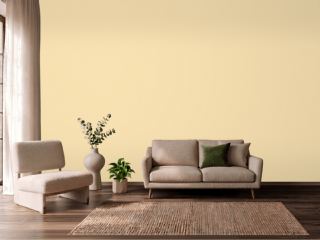 Banana CreamSherwin-Williams SW 6673
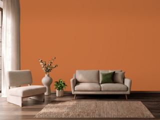 YamSherwin-Williams SW 6643
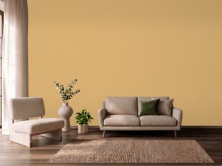 Tavern OchreBenjamin Moore CW-375
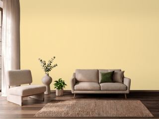 Butter UpSherwin-Williams SW 6681
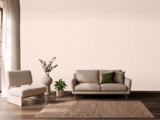 Champagne PinkValspar 2004-4C
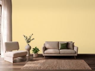 SoléSherwin-Williams SW 6896
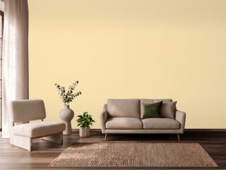 PastaDunn-Edwards DE5331
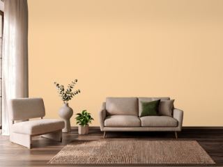 GranolaDunn-Edwards DE5296
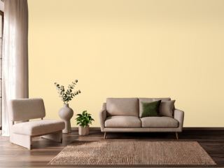 They call it MellowSherwin-Williams SW 9015
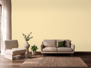 Friendly YellowSherwin-Williams SW 6680
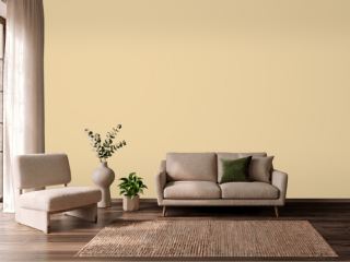 Dorset CreamFarrow & Ball 68
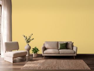 CitronFarrow & Ball 74
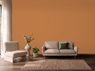 PumpkinVista Paint 1335
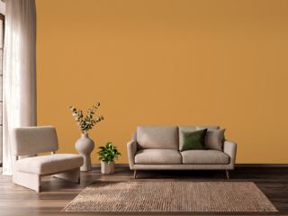 ChapultepecVista Paint 7933