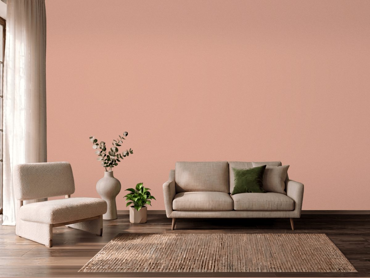
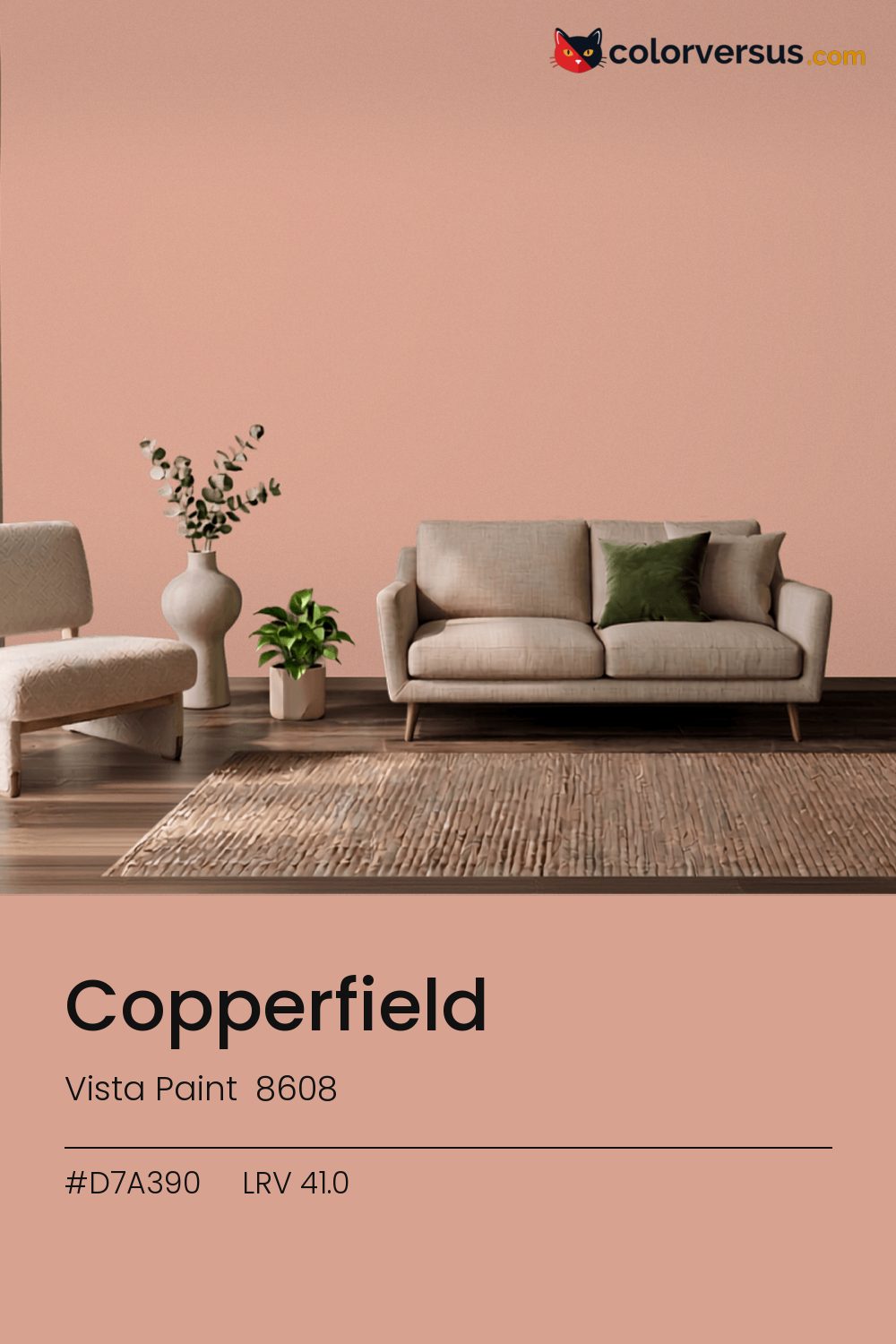
Vista Paint 8608Vista Paint 8608
There is no reading this as a background color. In the Vista Paint lineup this is 8608.
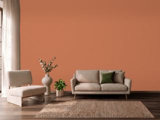
At chroma 24.0 it will not sit quietly next to another strong color. On one wall of an otherwise neutral room, this reads as a deliberate choice rather than an overwhelming one.
Afternoon sun will push the red further warm; if that reads as too much, a cooler bulb in the room can pull it back. 41.0 on the light-reflectance scale is unremarkable on its own; the chroma is what actually drives how this color behaves.
In warm light this stays orange; under cooler, daylight-style bulbs it can slide toward red. It's close enough to that edge that a sample is worth checking in the room's own lighting, not under a store's. If the room already has blues and cool greys in the floor, a rug, or the furniture, this color will fight it rather than sit well beside it - the two sit at opposite ends of the color spectrum, which is exactly why they clash instead of blend.
Anything pale placed against this wall will look paler than it is; anything warm-metal will look warmer. Neither is an illusion the color plays deliberately - it is simple contrast, but worth planning rather than discovering. A natural scheme here moves in three clear steps: this color on the main wall, a noticeably lighter mid-tone for a second wall or built-in, and a near-white on the ceiling. Each jump should be obvious at a glance, not something you have to squint to tell apart (roughly 41.0, 63 and 85 on the light-reflectance scale, for reference).
If a second wall color is wanted in the same room, Behr Maui Mist keeps the jump obvious rather than muddy (roughly 363 LRV points from this one). A flatter finish keeps this much color from creating harsh reflections.
Switching brands, Benjamin Moore Salmon Mousse (046) is the closest equivalent at delta-E 1.08, near enough for most rooms. This is a relatively uncrowded spot in the spectrum - just 2 colors from other brands come this close.
It is lighter than 42 percent of the Vista Paint range. Vista Paint lists it in the K codes, alongside 1,318 other colors.
Vista Paint Copperfield is a warm color: its hue angle is 46° in CIE Lab at a chroma of 24, with a red.
The light reflectance value (LRV) of Vista Paint Copperfield (8608) is 41.0, on a scale where 0 is absolute black and 100 is absolute white, which makes it a mid-tone color.
Measured on the color wheel, Vista Paint Copperfield pairs with Vista Paint Make a Splash (7345, complement), Benjamin Moore Golden Hills (262, analogous, warmer), Benjamin Moore Precious Pink (2084-40, analogous, cooler), Behr Maui Mist (BL-W10, soft accent).
Vista Paint Copperfield's hex value is #D7A390, RGB 215, 163, 144.
Vista Paint Copperfield is classified as a orange, with a red.
The nearest Pantone TCX color to Vista Paint Copperfield is 14-1316 TCX Dusty Pink, delta-E 3.47; the nearest RAL Classic is RAL 3012 Beige red, delta-E 10.1. Neither is an exact match.
The closest cross-brand match to Vista Paint Copperfield is Benjamin Moore Salmon Mousse (046), at a delta-E of 1.08.
| HEX | #D7A390 |
| RGB | 215, 163, 144 |
| CMYK | 0%, 24%, 33%, 16% |
| HSL | 16°, 47%, 70% |
| HSV | 16°, 33%, 84% |
| CIE Lab | 71.32, 16.63, 17.32 |
| LCh | 71.32, 24.01, 46.2° |
| XYZ | 46.16, 42.66, 32.18 |
| Pantone (nearest) | 14-1316 TCX Dusty Pink · ΔE 3.47 |
| RAL (nearest) | RAL 3012 Beige red · ΔE 10.1 |
| 14-1316 TCX Dusty Pink | ΔE 3.47 | |
| 15-1322 TCX Dusty Coral | ΔE 4.36 | |
| 15-1516 TCX Peach Beige | ΔE 4.63 | |
| RAL 3012 Beige red | ΔE 10.1 |
Pantone TCX and RAL Classic are physical standards; these are their published sRGB approximations, so check a fan deck before specifying. Pantone® and RAL are trademarks of their respective owners.
Shades mix the color toward black, tints toward white. Click any step to find the paint colors closest to it.
One image with Copperfield and its closest color at every other brand, measured by delta-E.
 Luscious LemonBehr HDC-MD-24
 Friendly TanValspar 2008-8A
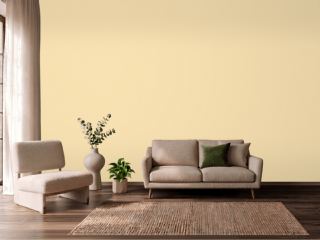 Banana CreamSherwin-Williams SW 6673
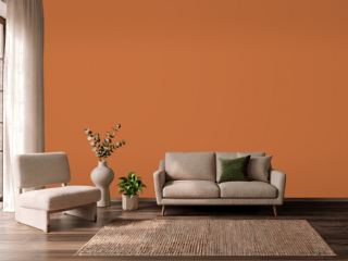 YamSherwin-Williams SW 6643
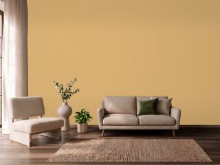 Tavern OchreBenjamin Moore CW-375
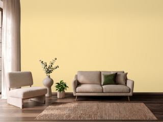 SoléSherwin-Williams SW 6896
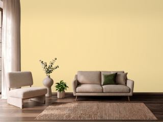 Butter UpSherwin-Williams SW 6681
 Champagne PinkValspar 2004-4C
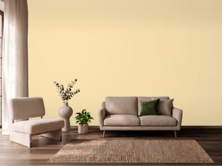 PastaDunn-Edwards DE5331
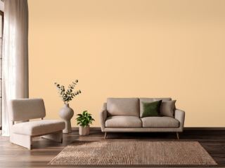 GranolaDunn-Edwards DE5296
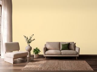 They call it MellowSherwin-Williams SW 9015
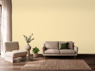 Friendly YellowSherwin-Williams SW 6680
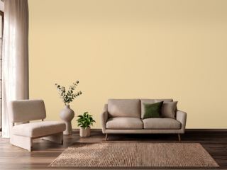 Dorset CreamFarrow & Ball 68
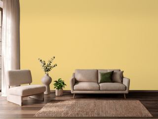 CitronFarrow & Ball 74
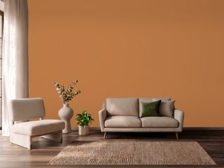 PumpkinVista Paint 1335
 Brick OrangeDutch Boy 7476