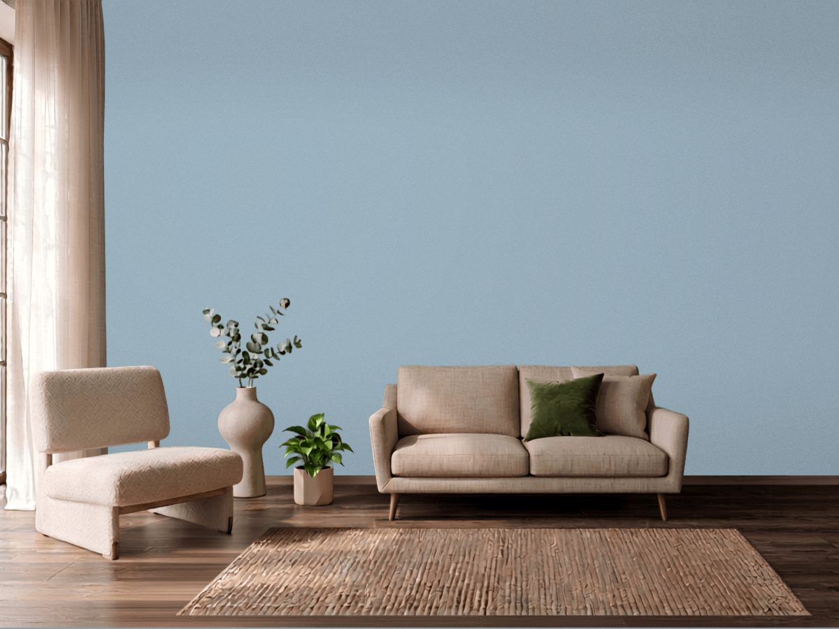
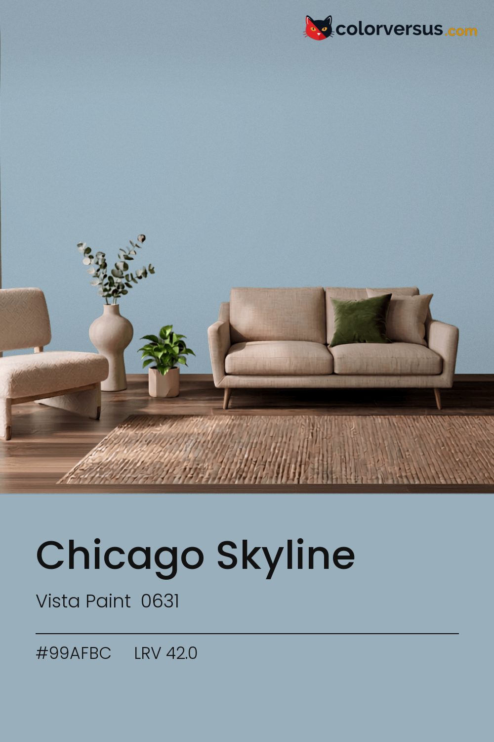
Vista Paint 0631Vista Paint 0631
A dependable middle ground, carried by a blue undertone that reads clearly without needing bright light to prove it. 0631 in the Vista Paint range.
42.0 on the light-reflectance scale puts it in the middle third, which is the part of the scale with the fewest surprises. Chroma 10.4 keeps the blue undertone present without letting it run the room.
Bedrooms and living rooms, where it is seen in lamplight as much as daylight. A warm bulb is the easiest fix if this reads colder than expected once it is on the wall. Dunn-Edwards Lighthouse pairs well as a second surface - close enough in feel to belong in the same room, far enough in lightness to read as two distinct walls (about 48.3 points apart on the reflectance scale).
This color and oranges and warm terracotta don't get along in the same room - they sit on opposite sides of the spectrum, so pairing them tends to feel like tension rather than contrast.
Warm metals - brass, aged gold, unlacquered fixtures - gain a contrast against this that they do not have against a lighter wall; it is a common reason people choose a color this deep in the first place. If the room needs more than one wall color, keep the steps far apart: this color, then something clearly lighter for a second surface, then a bright white above. Two similar tones just look like a mismatch; three distinct ones read as a plan (about 42.0 to 64 to 85 in LRV terms).
By the numbers, Behr Rainy Sidewalk (HDC-CT-24) and this color are indistinguishable - delta-E 0.85, well under what the eye can separate. 3 other-brand colors land within delta-E 2 of this one - a well-populated part of the spectrum with several near-equivalents to choose from. A satin finish is worth it in a room that needs to be wiped down often, at the cost of showing a bit more of the wall's surface than a flat finish would.
It is lighter than 44 percent of the Vista Paint range. This is a crowded part of the scale - 679 colors measure within a point of 42.0 - so most brands will have something close. Vista Paint lists it in the C codes, alongside 1,421 other colors.
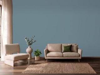
Vista Paint Chicago Skyline is a cool color: its hue angle is 243° in CIE Lab at a chroma of 10.4, with a blue undertone.
The light reflectance value (LRV) of Vista Paint Chicago Skyline (0631) is 42.0, on a scale where 0 is absolute black and 100 is absolute white, which makes it a mid-tone color.
Measured on the color wheel, Vista Paint Chicago Skyline pairs with Vista Paint Oak Plank (0148, complement), Behr Meadow Phlox (S540-3, analogous, warmer), Vista Paint Acapulco Aqua (7480, analogous, cooler), Dunn-Edwards Lighthouse (DEW385, soft accent).
Vista Paint Chicago Skyline's hex value is #99AFBC, RGB 153, 175, 188.
Vista Paint Chicago Skyline is classified as a teal, with a blue undertone.
The nearest Pantone TCX color to Vista Paint Chicago Skyline is 15-4008 TCX Blue Fog, delta-E 2.91; the nearest RAL Classic is RAL 7040 Window grey, delta-E 8.43.
The closest cross-brand match to Vista Paint Chicago Skyline is Behr Rainy Sidewalk (HDC-CT-24), at a delta-E of 0.85 - close enough to be the same color by measurement.
| HEX | #99AFBC |
| RGB | 153, 175, 188 |
| CMYK | 19%, 7%, 0%, 26% |
| HSL | 202°, 21%, 67% |
| HSV | 202°, 19%, 74% |
| CIE Lab | 70.22, -4.78, -9.19 |
| LCh | 70.22, 10.36, 242.5° |
| XYZ | 37.54, 41.06, 53.52 |
| Pantone (nearest) | 15-4008 TCX Blue Fog · ΔE 2.91 |
| RAL (nearest) | RAL 7040 Window grey · ΔE 8.43 |
| 15-4008 TCX Blue Fog | ΔE 2.91 | |
| 15-4312 TCX Forget Me Not | ΔE 3.23 | |
| 14-4210 TCX Celestial Blue | ΔE 3.34 | |
| RAL 7040 Window grey | ΔE 8.43 |
Pantone TCX and RAL Classic are physical standards; these are their published sRGB approximations, so check a fan deck before specifying. Pantone® and RAL are trademarks of their respective owners.
Shades mix the color toward black, tints toward white. Click any step to find the paint colors closest to it.
One image with Chicago Skyline and its closest color at every other brand, measured by delta-E.
 Rain DanceBehr S480-1
 Adirondack BlueBehr N480-5
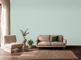 Palladian BlueBenjamin Moore HC-144
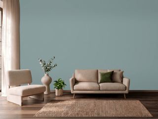 Oval Room BlueFarrow & Ball 85
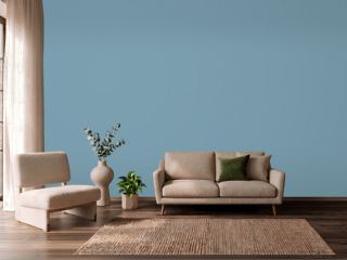 Cool DuskBehr 550F-4
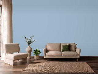 Lulworth BlueFarrow & Ball 89
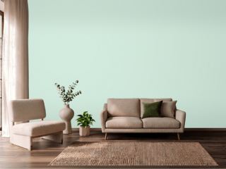 Green AquaBehr M420-2
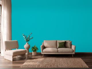 CalypsoSherwin-Williams SW 6950
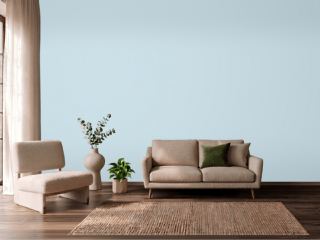 Breath of Fresh AirBenjamin Moore 806
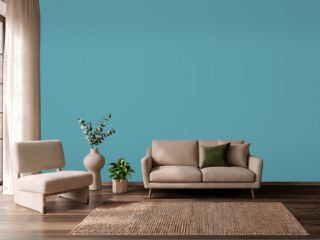 TurquoiseBehr BIC-53
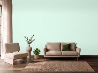 Fresh MintBenjamin Moore 2037-70
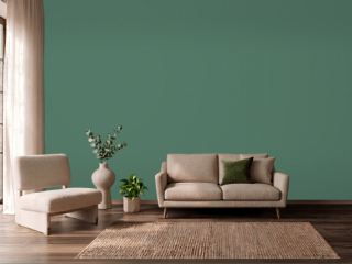 Kendal GreenSherwin-Williams SW 6467
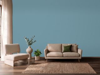 Stone BlueFarrow & Ball 86
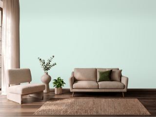 Embellished BlueSherwin-Williams SW 6749
 Blustery SkySherwin-Williams SW 9140
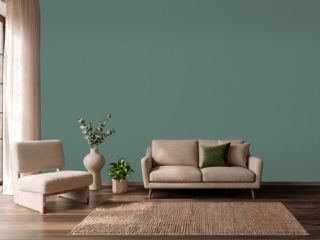 Forest EdgeBehr S430-6