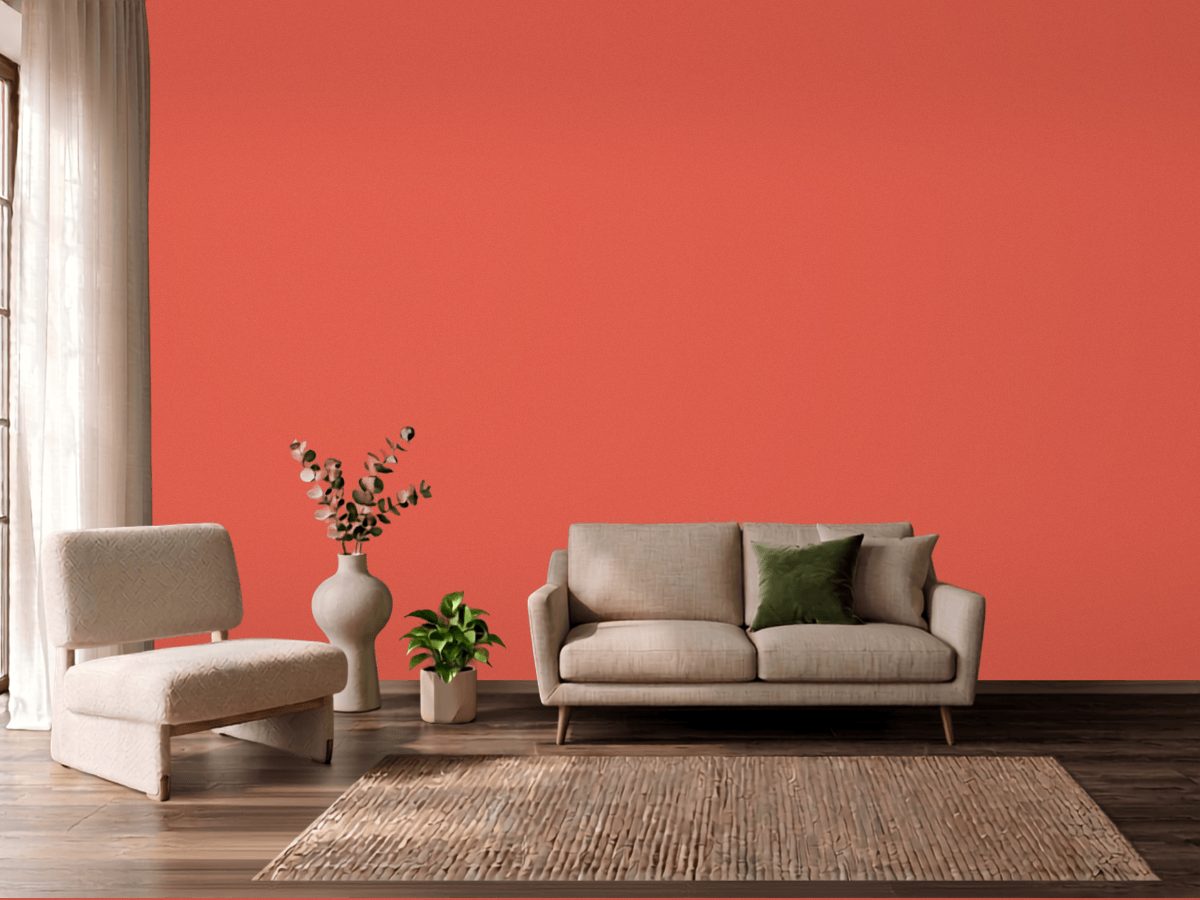
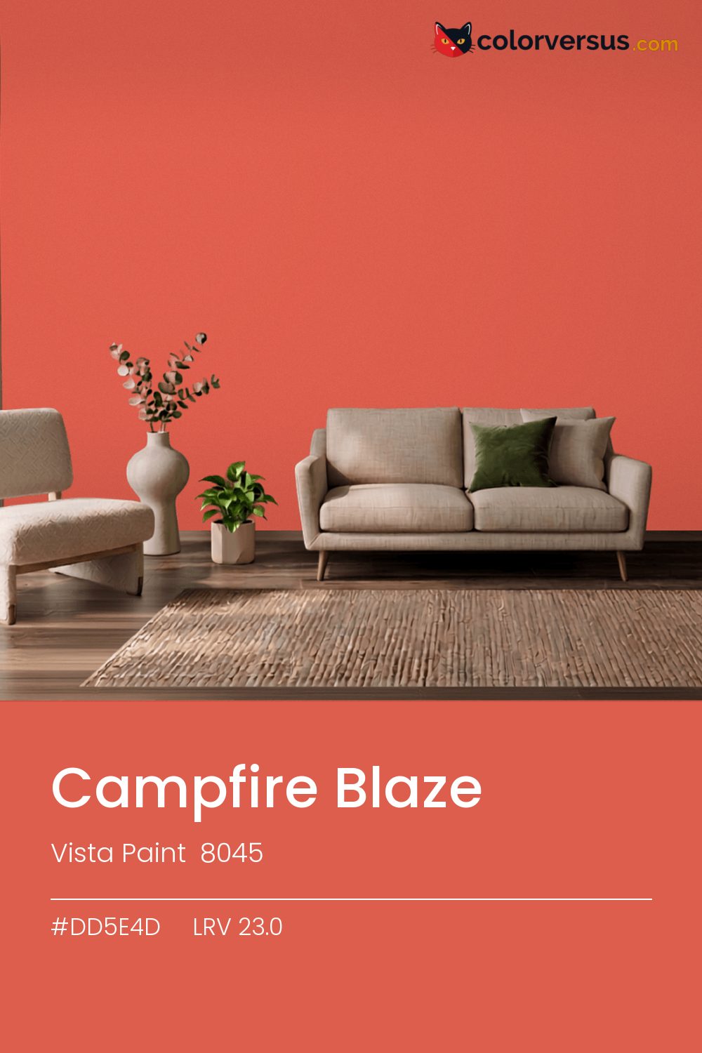
Vista Paint 8045Vista Paint 8045
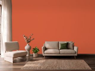
Strong enough that it sets the palette for the room, not the other way around. 8045 in the Vista Paint range.
Chroma 59.6 is high enough that the color will bounce onto light surfaces, so expect it everywhere, not only on the wall. Ideal for a single accent wall or a small room where you want to commit.
Afternoon sun will push the red further warm; if that reads as too much, a cooler bulb in the room can pull it back. LRV 23.0 tells you how much light comes back, which matters less here than how much color comes with it.
Depending on the bulb, this can genuinely read as red or as orange - it sits right on the border between the two, only 9° apart. This color and blues and cool greys don't get along in the same room - they sit on opposite sides of the spectrum, so pairing them tends to feel like tension rather than contrast.
Anything pale placed against this wall will look paler than it is; anything warm-metal will look warmer. Neither is an illusion the color plays deliberately - it is simple contrast, but worth planning rather than discovering. If the room needs more than one wall color, keep the steps far apart: this color, then something clearly lighter for a second surface, then a bright white above. Two similar tones just look like a mismatch; three distinct ones read as a plan (about 23.0 to 54 to 85 in LRV terms).
Behr Airy pairs well as a second surface - close enough in feel to belong in the same room, far enough in lightness to read as two distinct walls (about 58 points apart on the reflectance scale). Matte suits a color this strong - a glossier sheen would turn every light source in the room into a visible hotspot on the wall.
For anyone tied to a different brand, Behr Fiery Red (180B-6) is the nearest stand-in, at a delta-E of 1.79. Only 1 other-brand color land within delta-E 2 of this one, which makes it comparatively unusual.
It is lighter than 21 percent of the Vista Paint range. This is a crowded part of the scale - 343 colors measure within a point of 23.0 - so most brands will have something close. The name is not unique: Behr HDC-AC-06 also sells a color called Campfire Blaze, and it is not the same shade. Among reds it is one of the strongest: only 4 percent of them carry more colour. Vista Paint lists it in the K codes, alongside 1,318 other colors.
Vista Paint Campfire Blaze is a warm color: its hue angle is 35° in CIE Lab at a chroma of 59.6, with a red.
The light reflectance value (LRV) of Vista Paint Campfire Blaze (8045) is 23.0, on a scale where 0 is absolute black and 100 is absolute white, which makes it a dark color.
Measured on the color wheel, Vista Paint Campfire Blaze pairs with Behr Paradise Sky (P470-4, complement), Dunn-Edwards Burst of Gold (DE5333, analogous, warmer), Benjamin Moore Peony (2079-30, analogous, cooler), Behr Airy (550C-1, soft accent).
Vista Paint Campfire Blaze's hex value is #DD5E4D, RGB 221, 94, 77.
Vista Paint Campfire Blaze is classified as a red, with a red.
The nearest Pantone TCX color to Vista Paint Campfire Blaze is 17-1547 TCX Emberglow, delta-E 4.28; the nearest RAL Classic is RAL 2012 Salmon orange, delta-E 6.69. Neither is an exact match.
The closest cross-brand match to Vista Paint Campfire Blaze is Behr Fiery Red (180B-6), at a delta-E of 1.79.
| HEX | #DD5E4D |
| RGB | 221, 94, 77 |
| CMYK | 0%, 57%, 65%, 13% |
| HSL | 7°, 68%, 58% |
| HSV | 7°, 65%, 87% |
| CIE Lab | 56, 48.58, 34.56 |
| LCh | 56, 59.62, 35.4° |
| XYZ | 35.16, 23.92, 9.78 |
| Pantone (nearest) | 17-1547 TCX Emberglow · ΔE 4.28 |
| RAL (nearest) | RAL 2012 Salmon orange · ΔE 6.69 |
| 17-1547 TCX Emberglow | ΔE 4.28 | |
| 17-1553 TCX Paprika | ΔE 5.9 | |
| RAL 2012 Salmon orange | ΔE 6.69 |
Pantone TCX and RAL Classic are physical standards; these are their published sRGB approximations, so check a fan deck before specifying. Pantone® and RAL are trademarks of their respective owners.
Shades mix the color toward black, tints toward white. Click any step to find the paint colors closest to it.
One image with Campfire Blaze and its closest color at every other brand, measured by delta-E.
 Red EarthFarrow & Ball 64
 Southwest PotteryBenjamin Moore 048
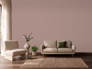 Sulking Room PinkFarrow & Ball 295
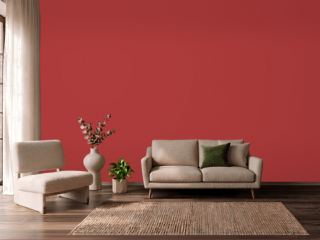 IndiscreetBehr UL110-6
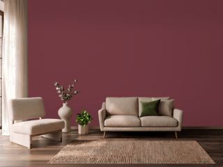 Fine WineSherwin-Williams SW 6307
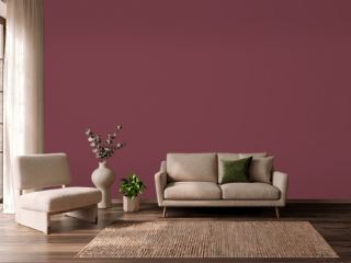 Wine TastingBehr S-H-110
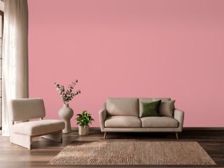 Secret GardenBenjamin Moore 1284
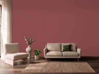 Eating Room RedFarrow & Ball 43
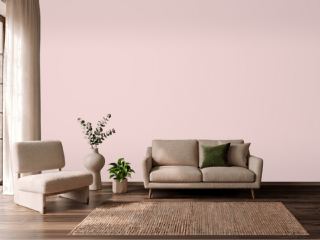 Charming PinkSherwin-Williams SW 6309
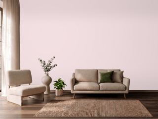 Berry TaffyValspar 1006-6C
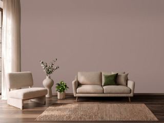 Cocoa BerrySherwin-Williams SW 9078
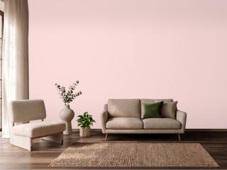 Ballet SlippersBenjamin Moore 1331
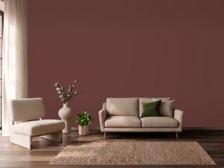 Chipotle PasteBehr PPU2-1
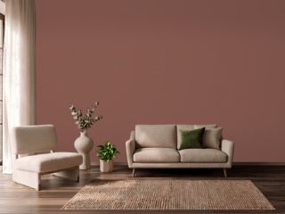 Canyon ClaySherwin-Williams SW 6054
 Charlotte's LocksFarrow & Ball 268
 Noble BlushBehr MQ4-4