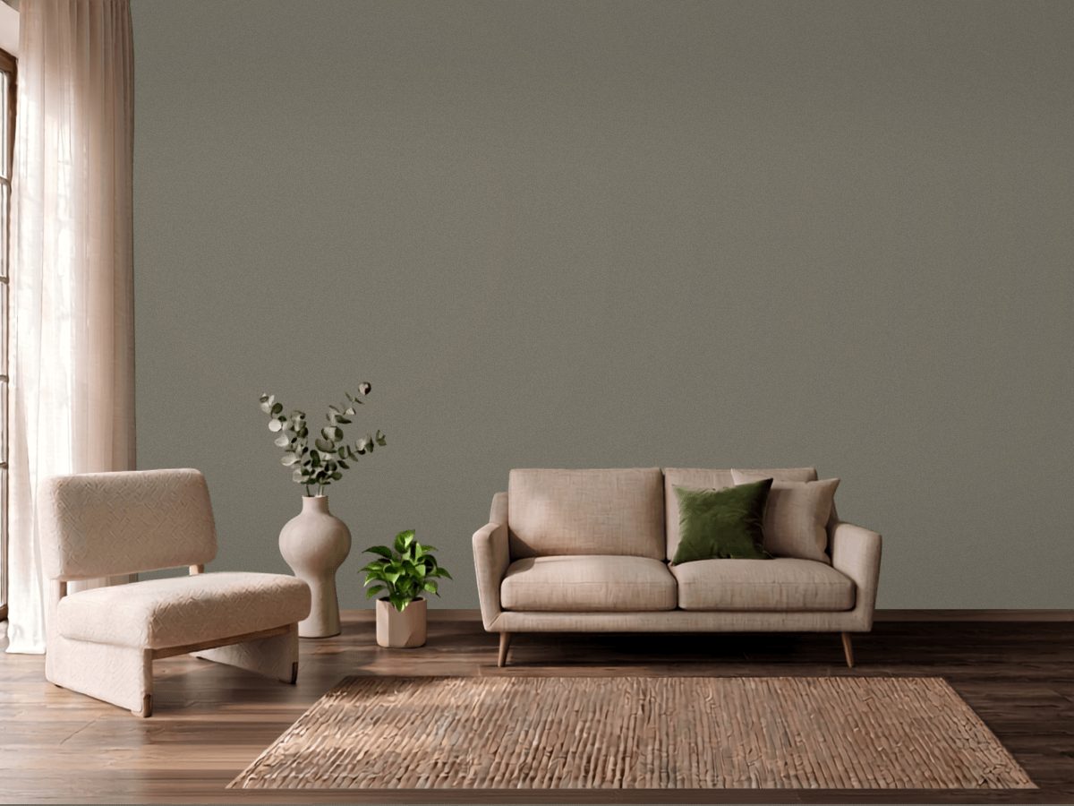
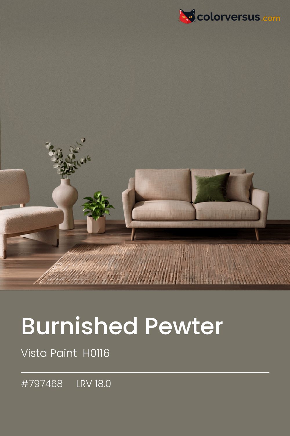
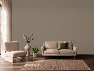
Vista Paint H0116Vista Paint H0116
Mid-range in both light and color, which is the most forgiving place to be. Vista Paint catalogs it as Burnished Pewter, H0116.
18.0 on the light-reflectance scale puts it in the middle third, which is the part of the scale with the fewest surprises. A chroma of 7.3 is enough to register as a real color choice, without the intensity that would force the rest of a room to match it.
A reasonable choice for a room that needs to feel grounded without going as dark as a true accent color. It holds up in a north-facing room, which is where warmth is usually missing. PPG Whirlwind makes a good second wall color here - different enough to read as a real choice, close enough to still feel related (about 35 points apart in light reflectance).
If the room already has blues and cool greys in the floor, a rug, or the furniture, this color will fight it rather than sit well beside it - the two sit at opposite ends of the color spectrum, which is exactly why they clash instead of blend.
Anything pale placed against this wall will look paler than it is; anything warm-metal will look warmer. Neither is an illusion the color plays deliberately - it is simple contrast, but worth planning rather than discovering. A natural scheme here moves in three clear steps: this color on the main wall, a noticeably lighter mid-tone for a second wall or built-in, and a near-white on the ceiling. Each jump should be obvious at a glance, not something you have to squint to tell apart (roughly 18.0, 52 and 85 on the light-reflectance scale, for reference).
Valspar Empire (6003-2B) matches it closely enough that no one will tell them apart on a wall. This is not a rare shade: 3 colors from other brands sit within delta-E 2 of it. Eggshell is a common middle ground here - enough durability for a lived-in room without the sheen that would draw attention to wall imperfections.
It is lighter than 16 percent of the Vista Paint range. The name is not unique: Vista Paint 8327 also sells a color called Burnished Pewter, and it is not the same shade. It is one of the quietest tans in the catalog, which is why it reads as a neutral on a large wall. Vista Paint lists it in the C codes, alongside 1,421 other colors.
Vista Paint Burnished Pewter is a warm color: its hue angle is 93° in CIE Lab at a chroma of 7.3, with a yellow undertone.
The light reflectance value (LRV) of Vista Paint Burnished Pewter (H0116) is 18.0, on a scale where 0 is absolute black and 100 is absolute white, which makes it a dark color.
Measured on the color wheel, Vista Paint Burnished Pewter pairs with Behr Atlantic Blue (600F-6, complement), Benjamin Moore Jojoba (AF-460, analogous, warmer), Sherwin-Williams Browse Brown (SW 6012, analogous, cooler), PPG Whirlwind (1013-3, soft accent).
Vista Paint Burnished Pewter's hex value is #797468, RGB 121, 116, 104.
Vista Paint Burnished Pewter is classified as a tan, with a yellow undertone.
The nearest Pantone TCX color to Vista Paint Burnished Pewter is 18-1108 TCX Fallen Rock, delta-E 2.54; the nearest RAL Classic is RAL 7006 Beige grey, delta-E 2.37.
The closest cross-brand match to Vista Paint Burnished Pewter is Valspar Empire (6003-2B), at a delta-E of 0.73 - close enough to be the same color by measurement.
| HEX | #797468 |
| RGB | 121, 116, 104 |
| CMYK | 0%, 4%, 14%, 53% |
| HSL | 42°, 8%, 44% |
| HSV | 42°, 14%, 47% |
| CIE Lab | 48.95, -0.32, 7.31 |
| LCh | 48.95, 7.32, 92.5° |
| XYZ | 16.63, 17.56, 15.61 |
| Pantone (nearest) | 18-1108 TCX Fallen Rock · ΔE 2.54 |
| RAL (nearest) | RAL 7006 Beige grey · ΔE 2.37 |
| 18-1108 TCX Fallen Rock | ΔE 2.54 | |
| 18-1110 TCX Brindle | ΔE 3.08 | |
| 17-0613 TCX Vetiver | ΔE 3.61 | |
| RAL 7006 Beige grey | ΔE 2.37 | |
| RAL 7003 Moss grey | ΔE 3.52 | |
| RAL 7039 Quartz grey | ΔE 4.92 |
Pantone TCX and RAL Classic are physical standards; these are their published sRGB approximations, so check a fan deck before specifying. Pantone® and RAL are trademarks of their respective owners.
Shades mix the color toward black, tints toward white. Click any step to find the paint colors closest to it.
One image with Burnished Pewter and its closest color at every other brand, measured by delta-E.
 Accessible BeigeSherwin-Williams SW 7036
 Natural LinenSherwin-Williams SW 9109
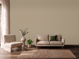 Studio TaupeSherwin-Williams SW 7549
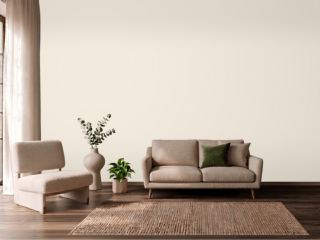 CreamySherwin-Williams SW 7012
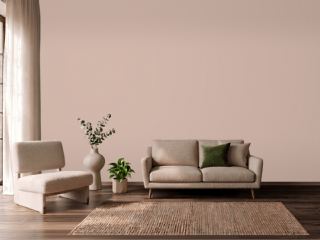 Sashay SandSherwin-Williams SW 6051
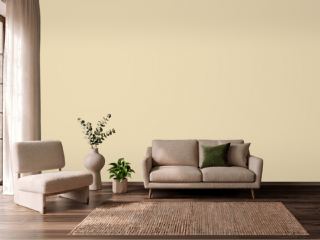 Farrow's CreamFarrow & Ball 67
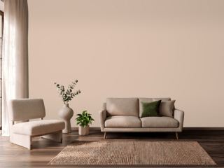 Setting PlasterFarrow & Ball 231
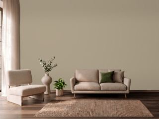 TurretBenjamin Moore CC-604
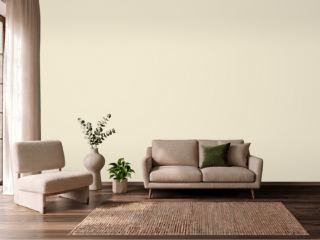 New WhiteFarrow & Ball 59
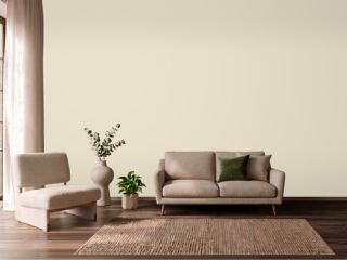 Polar BearSherwin-Williams SW 7564
 Koral KicksSherwin-Williams SW 6610
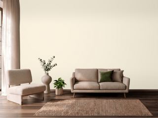 Lily of the ValleyBenjamin Moore 905
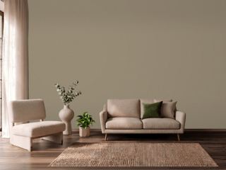 Mouse's BackFarrow & Ball 40
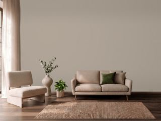 Mega GreigeSherwin-Williams SW 7031
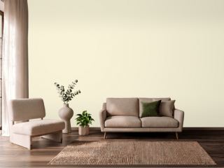 Soft CreamPPG 1205-2
 Warm StoneSherwin-Williams SW 7032