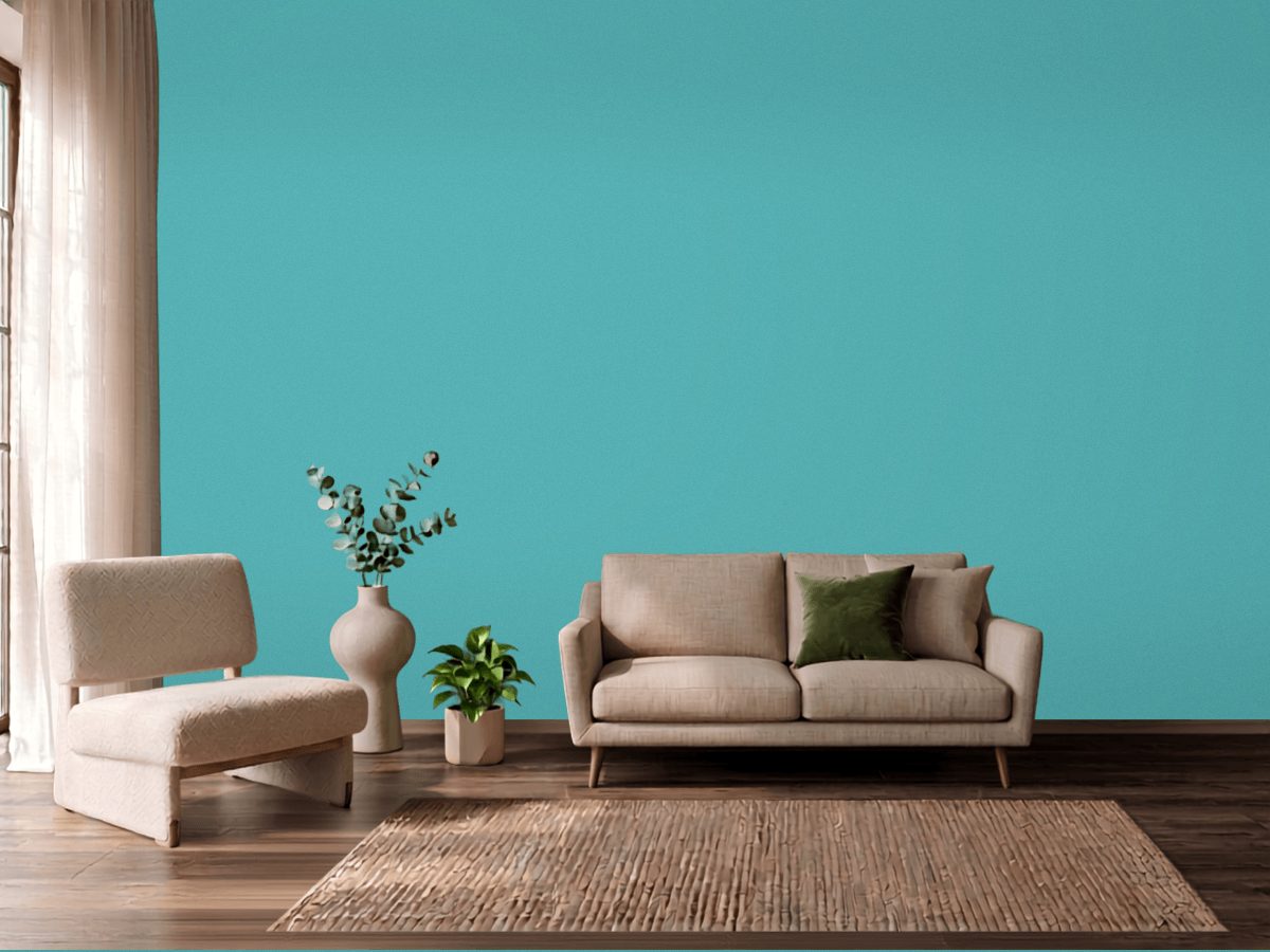
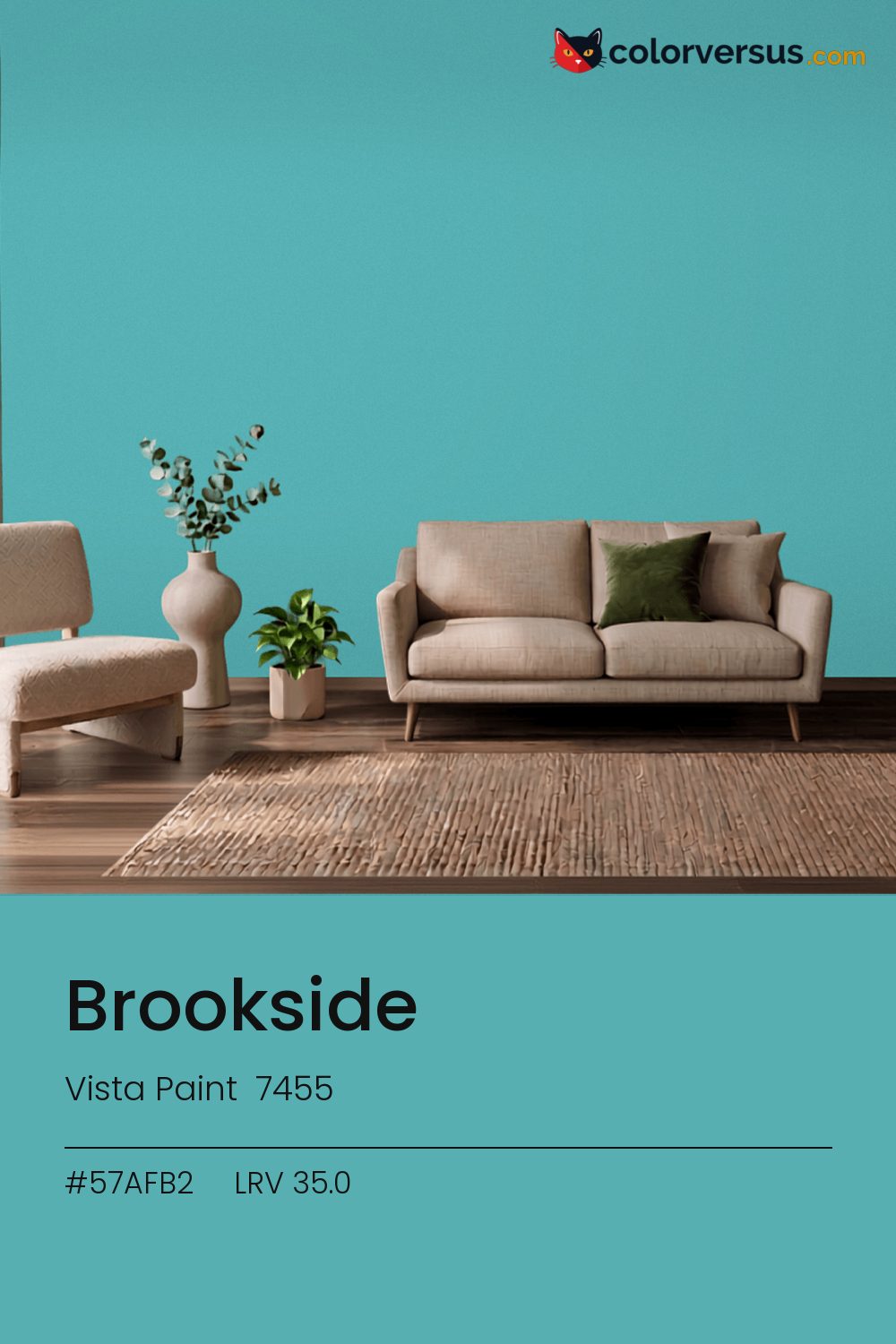
Vista Paint 7455Vista Paint 7455
This is a color that decides the room rather than supporting it. Vista Paint's designation for it is 7455.
Chroma 27.2 is high enough that the color will bounce onto light surfaces, so expect it everywhere, not only on the wall. A powder room or a nook is often the right scale for a color this strong - enough impact without living with it in every sightline.
South light flatters it. In a north-facing room it can turn cold, so sample that wall first. LRV 35.0 tells you how much light comes back, which matters less here than how much color comes with it.
If the room already has reds and brick tones in the floor, a rug, or the furniture, this color will fight it rather than sit well beside it - the two sit at opposite ends of the color spectrum, which is exactly why they clash instead of blend.
Next to it, white trim reads brighter and cooler than it does anywhere else in the house - the gap in light reflectance is what does that, not the trim paint itself. A natural scheme here moves in three clear steps: this color on the main wall, a noticeably lighter mid-tone for a second wall or built-in, and a near-white on the ceiling. Each jump should be obvious at a glance, not something you have to squint to tell apart (roughly 35.0, 60 and 85 on the light-reflectance scale, for reference).
Benjamin Moore Hint of Violet pairs well as a second surface - close enough in feel to belong in the same room, far enough in lightness to read as two distinct walls (about 31.2 points apart on the reflectance scale). Matte suits a color this strong - a glossier sheen would turn every light source in the room into a visible hotspot on the wall.
Benjamin Moore Harbor Side Blue (740) runs close enough - delta-E 2.26 - that swapping brands should not change how the room looks. Across the other brands, nothing lands within delta-E 2 of this one - there is no easy substitute.
It is lighter than 33 percent of the Vista Paint range. The name is not unique: Valspar 4008-6A and Vista Paint H0083 also sell a color called Brookside, and it is not the same shade. Vista Paint lists it in the K codes, alongside 1,318 other colors.
Vista Paint Brookside is a cool color: its hue angle is 201° in CIE Lab at a chroma of 27.2, with a teal.
The light reflectance value (LRV) of Vista Paint Brookside (7455) is 35.0, on a scale where 0 is absolute black and 100 is absolute white, which makes it a mid-tone color.
Measured on the color wheel, Vista Paint Brookside pairs with Sherwin-Williams Enticing Red (SW 6600, complement), Benjamin Moore Blue Dragon (810, analogous, warmer), Behr Shamrock Green (P420-5, analogous, cooler), Benjamin Moore Hint of Violet (2114-60, soft accent).
Vista Paint Brookside's hex value is #57AFB2, RGB 87, 175, 178.
Vista Paint Brookside is classified as a teal, with a teal.
The nearest Pantone TCX color to Vista Paint Brookside is 15-5217 TCX Blue Turquoise, delta-E 3.33; the nearest RAL Classic is RAL 6027 Light green, delta-E 10.07. Neither is an exact match.
The closest cross-brand match to Vista Paint Brookside is Benjamin Moore Harbor Side Blue (740), at a delta-E of 2.26.
| HEX | #57AFB2 |
| RGB | 87, 175, 178 |
| CMYK | 51%, 2%, 0%, 30% |
| HSL | 182°, 37%, 52% |
| HSV | 182°, 51%, 70% |
| CIE Lab | 66.44, -25.48, -9.66 |
| LCh | 66.44, 27.25, 200.8° |
| XYZ | 27.29, 35.9, 47.6 |
| Pantone (nearest) | 15-5217 TCX Blue Turquoise · ΔE 3.33 |
| RAL (nearest) | RAL 6027 Light green · ΔE 10.07 |
| 15-5217 TCX Blue Turquoise | ΔE 3.33 | |
| 15-4714 TCX Aquarelle | ΔE 4.82 | |
| RAL 6027 Light green | ΔE 10.07 |
Pantone TCX and RAL Classic are physical standards; these are their published sRGB approximations, so check a fan deck before specifying. Pantone® and RAL are trademarks of their respective owners.
Shades mix the color toward black, tints toward white. Click any step to find the paint colors closest to it.
One image with Brookside and its closest color at every other brand, measured by delta-E.
 Rain DanceBehr S480-1
 Adirondack BlueBehr N480-5
 Palladian BlueBenjamin Moore HC-144
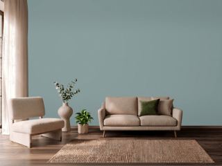 Oval Room BlueFarrow & Ball 85
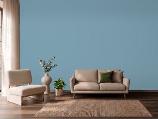 Cool DuskBehr 550F-4
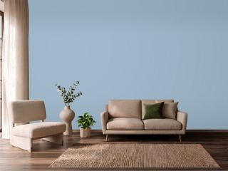 Lulworth BlueFarrow & Ball 89
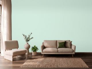 Green AquaBehr M420-2
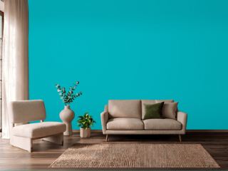 CalypsoSherwin-Williams SW 6950
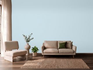 Breath of Fresh AirBenjamin Moore 806
 Fresh MintBenjamin Moore 2037-70
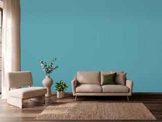 TurquoiseBehr BIC-53
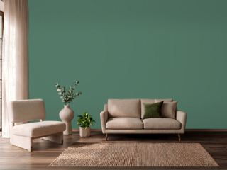 Kendal GreenSherwin-Williams SW 6467
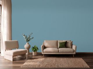 Stone BlueFarrow & Ball 86
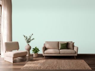 Embellished BlueSherwin-Williams SW 6749
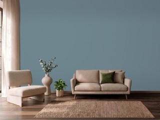 Blustery SkySherwin-Williams SW 9140
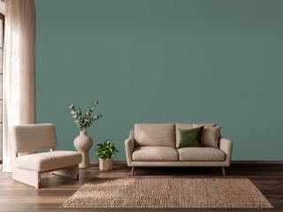 Forest EdgeBehr S430-6