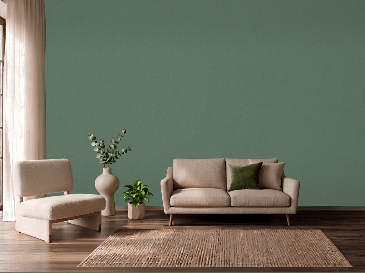
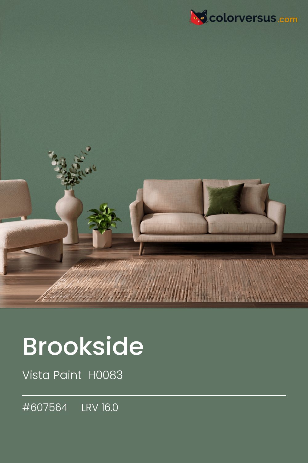
Vista Paint H0083Vista Paint H0083
Mid-range in both light and color, which is the most forgiving place to be. H0083, from Vista Paint.
16.0 on the light-reflectance scale puts it in the middle third, which is the part of the scale with the fewest surprises. A chroma of 13.3 is enough to register as a real color choice, without the intensity that would force the rest of a room to match it.
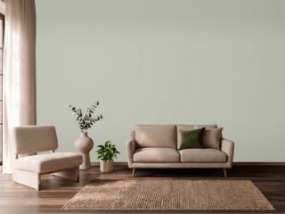
Bedrooms and living rooms, where it is seen in lamplight as much as daylight. This is a color worth testing in the specific room it is going in - cool colors shift more than warm ones do between north and south walls. Behr Standing Ovation makes a good second wall color here - different enough to read as a real choice, close enough to still feel related (about 33 points apart in light reflectance).
If the room already has pinks and warm blush tones in the floor, a rug, or the furniture, this color will fight it rather than sit well beside it - the two sit at opposite ends of the color spectrum, which is exactly why they clash instead of blend.
The lighter the trim beside this, the more it will seem to glow - a side effect of the light-reflectance gap rather than anything special about the trim color. A natural scheme here moves in three clear steps: this color on the main wall, a noticeably lighter mid-tone for a second wall or built-in, and a near-white on the ceiling. Each jump should be obvious at a glance, not something you have to squint to tell apart (roughly 16.0, 51 and 85 on the light-reflectance scale, for reference).
Switching brands, Behr Pine Brook (S420-6) is the closest equivalent at delta-E 2.94, near enough for most rooms. Across the other brands, nothing lands within delta-E 2 of this one - there is no easy substitute. A satin finish is worth it in a room that needs to be wiped down often, at the cost of showing a bit more of the wall's surface than a flat finish would.
It is lighter than 14 percent of the Vista Paint range. The name is not unique: Valspar 4008-6A and Vista Paint 7455 also sell a color called Brookside, and it is not the same shade. Vista Paint lists it in the C codes, alongside 1,421 other colors.
Vista Paint Brookside sits between warm and cool: its hue angle is 149° in CIE Lab at a chroma of 13.3, with a green undertone.
The light reflectance value (LRV) of Vista Paint Brookside (H0083) is 16.0, on a scale where 0 is absolute black and 100 is absolute white, which makes it a dark color.
Measured on the color wheel, Vista Paint Brookside pairs with Sherwin-Williams Vigorous Violet (SW 6838, complement), Benjamin Moore Cedar Mountains (706, analogous, warmer), Behr Less Travelled (MQ6-15, analogous, cooler), Behr Standing Ovation (N570-2, soft accent).
Vista Paint Brookside's hex value is #607564, RGB 96, 117, 100.
Vista Paint Brookside is classified as a green, with a green undertone.
The nearest Pantone TCX color to Vista Paint Brookside is 17-5912 TCX Dark Ivy, delta-E 3.29; the nearest RAL Classic is RAL 7003 Moss grey, delta-E 9.28. Neither is an exact match.
The closest cross-brand match to Vista Paint Brookside is Behr Pine Brook (S420-6), at a delta-E of 2.94.
| HEX | #607564 |
| RGB | 96, 117, 100 |
| CMYK | 18%, 0%, 15%, 54% |
| HSL | 131°, 10%, 42% |
| HSV | 131°, 18%, 46% |
| CIE Lab | 47.14, -11.39, 6.83 |
| LCh | 47.14, 13.28, 149.1° |
| XYZ | 13.48, 16.13, 14.46 |
| Pantone (nearest) | 17-5912 TCX Dark Ivy · ΔE 3.29 |
| RAL (nearest) | RAL 7003 Moss grey · ΔE 9.28 |
| 17-5912 TCX Dark Ivy | ΔE 3.29 | |
| 17-6009 TCX Laurel Wreath | ΔE 5.29 | |
| 17-6212 TCX Sea Spray | ΔE 5.51 | |
| RAL 7003 Moss grey | ΔE 9.28 |
Pantone TCX and RAL Classic are physical standards; these are their published sRGB approximations, so check a fan deck before specifying. Pantone® and RAL are trademarks of their respective owners.
Shades mix the color toward black, tints toward white. Click any step to find the paint colors closest to it.
One image with Brookside and its closest color at every other brand, measured by delta-E.
 Green SmokeFarrow & Ball 47
 Card Room GreenFarrow & Ball 79
 Mint ConditionSherwin-Williams SW 6743
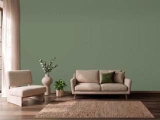 Avon GreenBenjamin Moore HC-126
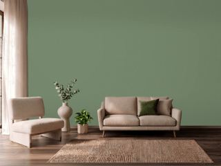 Calke GreenFarrow & Ball 34
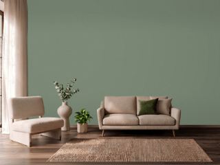 Privilege GreenSherwin-Williams SW 6193
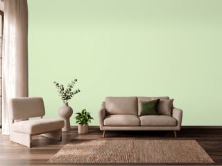 Sprig of MintValspar 6004-7B
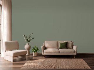 Dried ThymeSherwin-Williams SW 6186
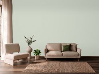 CastawayPPG 1129-3
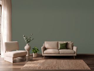 RosemarySherwin-Williams SW 6187
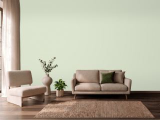 Gratifying GreenSherwin-Williams SW 6435
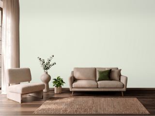 Spinach WhiteSherwin-Williams SW 6434
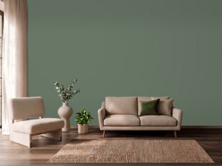 Cushing GreenBenjamin Moore HC-125
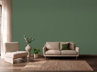 Peale GreenBenjamin Moore HC-121
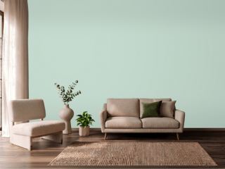 Aberdeen GreenBenjamin Moore 631
 MizzleFarrow & Ball 266